Team's Response
Mentioned in UG that for users with small screen size, they should use the application in full screen to enjoy the application's full suite of features. This arises from the deliberate decrease in width of the application to the bare minimum width. We have accounted for the constraints under https://nus-cs2103-ay2122s1.github.io/website/admin/tp-constraints.html#constraint-screen-resolution for small screen sizes and recommended for users who might potentially face such inconvenience to use the full screen version of the application.
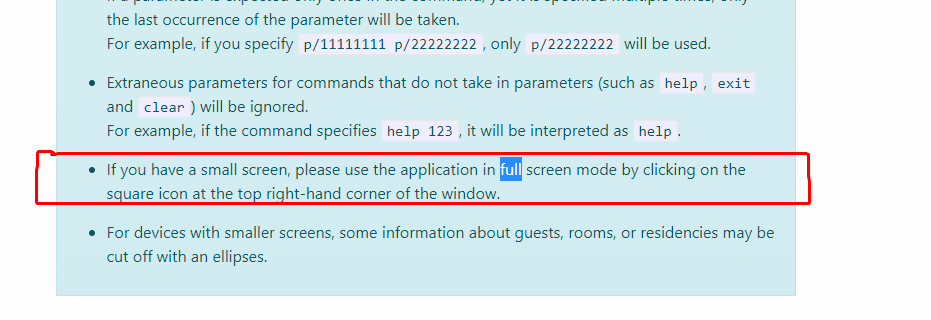
If we were to allow this to be classified as a functionality bug, then one could even argue that reducing the height of the application leads to a functionality bug too as we are unable to see the full information as shown in the below screenshot.
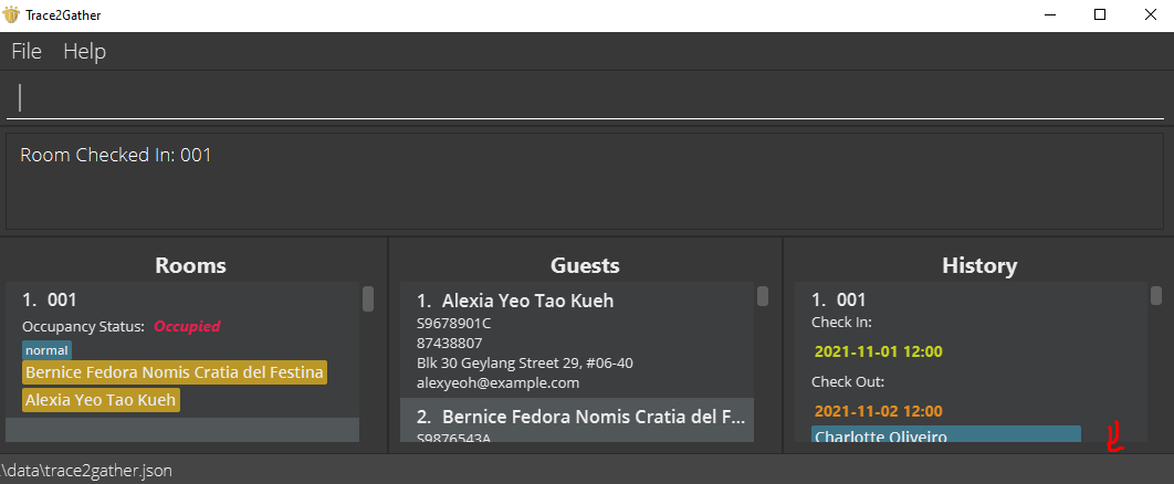
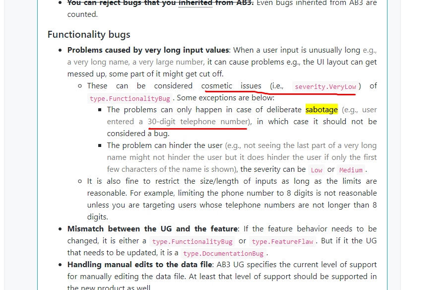
Therefore, it is a cosmetic bug that could have been remedied if the user used the full screen version of the application. And just in case the tester does do that, please keep in mind that deliberately long inputs are also considered to be VeryLow in severity based on the specs as shown below:
Items for the Tester to Verify
:question: Issue response
Team chose [response.NotInScope]
- [x] I disagree
Reason for disagreement: 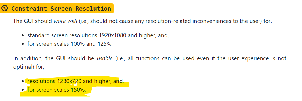
According to the textbook, it is entirely within scope to ensure that the application is usable in certain reasonable screen sizes.
During the practical, I did not intentionally minimize the width to its minimum. In fact, I used the default window size when the application started up.
The bug shows up when using the setting recommended by the textbook
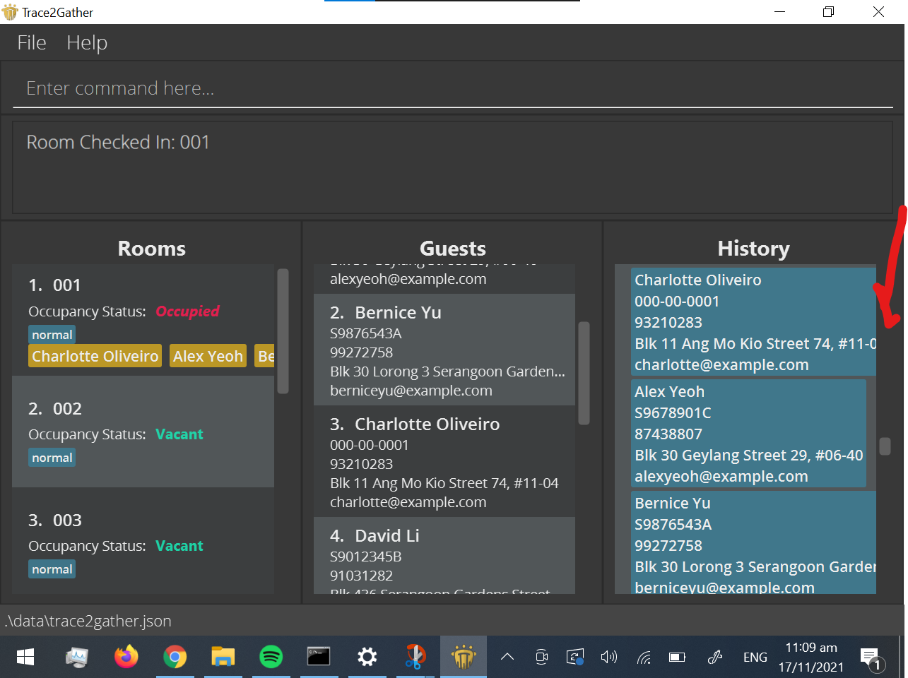
Therefore, I believe it is entirely within scope for an application to be usable at the window widths I used.
Furthermore, I don't think you can argue that I used unreasonably long inputs since I used the default input provided by the developer team.
:question: Issue severity
Team chose [severity.VeryLow]
Originally [severity.Low]
- [x] I disagree
Reason for disagreement: This bug happens often for most addresses.
Furthermore, this bug has serious consequences with no workarounds. When this bug occurs, you would not be able to see a guest's address, defeating the entire purpose of the application. There is also no workarounds like horizontal scrollbars or text-wrap that would allow you to view the address. I feel that this bug could be justified as a severity.Medium as it causes the application to become unusable.
Lastly, I feel that including the advisory inside the UG does not nullify the severity of the bug. As you can see in the screenshot below, if a user has a screen resolution of 1280 x 720 and 150% zoom. the bug still occurs even in fullscreen mode

Normally, this would be a verylow severity issue, as it is a cosmetic bug. However, the cutting of takes place for normal inputs as shown in the screenshots.
In fact, this UI overflow can be seen from the default data provided at the start of the program.
This would cause occasional inconvenience to some user, but they can continue to use the product.