Team's Response
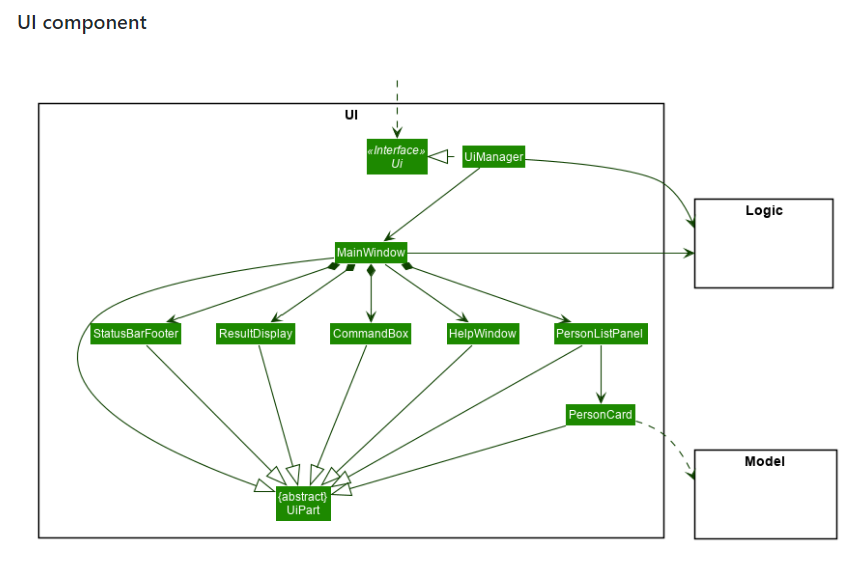
Hi! Thank you for bringing this issue up. However, we downgraded this to Very Low as the overall meaning of the diagram isn't affected.
Items for the Tester to Verify
:question: Issue severity
Team chose [severity.VeryLow]
Originally [severity.High]
- [x] I disagree
Reason for disagreement: This was taken from the part "Class diagram for UI component" The arrows pointing should be directly to classes in UI and not to the outer box encompassing the classes. It is challenging for developers to make sense of the interaction with model / controller component given its ambiguity. Hence, developers might found it hard to decipher this class diagram. Hence, I feel that this issue is of severity of at least low.
This is evident in the ab3's example below that shows arrows pointing from MainWindow/Ui Manager to logic component .

Does not resemble a class diagram