Team's Response
We believe that everything remains clearly visible upon start-up, and should users attempt to resize the window, a very clear workaround exists of resizing it back.
Items for the Tester to Verify
:question: Issue response
Team chose [response.NotInScope]
- [x] I disagree
Reason for disagreement: Tags are critical pieces of information and a core component of the app for users to provide useful remarks about their client. Furthermore, there is also a current feature developed around tags. As such, I believe this should be well within the scope of the current version of the product.

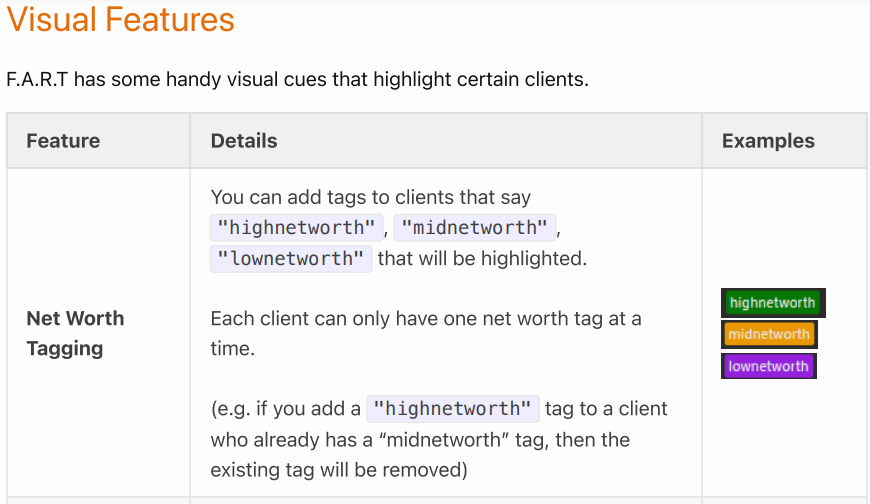
Missing tags could lead to confusion or oversight, particularly if a user unknowingly resizes the window to a smaller size. For example, obscuring the net worth information could directly affect usability and even lead to errors in decision-making.

Furthermore, users are led to believe that this behaviour should work since the tags are dynamically shifted based on the section's window size till beyond a certain point, which is why I believe this should be a functionality bug. Should this behaviour not be supported, a limit on how small the window can be resized could have been added (since it can be resize all the way to 0 width currently) or the tags should have been configured to wrap to the next line, making this a functionality bug.
video:https://raw.githubusercontent.com/Johnwz123/pe/main/files/ff83fa63-c722-4f72-a17d-5ce782179d83.mp4
While I acknowledge that the issue is resolved by simply resizing the window back, this solution is not the most user-friendly. Users should not be expected to manually rectify visual issues caused by resizing. This disrupts workflow and is particularly frustrating for users unfamiliar with the app or those who inadvertently resize the window too small.
An intuitive design should prevent such issues, such as setting a minimum window size or wrapping the content appropriately, making this a "minor inconvenience". Nevertheless, I do acknowledge that everything remains clearly visible upon start-up, which is I agree this would only be a bug of low severity.
Given that the above solutions do not require "much additional effort" and should be implemented for the tags to remain visible for the tag feature to be "reasonably useful", I do not agree that this is not in scope.

When resizing the left window smaller beyond a certain size, the tags stop following the resize and instead gets covered instead and if I resize further, the name also gets covered.
I feel this is quite severe since it may cause users to miss out on a tag, which could be potentially important information.
Furthermore, there is also a minor cosmetic issue as can be seen for the last person below.
I believe this could have been easily fixed by adding a limit on how small the window can be resized to avoid this issue (since it can be resize all the way to 0 width currently) or wrap the tags to the next line.