Team's Response
Our team has rejected this as not a bug reason being that in the earlier phases, we have deemed that the nature of our application does not prioritise nor necessitate the legal full name of a candidate to be inputted for functionality. The name is simply an identifier for the prof, and it is at the prof's discretion to shorten and only keep the first name or part of an extremely long name for the interview scheduling and for convenience. The focus is instead on the unique email, studentid and phone which identifies a candidate and allows for contacting the candidates.
Other design considerations that involve wrapping the name (as suggested by the tester) is not deemed suitable (and considered a suboptimal design) because it would then hinder the user's view of more pertinent information like the interview/application status, as well as studentid. course and seniority details in the candidates list/candidate profile panel. Instead the team has already addressed this by allowing some flexibility in resizing the panels to allow better viewing of longer names if really needed.
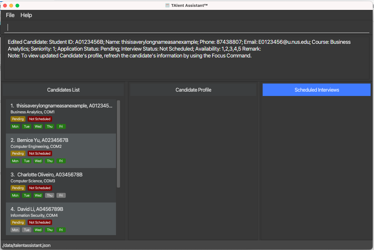
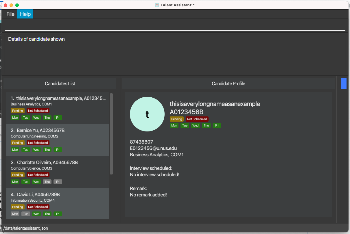
Currently, the default window size for the candidates list and focus panel allows for a considerable number of characters shown (see first screenshot below) of up to about 30 characters (or even more) in the candidates display. Likewise for the focus panel (see second screenshot below), a simple resizing of the focus panel which has been implemented by the team also reveals the full long name inputted (with room for more characters as the tester has also determined). In addition, extremely long names could further be deemed as extreme user inputs which is also not accepted as a bug.


Hope this clarifies.
Items for the Tester to Verify
:question: Issue response
Team chose [response.Rejected]
- [x] I disagree
Reason for disagreement: ## Reason I feel that requiring user's decision to shorten and only keep the first name or part of an extremely long name is not a good enough reason to reject this issue. Some times it is easier to write out the full name of a candidate as we can cross check with our other information easier. The user could decide not to keep the first name or part of a long name as it may aid them in remembering the correct information when they need.
I feel that the team could have set a limit on the name length or even do a wrapping which would not cause any inconvenience at all. If the team decides to implement a wrap feature, they could have use a scrollview to allows the users to still scroll down or look below for unique email, studentid and phone number.
I do agree that the feature to allow resizing of the focus panel do solve the issue of long names. However, this brings about an inconvenience as the would have to minimise the other panels (candidate list or scheduled interviews) which can bring about inconvenience as the user would then need to resize back to show the other list. In this case, I feel that instead of the bug being a Functionality bug, this could have been a Feature Flaw instead as the team could have designed the UI better to account for this issues.
Hence, I feel that the response is not strong enough to be not considered as an issue.
:question: Issue severity
Team chose [severity.VeryLow]
Originally [severity.Low]
- [x] I disagree
Reason for disagreement: This is still an issue that can cause inconvenience to users as name can be cut off. I feel that this should not be lowered as this is clearly not just a cosmetic issue that does not affect usage. Having it as a severity.Low bug fits the criteria as only certain people with long names will be affected when using the application.
Details
Application does not wrap people names that are long (shown in screenshot #1). This can be an issue as there are some names who are really long. Although the app has a functionality to expand the focus area but even so with a longer name, the name will still get cut off (shown in screenshot #2). My suggestion for the solution is to wrap the names of the candidates in the UI.
Command (example command to test)
edit 1 n/Christopher Lang Wee Kiat Oliveiro Roy Balakrishnan John Doeedit 1 n/This is to simulate a very long candidate name that can pose an issue to the application due to it being very long and causes the name to be cut offScreenshots