JuliaDocs / Documenter.jl

A documentation generator for Julia.
https://documenter.juliadocs.org
MIT License
818 stars 480 forks source link

Light-colored vertical guides in LaTeX tables for readability #1952

Open mortenpi opened 2 years ago

mortenpi commented 2 years ago

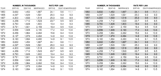
Use colors, not lines, i.e.

See the discussion in https://github.com/JuliaDocs/Documenter.jl/pull/1938#issuecomment-1250680367

odow commented 2 years ago

I'm not convinced this is needed. The JuMP docs, https://github.com/jump-dev/JuMP.jl/pull/3094, https://jump.dev/JuMP.jl/previews/PR3094/JuMP.pdf, have a bunch of large tables that are pretty readable as-is:

image image

Does anyone have examples of where this would be beneficial?
mortenpi commented 2 years ago

Personally, I find it would be beneficial in both of those examples. Although a little bit of experimentation might be necessary to make sure it's not intrusive at the same time.

cormullion commented 2 years ago

good typography can always organize a table, no stripes needed

(Edward Tufte, at https://www.edwardtufte.com/bboard/q-and-a-fetch-msg?msg_id=0001IV)

But a little bit of extra row spacing (in the first figure here) would be nice...

mortenpi commented 2 years ago

There is a suggestion in the Tufte thread to use a separator line, but only every some N lines, which would perhaps be less intrusive than colored background, but still achieve the same goal, especially if it is not styled too strongly.

http://www.ericson.net/images/table.gif