Details:
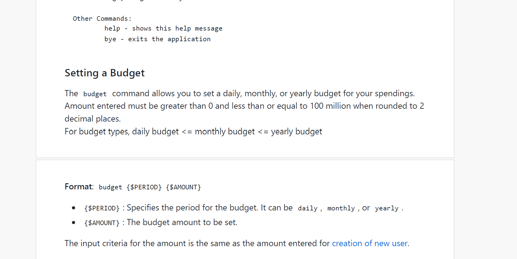
Firstly, the page breaks are all over the place (see Screenshot 1), cutting off paragraphs and sections in awkward places that make it hard to follow the flow of the UG.
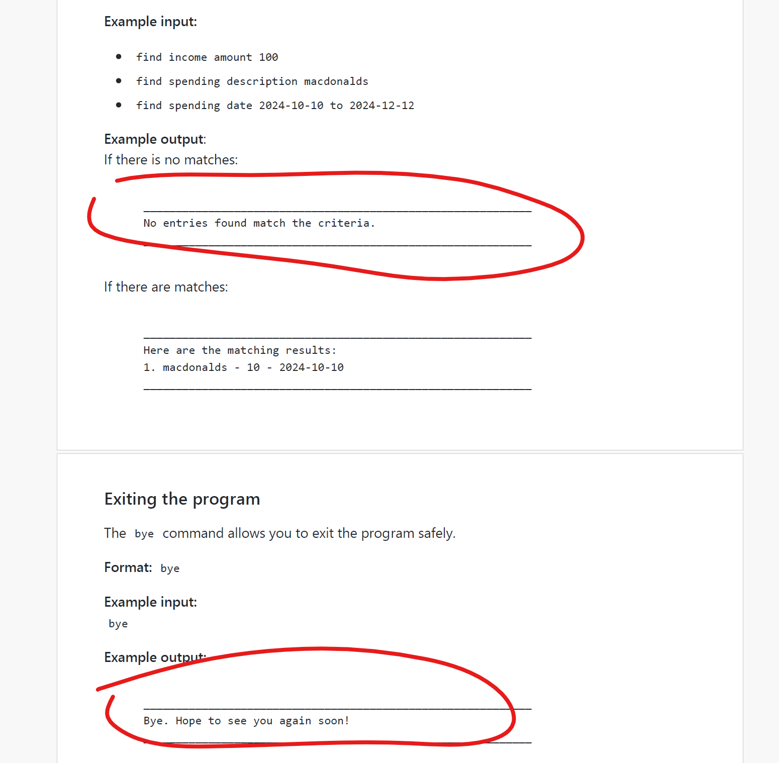
Secondly, many of the expected outputs are simple, repetetive or redundant (see Screenshot 2), and hence take up unnecessary space in the UG that also add to the complexity of reading the UG for new users.
Details: Firstly, the page breaks are all over the place (see Screenshot 1), cutting off paragraphs and sections in awkward places that make it hard to follow the flow of the UG. Secondly, many of the expected outputs are simple, repetetive or redundant (see Screenshot 2), and hence take up unnecessary space in the UG that also add to the complexity of reading the UG for new users.
Screenshots: 1. 2.
2.
