Team's Response
No details provided by team.
The 'Original' Bug
[The team marked this bug as a duplicate of the following bug]
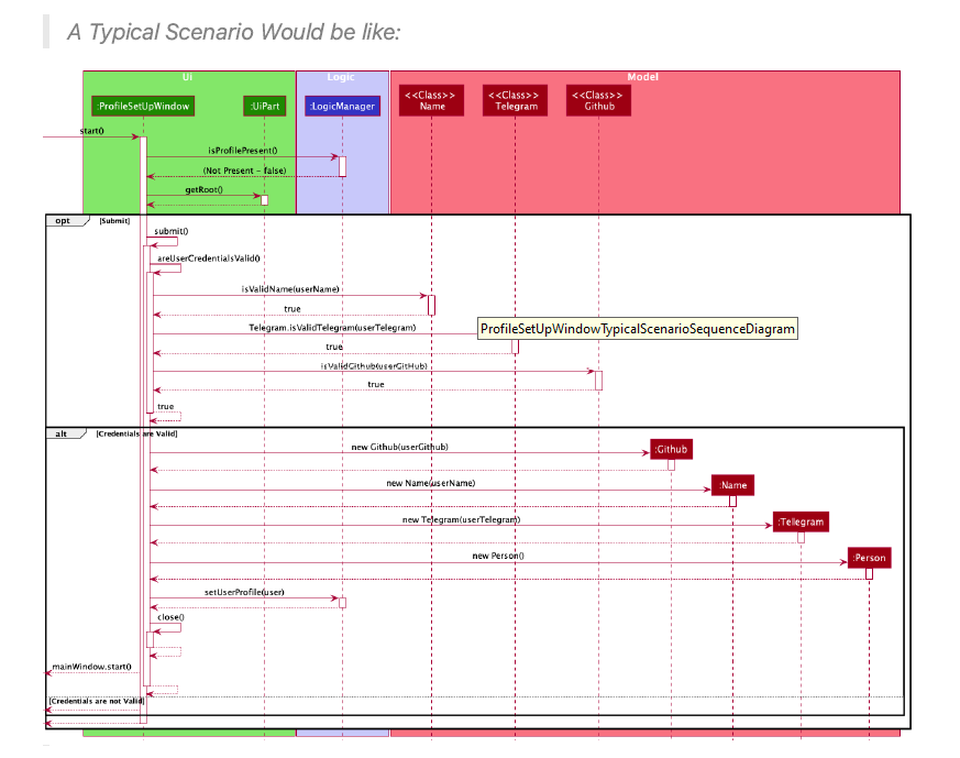
Too complicated sequence diagram
Note from the teaching team: This bug was reported during the Part II (Evaluating Documents) stage of the PE. You may reject this bug if it is not related to the quality of documentation.

in the DG This diagram seems too complicated. There are lots of details in this diagram but it seems to be too much and causes the image to be squished up. On my computer, I had to zoom in a fair bit to be able to see the words.
Perhaps this could be split into 2 different diagrams...?
[original: nus-cs2103-AY2122S1/pe-interim#3015] [original labels: severity.Low type.DocumentationBug]
Their Response to the 'Original' Bug
[This is the team's response to the above 'original' bug]
This diagram has been provided to showcase what a typical scenario would like when the app is running.
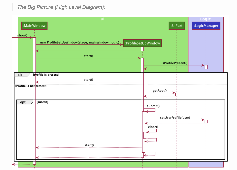
An alternate high level diagram is provided below that diagram in the DeveloperGuide for reference.
Items for the Tester to Verify
:question: Issue duplicate status
Team chose to mark this issue as a duplicate of another issue (as explained in the Team's response above)
- [ ] I disagree
Reason for disagreement: [replace this with your reason]
:question: Issue response
Team chose [response.Rejected]
- [ ] I disagree
Reason for disagreement: [replace this with your reason]
:question: Issue severity
Team chose [severity.Low]
Originally [severity.VeryLow]
- [ ] I disagree
Reason for disagreement: [replace this with your reason]

Currently, this sequence diagram for the profile set up contains too much lower level details and a bit hard to read. If it is possible, may I suggest abstracting some lower level details to make it more readable.