Team's Response
We reject this bug report. Since 'deleteGroup' is an operation that modifies the data, we added the 'gr' to give more clarity to users that they are going to delete it by the group number. Furthermore, 'findGroup' is a search feature that does not modify the data, so there is no need for a prefix and the keyword being searched would be enough.
Items for the Tester to Verify
:question: Issue response
Team chose [response.Rejected]
- [x] I disagree
Reason for disagreement: Initially, I suggest the format be deleteGroup GROUP_NUMBER because no prefix in findGroup, thus I feel that original deleteGroup has unnecessarily complicated command formats.
After receiving the team response, I agree that the prefix "gr/" give more clarity to users about deleteGroup
However, at the same time, it confuses users about the command findGroup which no need the prefix and
Only the group number is searched.

Given that so many numbers in a group details (e.g.: a group has index which may different from group number, and a group has tut group number)
- For first-time users, they may think it also support searching by tutorial number
- For users who use system for a few times, as they remember
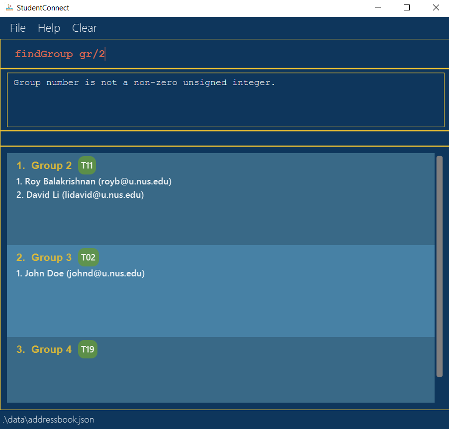
findGroupis finding by group number, they may type the prefix "gr/", and the error should be warning them to not enter the prefix instead of saying "Group number should be ... integer." (because the group number they enter is in correct format, they only enter additional prefix "gr/")

Therefore, the inconsistent format in these two commands may lead to problems "specificity of error message" or "unnecessarily complicated command format"
## :question: Issue severity Team chose [`severity.VeryLow`] Originally [`severity.Low`] - [x] I disagree **Reason for disagreement:** I believe the inconsistency in the command format will lead users type some commands as I suggest above (and I will consider this a normal user behaviour). I don't think it is merely a cosmetic issue because it might affect the usage of some users. For example, the app will block users' input I mention above.
Here is your command and example of
deleteGroupAt the same time, here is your format of command
findGroup:findGroup KEYWORDSince the expected arguments here are both group number I'm curious about why command
deleteGroupneed to include the Prefixgr/I feel that user may feel confused about this.
Expected format of
deleteGroup:deleteGroup GROUP_NUMBER