Team's Response
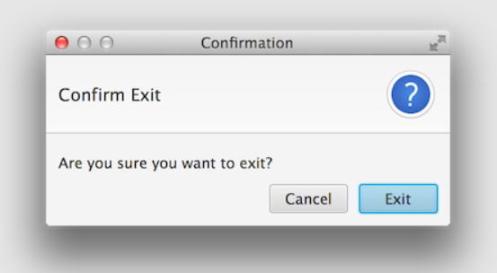
The app is still mainly CLI based, and the sole purpose of the popup is to prevent accidental clearing of all the data, which could be costly. The user is also able to use the keyboard such as left/right arrows and enter button to do the confirmation, thus it does not violate that condition.
Items for the Tester to Verify
:question: Issue response
Team chose [response.Rejected]
- [x] I disagree
Reason for disagreement: I accept the reason that users can use keyboard and enter button.
However, the UI didn't show which option the user current at. For example , have blue colour (as the picture below) for the option which user select by right/left arrows.

In rare situation, when a user enter clear and he decide to select "cancel" in the confirmation.
Scenario below may happen:
- after clicking right/left arrows a few time, he realise no colour change, he may use mouse to click cancel because he not sure which option he select now (still need to click)
- user may think the default option is "cancel" then he click enter
In the latter scenario, it can cause data loss (a big inconvenience for users).
According to your design of
clearcommand, user need to click instead of typing to complete executing the whole command.I feel like this might violates our target user who prefer CLI so that this implementation can be improved.