L5-Z / pe

0 stars 0 forks source link

Messy UG that is hard to navigate and read #9

Open L5-Z opened 7 months ago

L5-Z commented 7 months ago

Very hard to navigate with the lack of a Table of Contents. Hyperlinks are scattered randomly and sparsely with no hyperlinks to specific commands/usages. Usage is interlaced with elements that should be in features such as :

Generate a randomised gift suggestion: gift
Generates a randomised gift idea either with or without any gender specifications.
Each suggestion comes with a category tag [Creative] , [Food] , [Accessory] , etc. to give users a sense of
what type of gift it is.
Example of usage: gift / gift male / gift female / gift unisex
Expected outcome:
[Creative] Personalised pens engraved with the recipient's name or initials
-> Satisfied with the gift suggestion? [Yes/No]
-> Changed you mind? type 'cancel' to exit this process!
If user input no : Regenerates another gift suggestion for users to consider.
Expected outcome:
[Flower] Red roses: Love and passion (associated with deep affection and desire)
-> Satisfied with the gift suggestion? [Yes/No]
-> Changed you mind? type 'cancel' to exit this process!
If user input yes : Choice will be confirmed and saved in view history for ease of reference.
Expected outcome:
This gift is about to make a love story even sweeter.

Where:

Each suggestion comes with a category tag [Creative] , [Food] , [Accessory] , etc. to give users a sense of
what type of gift it is.

Should be under Features. Excessive use of examples and only in code blocks makes it text heavy and straining for readers. Just the immediate visuals after inputting a command should suffice.

Here is another text heavy Usage example with many elements that can be shifted to the Features section instead:

Generate a smart itinerary, based on your user profile: smart
The smart command generates a personalised itinerary tailored to your preferences, including your favorite
cuisine and preferred location. This feature takes into account the details you’ve provided to Flirt and Fork to
recommend a combination of food and activities that align with your tastes and interests.
Format: smart
Simply enter smart to let Flirt and Fork create a custom itinerary for you. Ensure your user profile is updated
with your current preferences for the best recommendations.
Expected Outcome:
Upon executing the smart command, Flirt & Fork will display a curated itinerary that includes two food
options and two activities. The suggestions for the afternoon (lunch + afternoon activity) are specifically
tailored to your default location and favourite cuisine, aiming to enhance your experience with personalized
options.
If Flirt & Fork successfully generates an itinerary, you’ll see something like this:
Here is a smart itinerary for your date (the afternoon is planned around your base preferences!):
We begin with lunch at Five Guys, followed by some fun at Museum of Ice Cream.
We proceed to have dinner at Tolido's Expresso Nook, and finish the night at Haw Par Villa.
In cases where your preferences are too unique or if an unexpected error occurs, Flirt & Fork will inform you
that it was unable to generate a suitable itinerary, encouraging you to try again or adjust your profile
preferences:
I could not generate a suitable itinerary based on your personal details!
I'm not smart enough for your default preferences, try 'itinerary' command instead!
Notes:
The itinerary suggestions are based on the current database of foods and activities within Flirt & Fork.
For the best experience, make sure your user details are up-to-date.
If Flirt & Fork encounters difficulty in generating an itinerary due to overly unique preferences or other
issues, you will receive a message encouraging you to adjust your preferences or try another command.
By using the smart command, you can discover new and exciting ways to enjoy your day, tailored
specifically to what you love.
soc-se-bot commented 7 months ago

Team's Response

Thanks for your feedback and criticisms! We do agree that our user guide is very text heavy since we wanted explanations and example outputs to make it as clear to the user as possible. However, we are unsure of what pdf reader you are using since it seems to be forcibly changing the formatting of our pdf.

For example, the background is black instead of white, the code snippets and blocks are missing and the bullet points have been replaced by arrows. All the headers have also been replaced with the same font as the regular text

Using Adobe Acrobat Reader and Google Chrome nets this result when compared to your first screenshot:
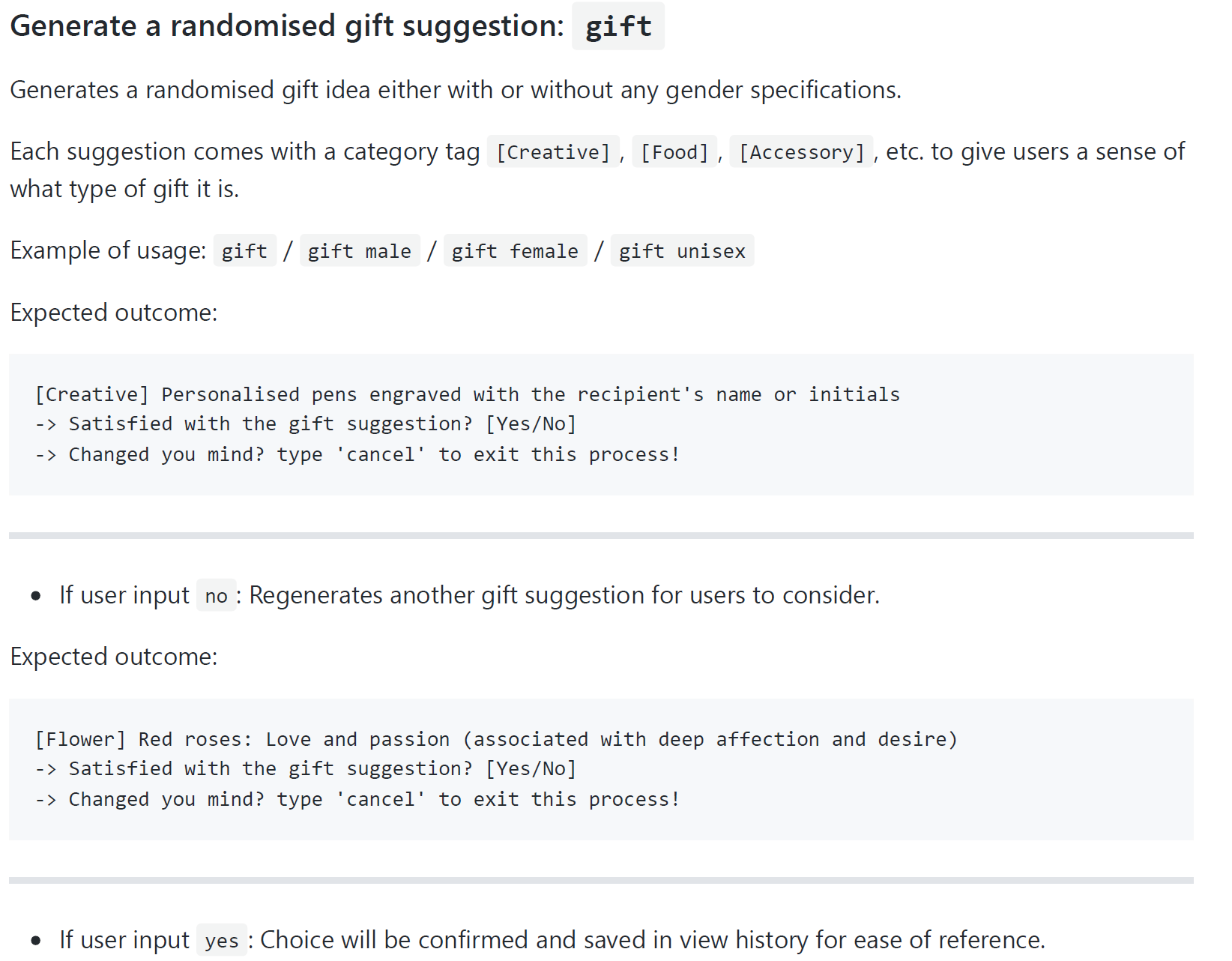
image.png

The different font sizes, bolding and code blocks all improve the readability of our user guide greatly. Since your critique on the guide being very wordy is valid, we think it can be greatly improved in a future update and hence, we classify it as NotInScope.

Items for the Tester to Verify

:question: Issue response

Team chose [response.NotInScope]

Reason for disagreement: [replace this with your explanation]