 zonkmachine
commented
8 years ago
zonkmachine
commented
8 years ago Yes. I have to lean forward a bit to see what's going on.
Closed tresf closed 7 years ago
zonkmachine
commented
8 years ago Yes. I have to lean forward a bit to see what's going on.
 vlad0337187
commented
8 years ago
vlad0337187
commented
8 years ago Yes, I had such problem, I needed to count squares (one, two, three, four - one quarter; one ...). The new one (with low contrast) is better because when I looked at the old one much time, than contrast squares stayed in my eyes near 20-30 seconds from when I stopped looking on it.
I think that for readability (you made right, decreasing extra contrast) we need to decrease extra contrast, but such dark (black) background and such pale lines may make grid illegible.
I think that the background must be more light, lines, could be lighter or darker than background depending on the situation, but not so contrast as they were (in old theme).
I'll make a sketch and post it here.
I made it. At first, you cad do so:
 (bar lines are the most contrast, quarter lines are lesser contrast and general lines are the lesser contrast).
So we can correct it a bit and add colors to make it more readable (two colors make more readable grid than one):
 (it still looks not enough readable (I think, that such color scheme, like an old one, will strain eyes and grid will stay near 20 seconds after you stopped looking on it) and quite strange, so we can continue searching)
Now we can make it feat new theme from here https://github.com/LMMS/lmms/pull/2983:

 (at the last general grid lines are lesser contrast, but they lesser strain my eyes, but the first one more fits theme. If not to take into account theme, I like more the last one. Maybe no, the first is better. Also it will feat different background colors (each per 4 bars, I'll post this here later))
Maybe it's good to divide a little bit each 4 bars in Piano roll by background color:

Also we can decrease contrast of the grid, which is located on the bars with dark background (there will be a little lesser readability, but also a little lesser eye strain and a bigger difference between dark and light bars):

Please tell what so you think about this.
 musikBear
commented
8 years ago
musikBear
commented
8 years ago Please tell what so you think about this.
A clearer visual difference in the grid, look to me as a great idea
 Umcaruje
commented
8 years ago
Umcaruje
commented
8 years ago 
@tresf does this look better?
 tresf
commented
8 years ago
tresf
commented
8 years ago Yes, better, but I should try it out interactively for a while. It's really the 1/4 note lines that were hard to see and https://github.com/LMMS/lmms/issues/3019#issuecomment-245580836 albeit a bit extreme, highlights the problem very well.
Umcaruje
commented
8 years ago I'll look into the code to change the transparency of the lines. I think @vlad1777d's idea of having a different color for a starting line is a bit of an overkill in my opinion. the alternating background color is already an enhancement (#2308) and should be handled seperately.
musikBear
commented
8 years ago @Umcaruje The picture is a jpg, so its not the best Quality, but i was wondering how it would look with bar-dividers made a 3 vertical lines : The center exactly ON the divider, but then 'flanked' by two new lines. Then the bar-dividers on your picture could be used as beat-dividers, and the tick-dividers could be preserved as they are on your picture. There would then be 3 really clear differentiable dividers.
Umcaruje
commented
8 years ago @musikBear the picture is actually a png, though github probably scaled it, so you should click on it so it appears in its natural size. I don't quite understand your request, could you please draw a mockup?
musikBear
commented
8 years ago @Umcaruje I made it for the first bar, so you can see the difference. I think it is clearer

 RebeccaDeField
commented
8 years ago
RebeccaDeField
commented
8 years ago I think we could get away with lightening the entire grid that @Umcaruje proposed here so long as we can strike a balance between the quarter notes being easy to distinguish and minimal eye strain.
tresf
commented
8 years ago How the "competition" does it, for comparison purposes only:


RebeccaDeField
commented
8 years ago A bit of analysis of the general design concepts...
 In this case the actual background is using different shades of gray and keeping the grid pretty transparent, which does seem give the eyes some rest, but the contrast is rather low.
 This grid is a bit different as the background is lighter and the grid is darker than the background. A darker grid with a lighter bg could also be a good idea for lower eye stress.
 This is actually a combination of the two above with a much lighter bg and darker grid and the background using different shades to differentiate. I would assume that this one might be more prone to eye strain after long periods of time.
It seems that piano roll using grids with lighter and darker lines rather than one color, so I think we should definitely do that to start. Can we also try using a darker (or lighter) shade of gray in the bg on every other space? I think that would aid in identifying where you want to place your note much quicker.
RebeccaDeField
commented
8 years ago Just wanted to leave one last idea here that I found on an older theme thread.
 Another way we could shade the background.
musikBear
commented
8 years ago Have to ask This image https://github.com/LMMS/lmms/issues/3019#issuecomment-246175403 surely first bar has a more distinguishing grid, than this: https://github.com/LMMS/lmms/issues/3019#issuecomment-246113815
Im sorry i push on here, but i very often have to lean forward, so this issue is quite important to me (lousy eyes and all that)
Just wanted to leave one last idea here that I found on an older theme thread.
Ya, #2308 that was mine, so i like it :p
vlad0337187
commented
8 years ago About different background colors for Piano Roll. I think that there is no need making new color each bar, because if grid is enough readable, everybody can see new bar as it is. But I often want to know: is now a new couplet (verse) or the old one.
So I think that new color must be every 4 bar because: -it will match with the background color of Music editor; -it's easy to understand where is current couplet, where is a new couplet (verse) (where is a new bar you can perfectly see and without background highlighting, so I think that this "feature" with different background can be used for another important goal).
vlad0337187
commented
8 years ago @tresf , about images that you posted:
-second is normal;
-first is bad - it's not contrast and not readable. It will be hard to notice the bars there. -third is just like the first one. Not contrast and not readable. It will be hard to notice quarters and bars there.
I think, there is no need to change current color scheme to first or third one because we will receive no benefits. All will stay as it was earlier.
musikBear
commented
8 years ago 
'1' is interesting. Here they option for high magnification in order to get a distinct piano-roll-view. The actual dividing vertical lines are not that clear, however because they have this large magnification, there are room for a real legend in the top of piano-roll. We can readout 1,2 Eg 1. beat 2. tick -etc. That can be helpful, but the downside is that it would be hard getting a overview of a whole melody. (They have a zoom for that, though)
'2' is fls.. fls has one of the most confusing features in piano-roll, and this picture here is a magnificent example I ask you: Can you count ticks? No, because fls has a 'floating-magnification' feature, that allows adjacent ticks to merge :/ ?! So inside one beat, there is two ticks drawed I positively hate that idea, and cant understand what it is good for The vertical grid is however almost distinctly in apearence. I can clearly see the lines for bars and beats, but the tick-lines are next to invisible. imo.. :see_no_evil:
'3' is imo without any visual difference between vertical dividing lines, and is extremely eye straining, if i try to analyse a piece of the score. That is a fault, LMMS should not recreate.
@vlad1777d So what you actually would like, was a custom-able shading, so you could enhance a verse with one shade, a hook with another, aso? -But that is a completely different thing in respect to getting a clean distinct default piano-roll-grid. Afaik this topic is about grid-dividers, and grid-shading, explicitly meant for getting best visual workspace, in piano-roll.
vlad0337187
commented
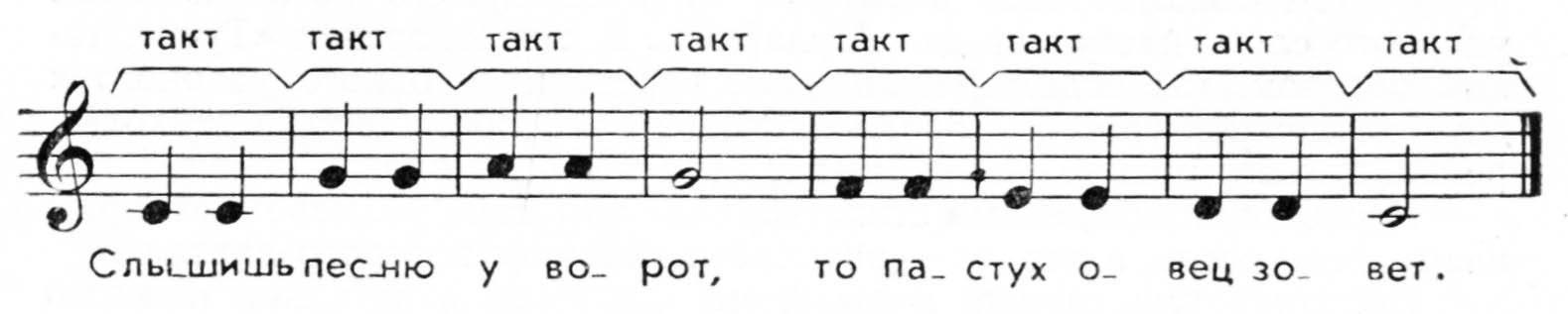
8 years ago @musikBear no, maybe that was an error in translation (I translate unknown words with Yandex translator).
The music consists of notes, which are grouped (if I translated it to English right) in bars (in Russian "bar" - "такт": http://www.kidly.ru/images/Untitled1-5.jpg)
And a text is grouped to quatrains. And one line of text usually matches 4 bars of music ("такт") (as you can see from picture: http://www.kidly.ru/images/Untitled1-5.jpg). And, depending on speed of music, one line of text can also match 2 bars of music (this also happens very often). Other variants are very rare.
So I suggested to divide each 4 bars in Piano roll by background color (for them to match or 1 line of text, or 2 lines).
Also such dividing will match with Song editor's dividing by color:
 Here and in Piano roll and in Song editor first 4 bars are darker, second 4 bars - lighter.
Such backgrounds are also good: https://github.com/LMMS/lmms/issues/3019#issuecomment-246432099 , but they are useless if grid is readable without them.
RebeccaDeField
commented
8 years ago Such backgrounds are also good: #3019 (comment) , but they are useless if grid is readable without them.
I agree that the grid should be more lighter than it currently is and more readable. This is just a personal opinion, but I think shading the bg in addition could help to make it more readable without making the contrast too high.
Very low contrast = eye strain Very high contrast = eye strain
Many lists also use this technique (even lists that use borders) so that your eyes have an easier time counting and finding what you're looking for.

Like I said before, this is just an opinion and I'm sure there are other ways we can pull it off without shading, but I believe shading would be an enhancement once the grid has enough contrast, not a replacement for good contrast.
 Spekular
commented
8 years ago
Spekular
commented
8 years ago @RebeccaDeField That image looks like it's using dummy data, but just in case it's sensitive/private stuff you should know that it's all still readable.
RebeccaDeField
commented
8 years ago @Spekular I'm almost certain it's dummy data, but I found the image on Google images and I like to make a habit of blurring info and faces that I reference from sites like google just in case. I really appreciate the heads up though.
Spekular
commented
8 years ago :+1: good habit imo.
The two companies I checked gave results on google. Then again there's only so many three letter combinations so it might as well be a coincidence.
RebeccaDeField
commented
8 years ago @Spekular Yeah, I'm a bit overly conscience about the legal side of things. Too many designers don't understand plagiarism, licencing, copyright, etc, but I feel it is an important part of the job.
Whoops, I'm starting to get a bit off topic here. Moving on..
 simonvanderveldt
commented
8 years ago
simonvanderveldt
commented
8 years ago Is there an easy way to try proposed changes locally, like changing an RGB value in a .css file somewhere in a ~/.config/lmms/ directory or something?
I think actually seeing the change in a full LMMS session and using it makes judging it a lot easier than looking at small parts of the application placed outside of it's context.
 grejppi
commented
8 years ago
grejppi
commented
8 years ago @simonvanderveldt there's no way to override a theme, so you might want to make a copy of the theme and edit that.
simonvanderveldt
commented
8 years ago What do all of you think of using a lighter background with a darker grid? To me it seems to be a bit calmer to my eyes.
For example mimicking FL (view at 100%):

Note that the above image contains more changes, the 3 different vertical grid lines have their own colors, from bar/darkest, beat/middle, tick/quantisation/lightest. Also the bars have a slight accent color around them (40% alpha).
edit: Now with some notes as requested by @BaraMGB This actually showed to me the velocity bars use a different color than the notes, which makes them unpleasant to look at with this lighter background.
vlad0337187
commented
8 years ago @simonvanderveldt , hm, not bad.
Spekular
commented
8 years ago Personally I think it looks out of place with the rest of the theme.
simonvanderveldt
commented
8 years ago Personally I think it looks out of place with the rest of the theme.
Do you mean the light background in general or these specific colors?
I'm asking because i pretty much used FL's colors, which aren't part of LMMS's color palette, so it makes sense it feels a bit out of place.
Just redid it with the darkest color used on the toolbar buttons as grid background color so it better matches with LMMS's colors.

 BaraMGB
commented
8 years ago
BaraMGB
commented
8 years ago That fits much more better in the theme. @RebeccaDeField what do you think?
RebeccaDeField
commented
8 years ago Thank you for taking the time to mock up your ideas and also code them up as well :) I agree with @BaraMGB that the second color scheme fits more with the theme. Here are a couple of my thoughts and ideas on it.
1. It might have less contrast I scaled down a screenshot of the previous editor and your proposal. I feel that the overall contrast between the toolbar, buttons and piano roll is more distinguishable when the background is darker.
| Darker | Lighter |
|---|---|
 |
 |
2. We would want to insure consistency If we go ahead with this idea we might want to make other areas in the program match the look. As of now, the song editor has a darker bg and so does the automation editor, etc. We would just want to make sure that it doesn't look out of place.
I hope this is helpful and I am sure there are other solutions besides the ones I come up with ^_^
BaraMGB
commented
8 years ago When the time line would be darker the contrast should be okay.
simonvanderveldt
commented
8 years ago @RebeccaDeField Thanks for the feedback. I think the main issue lies with the contrast between the time line and the toolbar right above it (with zoom, quantization, etc in it). They almost merge together which probably shouldn't be the case.
Possible solutions are to make the time line darker (or lighter? I doubt that would look good though) or do the same to the toolbars. I noticed the topmost toolbar is darker than the other 2 as well, not sure if that's on purpose. But maybe that color can be reused for the time line.
100% agree on consistency, if a lighter background for the piano roll happens it should also apply to the other parts.
vlad0337187
commented
8 years ago @RebeccaDeField , Darker variant looks bad in comparison with that lighter one, it strains eyes much and is not so clear.
RebeccaDeField
commented
8 years ago @vlad1777d I'm not trying to say that the dark timeline is better, just pointing out some opportunities/ideas for improvement for the lighter option.
@simonvanderveldt I think that a combination of tweaking the toolbar and timeline color will yield the best results. For example, if you darken the timeline, lighten the toolbar and vice versa.
The topmost darker bar you are referring to is the title bar for the window and I think that picking your colors from other parts of the program like you said is a good idea :)
musikBear
commented
8 years ago Perhaps one more enhancement for easy viewing of the piano-roll?
Stroke the cursor position with a subtle shade of either the theme green (img) or the theme blue
 Current 'grey-shade' is quite difficult to see, especially when the scale has been selected
simonvanderveldt
commented
8 years ago @musikBear Actually at first I did't even notice there was highlighting going on for the note under the cursor. So imho that can definitely use some love. I do think it's a different issue than the grid contrast, so probably deserves it's own issue.
simonvanderveldt
commented
8 years ago I scaled down a screenshot of the previous editor and your proposal. I feel that the overall contrast between the toolbar, buttons and piano roll is more distinguishable when the background is darker.
@RebeccaDeField After some reflection I think the thing you're describing is actually a good thing. The contrast between the very dark background of the Piano Roll grid vs it's surroundings and the notes on it is pretty high, which is somewhat eyestraining (see also https://github.com/LMMS/lmms/issues/3019#issuecomment-253320314). The lighter background reduces that, which makes the whole a bit easier on the eyes, whilst also increasing the grid contrast.
What's gotten worse by lightening the grid imho is how the whole LMMS window looks, the toolbars don't "frame" the grid as nicely as they did with the dark background. I've been trying all kinds of dark combinations of the toolbars, timeline and grid, but haven't found anything that looked better and gave a better feeling of contrast. It seems others have solved this by having the toolbars/rest of the application be a lighter color than the grid (see https://github.com/LMMS/lmms/issues/3019#issuecomment-246238246)). (so not a light color perse, but a lighter color)
tresf
commented
8 years ago lightening the grid [worsens] the whole LMMS window look
Yeah, because it breaks the theme.
My major concern (what inspired this bug report) with the current theme (in my opinion) is the difficulty in locating quarter notes and @vlad1777d's https://github.com/LMMS/lmms/issues/3019#issuecomment-245580836 seems to focus on that without sacrificing too much from the theme design.
Umcaruje
commented
8 years ago I'll see to implement @vlad1777d's full idea around these days.
simonvanderveldt
commented
8 years ago and @vlad1777d's #3019 (comment) seems to focus on that without sacrificing too much from the theme design.
I never really understood his suggestion because they all look the same to me. But if it does work for others we're at least solving the problem for them :)
The only thing I see is a colored bar line, is that the gist of the suggestion?
Umcaruje
commented
8 years ago 
So, I implemented @vlad1777d's idea, but there is a problem now in what order the lines are rendered. This kind of grid requires a very specific drawing order to look good:
Now the only way I see this is to use a seperate for loop for every line, like its done in the automation editor, but then we have a problem when rendering triplets.
Anyways, help would be appreciated on this, as my school started so I don't have as much free time as I had before :)
 zapashcanon
commented
8 years ago
zapashcanon
commented
8 years ago @Umcaruje, sorry, not idea about the way to solve your problem, but anyway, I just wanted to say that it looks really better! :)
musikBear
commented
8 years ago @Umcaruje In AS there would be a depth-value for a graphic object so depth would be a way to control the order of graphic objects, but the concept of depth for graphic, does that exists in cpp? or
But it does look better! :+1: Only thing i miss is the alternate shading, #2308 but if that is prosponed, then no big deal. Alternate shadings would in fact make all the fuzz about how to distinctively impress the bar-lines, completely obsolete. The bars would be immediately identifiable
vlad0337187
commented
8 years ago @Umcaruje , at first I drew 16-th lines, than vertical green (quarters), than vertical (bars) (more light green) and horizontal (octaves) (the same ones). That's all.
They have not opacity, so you can draw one above other. At first - grey, second - darker green, third - lighter green.
Please look here: lmms_piano_roll_grid_v3.xcf.zip Here are two kinds of background (darker and lighter), two kinds of grey grid (darker for darker background, lighter for lighter). It's for @musikBear 's alternate shading idea. I still think that it would be better to highlight each 4 bars by color: https://github.com/LMMS/lmms/issues/3019#issuecomment-246997997
vlad0337187
commented
8 years ago @simonvanderveldt , about your idea: https://github.com/LMMS/lmms/issues/3019#issuecomment-253041171 I like it. Maybe it lesser strains eye, than my one.
But I still think that dividing with colors is more efficient, than just by values of one color:

 Color notes Piano roll.zip
I added a little light and yellow to quarter grid for it to be more noticeable. Firstly I thought my variant is better than youth - it allows to recognize 16-th from quarter lines more easily. But your variant has a little lesser eye strength. So I thought to combine them. Result has dynamic diapason to both sides (lighter, darker). It looks like nice, as for me. But I even don't know. My old light variant is enough light too (to strain eyes not very much). So I even don't know.
Also I'm afraid if I'll make my old light side more lighter to fit @simonvanderveldt 's background color, grid color would blend with background, so we will need to make it a lot lighter (it'll blend with quarter and bar lines), if we make it a lot darker - I even don't know. We need to try it.
Friends, what do you think about this? I think, that then more decision was considered, than better result will be.
Spekular
commented
8 years ago @vlad1777d That looks pretty nice, though I think the color difference could be a bit subtler.
vlad0337187
commented
8 years ago @Spekular , agree, but I cannot change background with one click - I need to remake full image from this: lmms_piano_roll_grid_v4-bar_without_margins.xcf.zip , I'll do this when I'll have time. (in last lighter variant image I painted every little square with background manually =) )
Umcaruje
commented
8 years ago Look, we can't have different colors across one line, it would complicate the code too much. The shading exists here but its too subtle, as I said its a WIP.
does that exists in cpp? or
The lines get drawn in the order where the code appeares. that's pretty much it. But we render the horizontal lines first, then vertical ones, and horizontal line rendering is linked to the rendering of the piano keys. It all needs separation.
tresf
commented
8 years ago Now the only way I see this is to use a seperate for loop for every line, like its done in the automation editor, but then we have a problem when rendering triplets.
I'd be interested to see the working code. At a glance, moving the drawing of the weak lines above the normal lines could fix this. I assume you've already tried that though.
I'm trying to adjust to the new theme and find it particularly hard to locate quarter notes. This may be a matter of an old dog trying to learn a new trick, but I continuously find myself misjudging where to place notes.
At a glance, the major difference seems to be the grid contrast on the background. Is anyone else experiencing this same problem? If this is an overwhelming "no", we can close this out as invalid.