Lalelulilulela / pe

0 stars 0 forks source link

Explanation for how meetings are displayed is hard to read and understand #19

Open Lalelulilulela opened 6 months ago

Lalelulilulela commented 6 months ago

image.png 
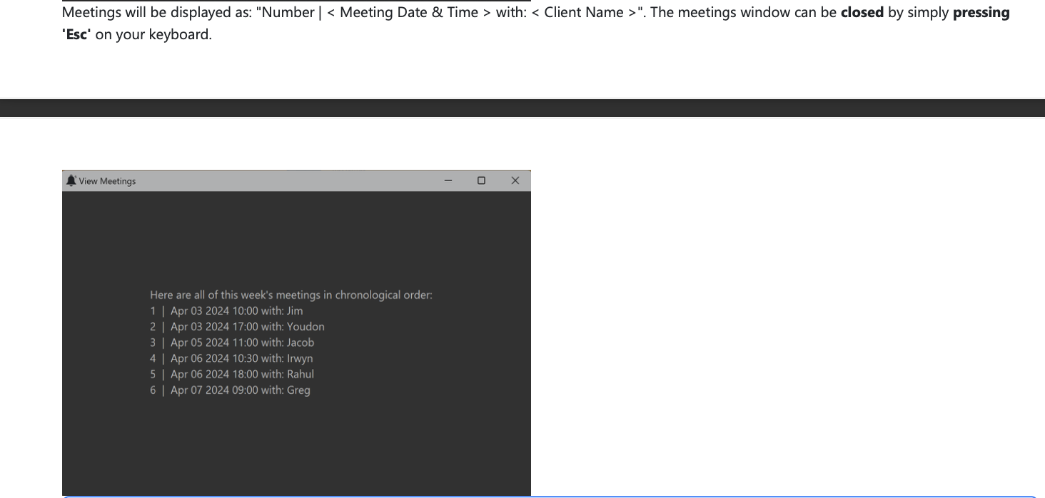
Since the image for how meetings are displayed is already provided, the explanation can be shortened from "Meetings will be displayed as: "Number | < Meeting Date & Time > with: < Client Name >".", to "Meetings will be displayed as shown below". This will remove redundant information and make the explanation clearer for the readers.

soc-se-bot commented 6 months ago

Team's Response

We included this additional detail to clarify doubts and be clear in the UG. This should not be faulted, since this does not affect readability of our UG (and is in fact adding details, which isn't a problem).

Items for the Tester to Verify

:question: Issue response

Team chose [response.Rejected]

Reason for disagreement: While the intention to make things for readers is applaudable, the additional detail is in fact redundant and reduces the readability of your UG. It is redundant as the image below already clearly shows and explains how the meetings are displayed. From the image, the readers can clearly see that a 'Number', '|', 'Meeting date and time', 'with:', followed by 'Client Name' is displayed. Furthermore the formatting in the explanation itself is inconsistent as 'Number' should be enclosed in '<>' similar to 'Meeting Date & Time' and 'Client Name'. 'Number' itself also does not explain that the numbers displayed are in fact the indexes of the clients in the client list. Hence, the additional explanation is redundant and reduces the readability of the UG so this bug should not be rejected.