Team's Response
Issue is mentioned in the DG, under Period Testing.

Items for the Tester to Verify
:question: Issue response
Team chose [response.Rejected]
- [x] I disagree
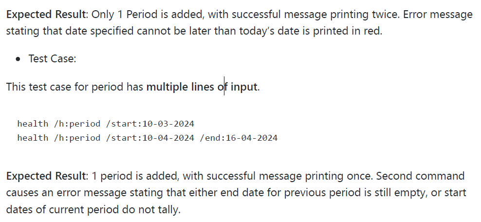
Reason for disagreement: The Developer's Guide (DG) contains a subtle explanation of a critical use case that is arguably misplaced. This example, due to its unique and necessary nature, should be prominently featured in the User's Guide (UG), where users typically seek comprehensive command usage instructions. The absence of this example in the UG hinders users' ability to fully grasp the application's capabilities, which is why I assert that this oversight in documentation structure is a bug that needs to be addressed.
Additionally, the application's use of red text to signify both errors and successful actions is problematic. This dual usage creates a visual ambiguity that can mislead users, particularly when dealing with date entries. An action that results in an error and an action that is successful but leads to an unhealthy state both produce red messages. This inconsistency in the user interface is not just a design flaw but a functional bug, as it directly impacts the user's understanding and interaction with the product. A clear demarcation in the use of color codes is essential for conveying accurate status information, and the current approach falls short of this requirement. Therefore, I maintain that these issues are bugs that compromise the usability and clarity of the application, and I strongly advocate for their resolution.
The UG states that "outstanding period entry must have an end date specified before a new entry can be added." But there is no examples of this unique situation. As such this caused unexpected behavior during testing.