berjine
commented
6 months ago
berjine
commented
6 months ago I nedded to do this on a heatmap so I am happy it is already a feature request !
My data has small negative points and big positive points, but I want to show the placement of the negative areas compared to the positive areas
At first I used a periodic colormap map like :flag or :tab20 which are great to show small variations in data with big dynamic range, but it can be complex to interpret
The easiest solution is probably to normalize the data to a symmetric interval or just apply a gain on the negative points, but this would have to be compensated somehow on the colorbar ticks
I ended up superposing two heatmaps each with the data of one sign and one half of the same colormap (code and example below)
It works good for me even though the split colorbar can look strange, it for sure would be cleaner with a unique skewed divergent colormap
It also works with InteractiveViz albeit with two minor problems :
- some NaNs seem to propagate in the pooling, making some datapoints disappear at the frontiers of the two heatmaps at low zoom
- the colorbars don't update dynamically (but the colorrange on the displayed heatmap does)
Code and image example
using GLMakie, NaNStatistics
data = rand(1000,1000).-0.01; #something with a big difference between the positive and negative ranges
data_pos = map(x-> x >= 0 ? x : NaN, data);
data_neg = map(x-> x < 0 ? x : NaN, data;
low, high = nanminimum(data_neg), nanmaximum(data_pos)
cmap = :seismic
cmap_high = to_colormap(cmap)[end>>1+1:end]
cmap_low = to_colormap(cmap)[1:end>>1]

f = Figure()
  ax1 = GLMakie.Axis(f[1:2, 1])
  heatmap!(ax1, data_pos, colormap = cmap_high)
  heatmap!(ax1, data_neg, colormap = cmap_low)
  Colorbar(f[1, 2], limits = (0,high), colormap = cmap_high)
  Colorbar(f[2, 2], limits = (low,0), colormap = cmap_low)
  f
Following up from a discussion of slack, I've spent some time thinking about how I can take a divergent colormap (e.g.
"RdBu") center it at zero, and let theloandhipoints vary independently.Currently, if you want to visualize data with a divergent colormap centered at zero, you must set a symmetric
colorrange=(vmin, vmax)wherevmin = -vmax. This can result in uneccessarily large colorbar ranges (e.g. if your data is in (-0.1, 100), the colorrange would have to be(-100, 100)).colorrange=(-0.1, 100), but then, forRdBu, the reds saturate at -0.1 while the blues saturate at 100, which is not a linear mapping of the data range onto the color space. (note: this is the suggested solution in #1601, but wouldn't work as expected, as explained).The best solution I found to this is the following:
This approach essentially "cuts" the original colormap
colsto match your actual data range in such a way that quantities with the same absolute value has the same color "strength" (given an input colormap intended to function as such).This approach preserves each discrete color in the original colormap
cols, and interpolates only the new endpoints.Obviously the code above assumes the desired center is zero, but extensions for arbitrary center values is trivial.
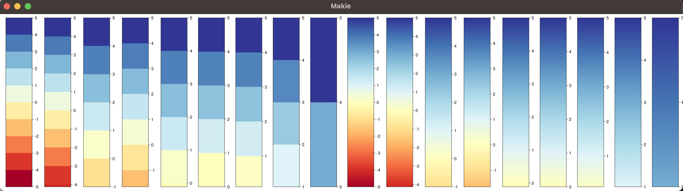
Some example outputs:
```julia cols = ColorSchemes.RdYlBu # RdYlBu is a vector of 11 perceptually uniform sequential colors for (lo, hi) in [(-5, 5), (-4.123, 5), (-1, 5), (-1.652462, 5), (-0.111,5), (0, 5), (0.111,5), (1,5), (3,5)] cmap = create_cmap(cols, lo, hi; categorical=true) cb = Colorbar(fig[1,end+1]; colormap = cmap, limits=(lo, hi), size=100, ticks=-5:5) end for (lo, hi) in [(-5, 5), (-4.123, 5), (-1, 5), (-1.652462, 5), (-0.111,5), (0, 5), (0.111,5), (1,5), (3,5)] cmap = create_cmap(cols, lo, hi; categorical=false) cb = Colorbar(fig[1,end+1]; colormap = cmap, limits=(lo, hi), size=100, ticks=-5:5) end ```