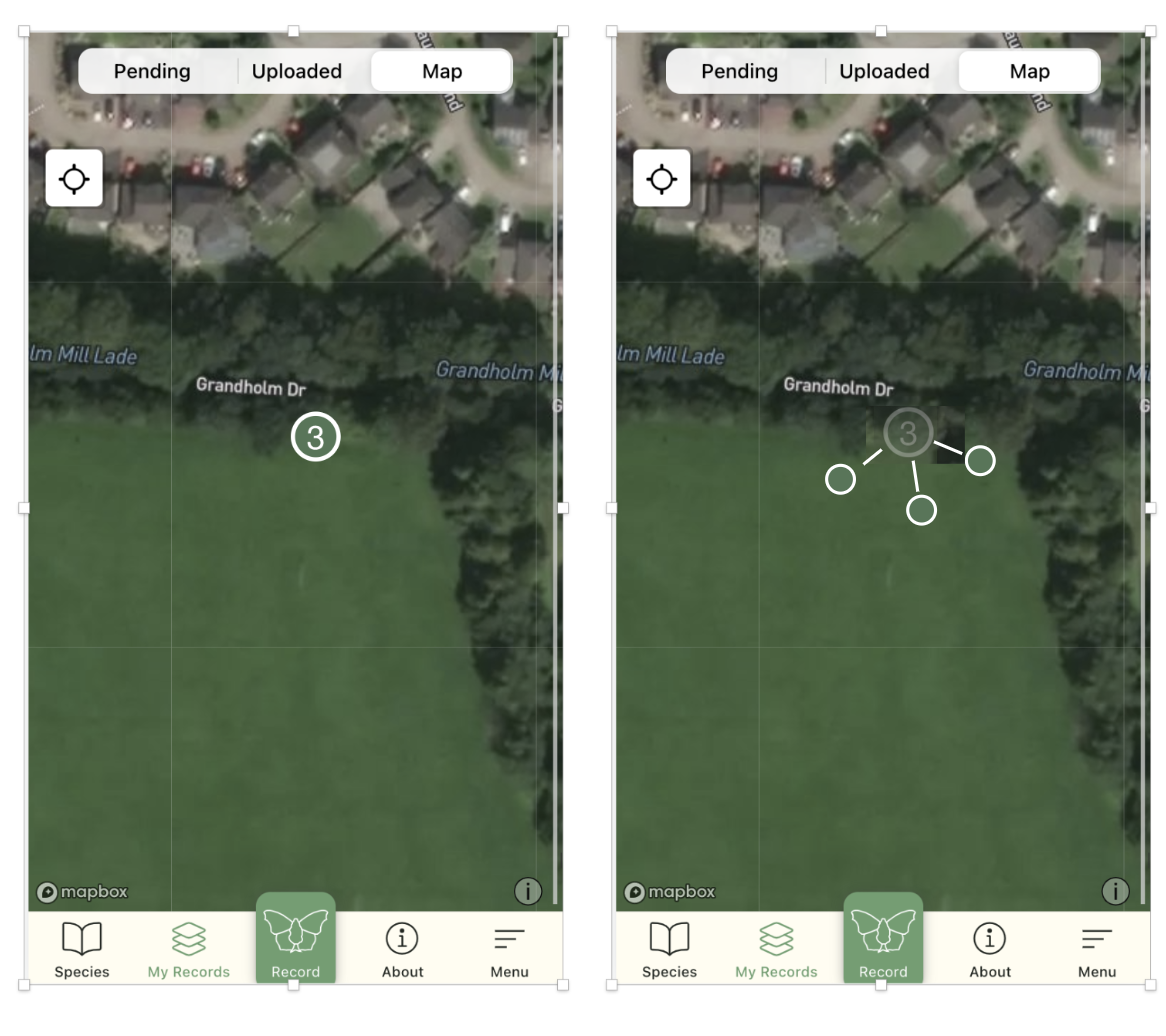
@RichardFoxBC Hi, we need to add marker clusters. Would something like that be okay?

Open RichardFoxBC opened 2 years ago
@RichardFoxBC Hi, we need to add marker clusters. Would something like that be okay?

Hi @Vilius-Stankaitis Yes that would be great! Just a marker with the number of species given (as in the left-hand example above) would be good. Many thanks
@RichardFoxBC The only issue with the left hand option is where a list has a mix of verification statuses?
True but then you'd have to click on it to see them. If there are 20 species on the list then there isn't any easy way of showing that info on the map, I'd suggest. especially if it is an area that the participant visits regularly and has many such lists all occupying very similar space on the map. One option would to be to have a different colour to indicate a mix??
Agreed. With the simplest option to go for the left hand map option but with a different colour.
The mockup above shows the cluster approach where the 3 overlapping occurrences are shown as a bubble with a number (left pic). Tapping that bubble would expand it to the 3 actual occurrences with own verification colours (right pic). Here is a playground to see how this would work.
This solution might not be ideal where there are many overlapping occurrences. We would have to expand it further making a bigger circle or do a spiral.


Alternative is to show a number but not to expand to actual occurrences, just show a 'next/previous' buttons for each occurrence view. The current ElasticSearch database output that serves this view doesn't allow the app to do that but maybe it could be modified.

You are also suggesting further grouping of occurrences into the matching lists. So instead of expanding into a circle of actual occurrences we could expand to lists. Since there would be fewer overlapping lists compared to actual occurrences this wouldn't require so much spiraling. This would be the combination of the cluster expand and also the previous/next arrows for a list.
Thanks for all this. I would favour keeping the map view simple. I'd be happy for a Species list (i.e. several species recorded at the same place/time) to be represented as a dot, just the same as an individual sighting but that when you tap on it, all the species records can be viewed as per Karolis' final example above. If all the records in such a list have the same verification status then the colour of the dot should represent that status - if there are a variety of different statuses within the list then we could give the dot a different colour - something very different to what we've used before such as purple? I think the expansion and spiraling of dots on the map will get very messy very quickly for people who have many records and isn't necessary.
OK, so I understand you don't want to group occurrences per survey/list and just to show previous/next buttons that navigate through all the overlapping occurrences from multiple lists, is that right?
Not sure that we are talking about exactly the same thing. I'm specifically referring to sightings submitted using the "Species list" function of the app. At the moment the map is only picking up from iRecord a single species from such lists and it should pick up all of them. The "Species list" submission can be shown on the map as a single dot (just the same as if it was a single species occurrence), but when you tap on it, it should open the text box showing the first species in the list with the option below to scroll to the second, third etc.
I'm not suggesting anything to do with grouping spatially overlapping occurrences from different dates.
Hope that makes sense
Thanks. Technically speaking, the map does show all the species (occurrences) from lists, but they overlap and are stacked one on top of the other at the moment. So you can only see one dot and tapping it opens whatever the species occurrence from the list is at the top of that stack. We can group the same list occurrences to one dot. This requires some work on the ElasticSearch database report.
If we group the same list occurrences there will still be an issue of the overlapping lists on the map (lists done on different dates at same location). We propose to show such overlapping lists as a cluster, tapping such cluster would expand it into multiple lists.
That all sounds good Karolis. Many thanks
Agreed. @kazlauskis can you create an issue for the requirement for a new ES report to support this way of viewing the list records via the map interface
Hi, not urgent, but just to let you know that I've found that in places where in the past I've submitted a species survey with a number of species recorded, the app map is only displaying one species.