 nus-se-bot
commented
2 months ago
nus-se-bot
commented
2 months ago Team's Response
Similiar issue. We would not consider this as a bug.
The 'Original' Bug
[The team marked this bug as a duplicate of the following bug]
Lack of visuals for Expenditure tracker section in the UG
Note from the teaching team: This bug was reported during the Part II (Evaluating Documents) stage of the PE. You may reject this bug if it is not related to the quality of documentation.
The expenditure tracker section in the UG can benefit from some visuals (eg. screenshots of use cases, example usage in the CLI interface).
Currently only format examples are given:
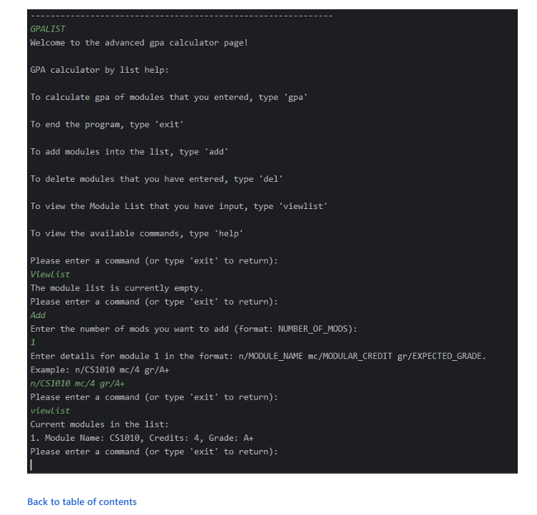
Usage examples, similar to the one given for the gpalist feature, would be useful:
[original: nus-cs2113-AY2324S2/pe-interim#1831] [original labels: severity.Medium type.DocumentationBug]
Their Response to the 'Original' Bug
[This is the team's response to the above 'original' bug]
The GPA feature functions differently as it follows a step-by-step approach. Hence requiring an example interface screenshot for better clarity. For the expenditure tracker, examples are indeed given in the UG. In addition, it works better since users are allowed to directly copy the example inputs.
Items for the Tester to Verify
:question: Issue duplicate status
Team chose to mark this issue as a duplicate of another issue (as explained in the Team's response above)
- [ ] I disagree
Reason for disagreement: [replace this with your explanation]
## :question: Issue response Team chose [`response.Rejected`] - [ ] I disagree **Reason for disagreement:** [replace this with your explanation]
Documentation Bug (Severity Medium)
There should be more visuals like expected output when a user enters as per the example given in the UG for more clarity.