 lazappi
commented
2 years ago
lazappi
commented
2 years ago Duplicate Bioconductor forum issue https://support.bioconductor.org/p/9143809/
Closed Fatima-Zare closed 2 years ago
lazappi
commented
2 years ago Duplicate Bioconductor forum issue https://support.bioconductor.org/p/9143809/
 azodichr
commented
2 years ago
azodichr
commented
2 years ago Hi @Fatima-Zare, Unfortunately I am having a difficult time understanding what you are trying to achieve in terms of "getting rid of the blue and red blocks". In Figure 3 that indicates genes that are simulated to be more highly or lowly expressed for the specific donor-cell-gene. For example, G4 looks to be simulated as a highly expressed gene in all celltypes, while G6 was simulated to have higher expression in celltype C. If you do not want these type of cell-type specific effects you can remove them from your simulation or you can reduce the DE effect sizes by adjusting the de parameters. I would also think the red boxes in Fig 4 are desired, you would expect gene A expression levels in cell-type X to be more correlated with gene A expression levels in cell-type Y than with gene B expression levels. Maybe I am missing something here?
The approach used to simulate data for individuals in the population is described in detail here and the details for how the values are simulated for each cell are described in detail here. Note that while multiplicative factors are being used to do things like simulate DE and eQTL, they are not the only difference between samples.
 Fatima-Zare
commented
2 years ago
Fatima-Zare
commented
2 years ago thank you for your reply. In figure 3, For some donors, gene 9 and gene 7 are both off in all cell types. How can I get rid of these big blue boxes? Is that normal that a gene expression level is zero for all Cell types? Is that related to DE effect or multiplicative factor?
azodichr
commented
2 years ago With single cell data zeros are quite common for lowly expressed genes (https://www.nature.com/articles/s41588-021-00873-4.pdf?proof=t) - and if some gene for some donor is sampled to have a mean exp at or close to zero then the cell group specific DE/eQTL effects will have no/little impact.
lazappi
commented
2 years ago Hi @Fatima-Zare were we able to answer your question? Please comment if anything is still unclear.
lazappi
commented
2 years ago I'm going to close this now but please reopen if you need extra information
Hi,
I'm using Splatter to generate single-cell simulated data.
I'm using these parameters:
Then you can see the heatmap of the normalized count matrix (SCcount) in figure 1.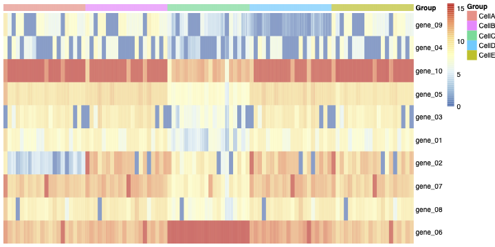
Then I aggregated the SCcount matrix across cluster-sample groups.
you can see the aggregated Sample-Celltype matrix in figure 2: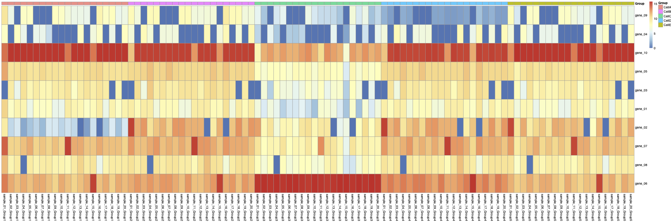
Then, from the aggregated Sample-Celltype matrix, I made another matrix to show gene expression levels in each CellType across all samples like:
you can see the heatmap of the cellg matrix in figure 3:
Then I calculate the correlation between rows of Matric cells.
you can see the heatmap of this correlation in figure 4.
Now I have some questions:
In figure 3, we can see an unknown structure (the blue blocks). It seems some genes are off in all of the cell types. This leads to a high correlation between rows of the matrix cellg (As you can see in figure 4).
1- How can I get rid of the blue and red blocks in figure 3 and also the red blocks in the Correlation matrix (figure4). 2- How are samples generated in the Splatter object? 3-Is it a multiplicative factor to create the samples? Is each sample just a multiplicative version of all the others?
I appreciate your help.