OxygenCobalt / Auxio

A simple, rational music player for android
GNU General Public License v3.0
1.78k stars 117 forks source link

Rounded corners broken on thin widget #730

Closed olivkauwu closed 2 months ago

olivkauwu commented 2 months ago

Description

I miss old widget design, earlier I could see track name and also it looked great, now I just can see album cover, no track info and also it doesn't look great with my theme. Please can you maybe add a option for alternative widget? Or maybe add track info on newer version, and monet on it looked really great. I see that there is more media buttons now, but me and maybe some users would prefer more old design. (I'm new to github, sorry it isn't place to ask this)

Photos of how it looked earlier
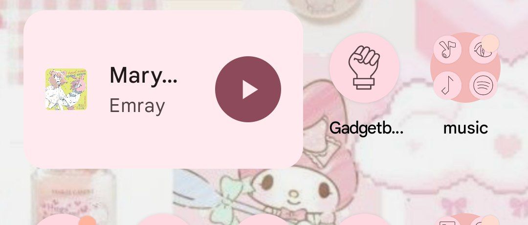
 IMG_20240227_150508_686

and now IMG_20240227_150524_294

Problem solved

No response

Other implementations

It was great in older Auxio version

Benefit

It will give more useful information on a widget

Duplicates

OxygenCobalt commented 2 months ago

I had to change the widget design to properly accommodate the new thin widget functionality. In general, the old design was solely designed for an edge case in landscape mode, and was only able to display track information by removing an excessive amount of controls. Generally I think music controls are more useful in general than having a bunch of song information, so the new design was control-oriented like other layouts.

I don't really see myself adding a way to switch back to the old widget. I am extremely hesitant to add new widget styles since it's extremely hard to maintain widgets that I won't regularly use. Having a single canonical design reduces the amount of bugs overall. New widget styles also act as precedent for even more widget styles, compounding the problem. I have gone back and forth on a text-based widget, but I can't meaningfully create a generalized design for that that will look good.

The only thing I am going to fix is the cover having sharp corners. That is not intended, and I imagine it's the result of your specific launcher not cropping the widget at all. I can go fix that and it should look a little better.

Mischievous-Loner commented 2 months ago

Widget doesn't load for me if forced 1:1 square album cover is enabled.

OxygenCobalt commented 2 months ago

Screenshot? @Mischievous-Loner

olivkauwu commented 2 months ago

I had to change the widget design to properly accommodate the new thin widget functionality. In general, the old design was solely designed for an edge case in landscape mode, and was only able to display track information by removing an excessive amount of controls. Generally I think music controls are more useful in general than having a bunch of song information, so the new design was control-oriented like other layouts.

I don't really see myself adding a way to switch back to the old widget. I am extremely hesitant to add new widget styles since it's extremely hard to maintain widgets that I won't regularly use. Having a single canonical design reduces the amount of bugs overall. New widget styles also act as precedent for even more widget styles, compounding the problem. I have gone back and forth on a text-based widget, but I can't meaningfully create a generalized design for that that will look good.

The only thing I am going to fix is the cover having sharp corners. That is not intended, and I imagine it's the result of your specific launcher not cropping the widget at all. I can go fix that and it should look a little better.

Maybe u can do similar design to Apple Music? Screenshot_20240228-224536

OxygenCobalt commented 2 months ago

That doesn't adhere to Material design 3 guidelines (Mostly in spacing), so either it would have to use an inconsistent spacing compared to everything else or would look squished into oblivion.

olivkauwu commented 2 months ago

That doesn't adhere to Material design 3 guidelines (Mostly in spacing), so either it would have to use an inconsistent spacing compared to everything else or would look squished into oblivion.

So, no? I think it will look great, and also it has all necessary buttons and track info

OxygenCobalt commented 2 months ago

Yes, it's not really an option. The issue is that apple uses a completely different design system that with extremely small layout spacing, which is not recommended under Material Design 3.

OxygenCobalt commented 2 months ago

The widget should be at least properly rounded in 3.4.2.