Open PallonCX opened 6 months ago

NOTE: No description provided, issue unclear on how this may affect reader understanding of DG or quality of documentation.
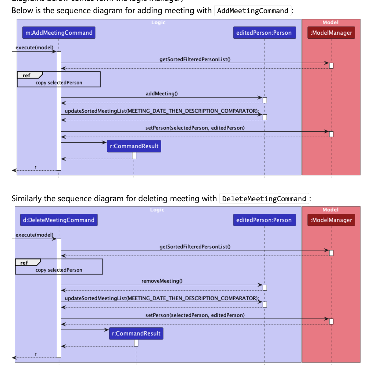
Assuming the issue is about these two diagrams in the DG being similar and certain aspects have been repeated: Thanks for raising this. The diagrams are similar but they have their own purposes to show the difference between the "add meeting" and "delete meeting", and we believe it is okay to be specific by adding the two diagrams for these two different commands, as developers reading the DG may want to know even the small differences in details.
Team chose [response.IssueUnclear]
Reason for disagreement: [replace this with your explanation]