 SmartFinn
commented
7 months ago
SmartFinn
commented
7 months ago I like the final Yaru variant, but the icon should be red instead of purple. A variant with just two buttons is also nice.
Closed morganist closed 7 months ago
SmartFinn
commented
7 months ago I like the final Yaru variant, but the icon should be red instead of purple. A variant with just two buttons is also nice.
 morganist
commented
7 months ago
morganist
commented
7 months ago @SmartFinn I honestly like everything they did more than the original icon. However, I do see where the designer was going. After all, the app acts both as a recorder and player, hence the buttons. But it just doesn't resemble anything from the real world... I had an idea of making it more like an old cassette recorder, with a row of buttons. Like this one:
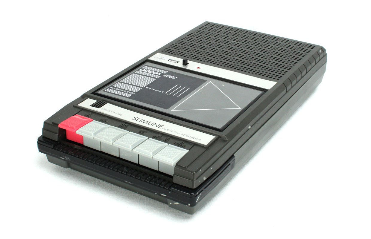
morganist
commented
7 months ago Literally a tape recorder.
SmartFinn
commented
7 months ago @morganist looks interesting, but it will be hard to adapt to small size icons, and I'm not a big fan of skeuomorphism.
morganist
commented
7 months ago just two big buttons, but still a recorder
morganist
commented
7 months ago @SmartFinn
@morganist looks interesting, but it will be hard to adapt to small size icons, and I'm not a big fan of skeuomorphism.
Thanks! I absolutely agree, but it was fun to try something like that. I also feel that it lacks colour.
morganist
commented
7 months ago @SmartFinn Can i ask how you feel about the one with just two buttons? I think it strikes the balance between skeuomorphism and simplicity and also it can be adapted easily to small sizes. I can also try to make it like a square.
morganist
commented
7 months ago just two buttons
SmartFinn
commented
7 months ago @morganist I prefer when an app icon closes to upstream icon as much as possible. In case, when an upstream icon too hard to adapt, we're trying to make the simplest version with upstream colors.
just two buttons
So this variant is good enough.


org.gnome.SoundRecorderSo, I've recently started using this neat little app and I quite dislike the Papirus icon for it:
I cannot really tell what's wrong with it, I just feel it does not match other Papirus icons that well. Maybe it is the waveform that I dislike the most. In my opinion, this different appearance of two buttons, one pressed and the other not, doesn't really work in Papirus style. The buttons look fine on a very 3d-ish original icon, but I think I dislike the waveform on it even more:
Overall, I think this is one of the worst cases of GNOME icon being slightly tweaked so it fits the Papirus style. But the problem is, the original icon doesn't appeal to me ether.
I really dig what guys at Ubuntu did with this icon (issue). They had a discussion and mockups and stuff. the icon turned out quite good. I just wanted to see if anybody would disagree with me here. I'd like to design a replacement myself.