Princeton-CDH / startwords

a research periodical irregularly published by the CDH.
https://startwords.cdh.princeton.edu
3 stars 3 forks source link

Design a visual language for highlighting text so that visual assets in SW4 feature can be encoded with a consistent and accessible way to identify or mark specific parts of text #319

Closed rlskoeser closed 11 months ago

rlskoeser commented 1 year ago

This issue tracks design work through the CDH design review workflow.

Here is a link to the

Description:

Related draft figures from Nick:

How the proposal/idea can fail:

Questions:

  1. You've already done design work for figure 6 in #315 ; and used text color changes instead of highlighting to de-emphasize the irrelevant portions; Grant and I like that and think it works better. Perhaps this can be adapted for the other visuals as well.
  2. How can we make information conveyed by visual highlighting accessible for screen readers?

Additional context

thatbudakguy commented 1 year ago

here's the original graphic from Jeff's article, which uses the same poem in our figure 4:

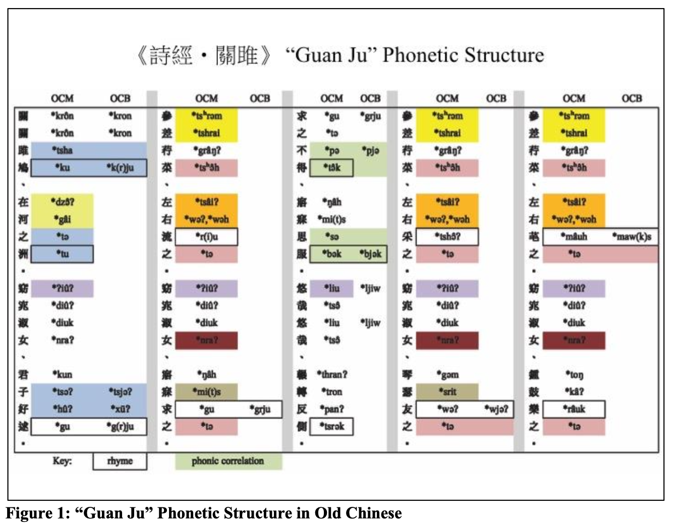
there are a few things going on which we want to do differently.

  1. Jeff uses color to indicate "phonetic correlation", but his idea of this is much less strict than what we are trying to show in our figure 4 (for example, he uses the same blue color for *tsha, *tә, and *tu, which are not rhymes).
  2. Jeff's example has columns "OCM" and "OCB". these are just two different reconstructions/ideas about what Old Chinese sounded like. we are interested in change over time, so we instead have old, middle, and modern chinese.

i like the idea to use colored backgrounds in general, but if we do it, what I'd like to do is to have the color correspond to the vowel sound only. then it's easy to see the u/uw and ə/ək parallels.

gissoo commented 11 months ago

@rlskoeser @gwijthoff below are details of what I have done for figure 3:

Note: my idea is you would press "play" and then it would take you through the instances, automatically displaying each instance for 3 seconds (this can be changed), users can also pause on one instance to read it and then play to proceed. We could also turn this into a "slide show" instead where each instance is paginated and you just press "<" or ">" to go through each, I also like that idea. Either of these are better than trying to show all instances in one view.

rlskoeser commented 11 months ago

@gissoo I like v1 the best. I agree that the numbers aren't adding that much, I think the annotation is sufficient to indicate the parallels. I prefer the light background so we can have colors as well as patterns.

On mobile we might need a little more separation or delineation between different sets of content.

I'm not sure the interactive version is worth the additional effort; even if we go that route, we would need a static version like v1 with all the annotations visible so we can include it in the PDF. If we make it playable, I would want to animate the static version with all annotations, and I think it's better if the content doesn't shift, so I would keep the citations/sources visible.

rlskoeser commented 11 months ago

My concern with the interactive version is not just the additional development effort - I'm not sure how to make it accessible. For making the static annotations accessible, I think we can add screen-reader only labels to parallel the visual markers.

gwijthoff commented 11 months ago

Static version v1 all the way! Agreed that more padding between each set of content would help.

I'd like to not display the citation/source when reading the instances, what do you think?

@gissoo do you mean, for example, 尚書《毋逸》"Do not Indulge", from the Book of Documents beneath the first text/translation pair? If so, I think those sources are important to include beneath the text so the reader knows where it's taken from.

thatbudakguy commented 11 months ago

I like v1 too.

We definitely need to display the sources for each of the excerpts — part of the reason is that we want to emphasize that these are all coming from totally different texts, which is what makes the parallelism so interesting. Also, since we didn't create this example (it comes from another scholar, Schaberg, who we cite) it wouldn't be very polite to remove the context from the example he originally found.

gissoo commented 11 months ago

@rlskoeser @gwijthoff @thatbudakguy thank you for your feedback – just to clarify regarding the display of sources I only meant it for the animated/interactive version because in that proposal I included all text in the default view (just not when the instances are being shown).

Here are the revised versions:

I understand it may not be worth doing the interactive version, it's just a better visual story telling than the static version for use within the article. I thought it would be easy to make it accessible.

gwijthoff commented 11 months ago

@gissoo so strange about those optical illusions -- I see them too! In that case, I think the slightly tighter spacing in v1.2 makes the difference seem less apparent.

rlskoeser commented 11 months ago

I'm happy with whichever spacing you all prefer.

@thatbudakguy what do you think about an interactive option that plays through the sets of parallel passages, as an enhancement to the static version? How valuable do you think it would be, are you interested in it?

rlskoeser commented 11 months ago

@gissoo I think we're in agreement on this one too. Please create an implementation issue for me, make it clear in Figma which version I should refer to, and export/upload any assets that are needed for implementation. You can close this issue when that's done. (Unless there is work to be done for other issues that we were tracking on this! Do you still need to design for figure 4?)

Assume static implementation for now, since we need to implement that as a baseline in any case.

rlskoeser commented 11 months ago

@gissoo when I was looking back at this issue I saw we had multiple figures included, and seeing Nick's screenshot of that colored table reminded me - I don't think you've done anything for figure 4 yet. Can we adapt the underline styles you're using for other annotations to use in this table layout? Based on Nick's notes we need only two styles (exact rhyme and slant rhyme).

gissoo commented 11 months ago

@rlskoeser @gwijthoff thank you for your feedback! I have chosen the tighter mobile version. I'll go ahead and make an implementation issue for fig 3 and I'll include the interactive version on the page as well just in case for once you hear from Nick about it.

I'll leave this issue open since I am still working on fig 4, will share that soon too.

gissoo commented 11 months ago

@rlskoeser @gwijthoff @thatbudakguy Below are details on what I have done for figure 4. I've increased the estimate for this issue as I'm having some difficulties with fig4.

gissoo commented 11 months ago

Note, semi-related to fig 4: I asked Nick about the meaning of the asterisks here, and he mentions that it's used to indicate when something is a guess and continues to say "...Because the sound system for Old Chinese is a very complicated “reconstruction”, basically everything is a guess of some kind, so phonologists always put the asterisk in front. I think it helps differentiate it from e.g. middle chinese (which scholars are more confident about) or mandarin (where we know the sounds for sure because people currently speak it). this answer seems to go into some more detail on it: https://linguistics.stackexchange.com/a/340"

– Could we indicate this anywhere on the article so readers who may not be familiar with the above could still understand? Or would a legend on the viz make sense?

gwijthoff commented 11 months ago

@gissoo thanks for including your correspondence with @thatbudakguy here. I can try to distill the above into a caption for fig. 4 so that readers understand the brac[k]ets and single / double underline system.

@thatbudakguy I see you started implementing this figure over in #356 -- are you working with @gissoo's latest designs from Friday, above?

thatbudakguy commented 11 months ago

@gissoo sorry I didn't catch your questions earlier!

Note: I asked Nick about his mention of the grey borders that indicate near-rhymes on the visual on the glitch page. He said he has removed them as deciding what is a half rhyme may be tricky. So I have used two underline styles here, one for the classic end-rhymes and one for the lost ones in the middle Chinese in the 3rd stanza. Let me know if this doesn't seem right or if I'm missing other elements that need to be visually indicated.

I think maybe the caption that says "note the lost rhymes in the 3rd stanza" is confusing you here — basically it's just pointing out that the third stanza has rhymes in Old Chinese, but no rhymes in Middle Chinese and no rhymes in Modern Chinese. Similarly, the first stanza has rhymes in both Old Chinese and Middle Chinese, but not Modern Chinese. The rhymes aren't different kinds — they are all rhymes. The caption is just drawing your attention to when the rhyme went away (historically speaking). There shouldn't be any underlines at all for the Middle Chinese reading of the 3rd stanza. Let me know if this doesn't make sense!

I'd also like to know if anything here can be faded out, like any parts of the poem? Or the modern Chinese in any of the stanzas. Is it ok if we only focus on what is being underlined and fade the rest?

I think fading the non-rhyming transcriptions could definitely work here — as long as the user can somewhat read them (just enough to see that they are different, if they wanted to). That way there are sort of three levels of text:

gissoo commented 11 months ago

@thatbudakguy thank you for your response. I understood the point on "when the rhyming disappeared", but was under the impression that this piece of information matters which is why I chose a different kind of underline style for it. If we don't really want to draw attention to it then we can fade it. Note: if you do expect the reader to read these even a bit then we should not fade them. I'll go ahead and propose a revision based on your comment above.

gissoo commented 11 months ago

@thatbudakguy also let me know which version you would prefer on desktop, the side-by-side or the stacked. The side-by-side is a lot easier to read IMO.

thatbudakguy commented 11 months ago

the side-by-side was kind of confusing for me, because i started to read the poem the way it would be read in Chinese (vertically). i think it's too easy to accidentally read the poem wrong, like this:

Screenshot 2023-09-19 at 15 35 13

the correct way would be this, which I think is a bit awkward:

Screenshot 2023-09-19 at 15 36 37

i also think that having the translation be squeezed into a small space next to the poem is a little strange; it results in a lot of line breaks in the english.

gissoo commented 11 months ago

@thatbudakguy oh I was hoping it would make it smoother, good to know it might still be read wrong. I thought having the translations with the stanza# would make it clearer that it should be read left-right-top-bottom, but if it's not clear then let's leave it.

@thatbudakguy @rlskoeser @gwijthoff Here are the revised versions based on Nick's input. Please zoom out to see all desktop and mobile.

Note: I made the parts that don't rhyme anymore 60% opaque so they are still hopefully readable and the rest are 30% opaque.

rlskoeser commented 11 months ago

This looks better to me. I had been puzzling over how to implement the other one logically in the html in a way that would still allow the tables to flow differently on desktop and mobile, so I think this design is better. I'm still not sure about the mobile layout that seems to break the table and repeating the table headers - semantically and for screen readers, it seems like it should be a single table, but I can look into options for this.

rlskoeser commented 11 months ago

I think this work has been completed, closing.