 designsats
commented
6 years ago
designsats
commented
6 years ago I see you are accepting BTC donations. Are you familiar with Steem and its ecosystem? All this work community has done was funded with Steem.
Open designsats opened 6 years ago
designsats
commented
6 years ago I see you are accepting BTC donations. Are you familiar with Steem and its ecosystem? All this work community has done was funded with Steem.
 ajs124
commented
6 years ago
ajs124
commented
6 years ago Why? What's wrong with the current logo?
 philipwhiuk
commented
6 years ago
philipwhiuk
commented
6 years ago My experience of Android apps (and actually there's parallels to country flag choice) is that users are extremely sensitive to icon changes. In practice it's the sort of thing you probably have to survey / poll for if you plan to change it. (There are problems with that of course like choice overload from lots and lots of designs).
 QuantumBadger
commented
6 years ago
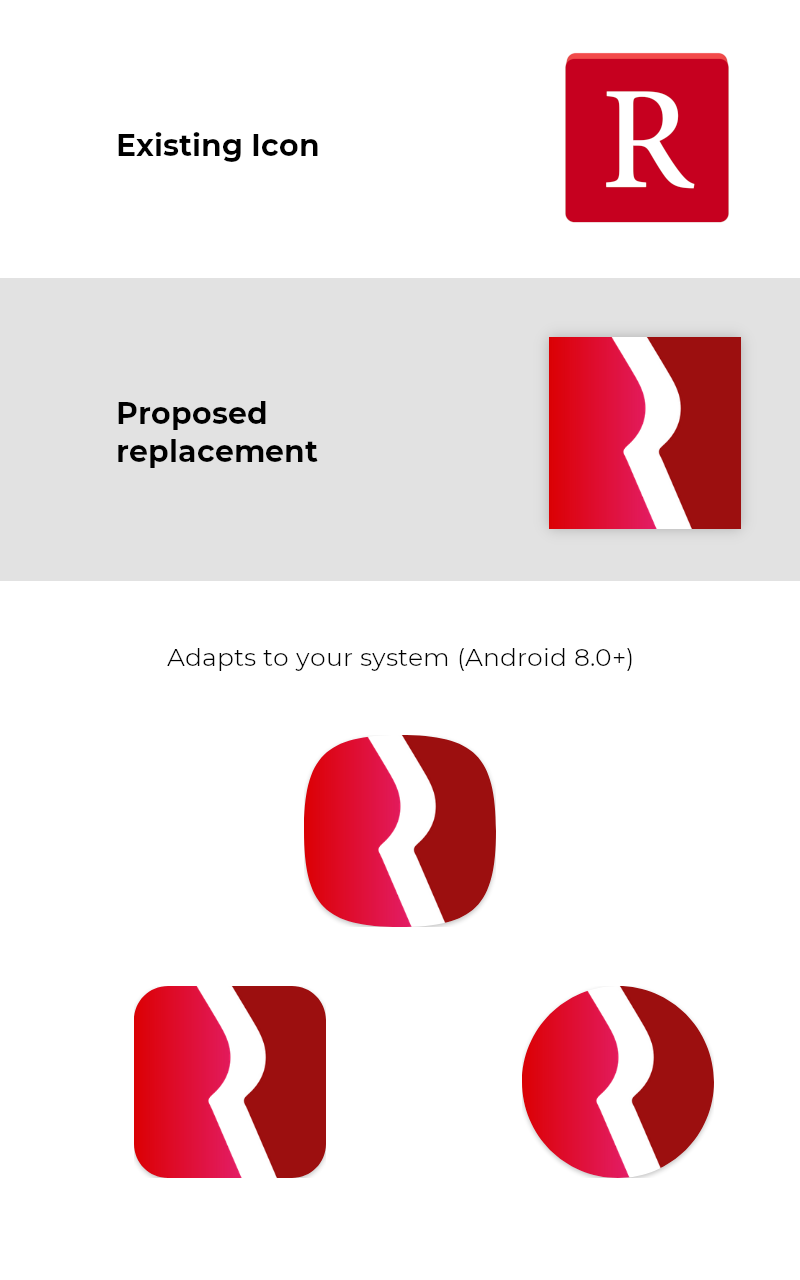
QuantumBadger
commented
6 years ago Thanks @andrejcibik. The app's current icon is a bit bland (the letter "R" in a red square), and I'm open to the idea of a redesign.
In particular I think the following could be a good choice:
https://steemit.com/utopian-io/@marty-arts/a-new-logo-for-redreader
At some point I'll go through all the submissions on the site.
I agree with @philipwhiuk that some kind of poll would be a good idea. And if we go ahead, I think we'll want to get explicit written permission from the creator for copyright reasons.
designsats
commented
6 years ago IF Instagram was brave enough with their drastic change :D Users hate any changes, but they get used to it after a while and new users just get the benefits.
Im sure most if not all users would gladly give you all premissions if asked :)
The logo you liked is now licensed under Creative commons.
QuantumBadger
commented
6 years ago I've now (finally :)) been through all the icons on Utopian.io, and my preference is still the one linked above.
As @andrejcibik says above, the logo is Creative Commons licensed, but specifically CC-BY, which requires attribution.
I'm very much in favour of providing credit to the author, but CC-BY seems a bit burdensome for a logo. Depending on how strictly the license is interpreted, it might be necessary to provide attribution (including a URL link to the author's page, and a link to the license) every time the logo is used anywhere (even for example in a screenshot of an app list, although hopefully this would be considered incidental fair use in most copyright jurisdictions).
Before going ahead, I'll need to confirm with the author that CC-BY version 4.0 applies, and that the following attribution is sufficient:
and that all other uses of the icon (e.g. in marketing, web pages, screenshots, etc) don't need their own individual attribution.
I might also spend some time tweaking the colours/etc, although it looks rather good already :)
designsats
commented
6 years ago I belive one entry somewhere in list of contributors is good enough.
 marionauta
commented
6 years ago
marionauta
commented
6 years ago Since there is a talk about redesigning the icon, it would be nice to also add support for android's new adaptive icons
https://developer.android.com/guide/practices/ui_guidelines/icon_design_adaptive
QuantumBadger
commented
6 years ago I've had the following response from the author:
Hello @quantumbadger, Im really glad you like my logo and of course, you are free to use it in any place you want. It is enough to mention me on those two places :)
So looks like we can go ahead :)
Since there is a talk about redesigning the icon, it would be nice to also add support for android's new adaptive icons
Thanks for letting me know about this. Making the linked icon adaptive will require some thought though, and I'm not sure how well the design would work with e.g. a circular mask.
Looks like the following site could be useful for testing:
QuantumBadger
commented
6 years ago Right, I've made an adaptive icon based on marty-arts original design:
https://redreader.org/adaptive_icon_proposal_1.png
You can play around with the adaptive-ness here (including changing the mask, and testing animations):
Everyone let me know your thoughts, and if the feedback's mostly positive then I'll make a post about this on the subreddit next week :)
In particular, please let me know which shape you think should be the default (square, circle, squircle, square-with-rounded-corners).
 lol768
commented
6 years ago
lol768
commented
6 years ago I like square-with-rounded-corners, FWIW
 DanGLES3
commented
6 years ago
DanGLES3
commented
6 years ago squircle
QuantumBadger
commented
6 years ago I've now pushed an initial version of this, along with a new attributions page in the settings -- feel free to test in the latest alpha!
I've gone with the squircle for now (on legacy devices).
 rileyinman
commented
5 years ago
rileyinman
commented
5 years ago @QuantumBadger is there a reason this was reverted? As far as I can tell the alpha only used this icon for a few versions, then went back to the original icon and eventually a white version of the normal one. Having a nicer, adaptive icon would be great and I'm confused as to why it was removed.
QuantumBadger
commented
5 years ago @rileyinman I had to make some visual modifications to the icon to make it adaptive, and people on reddit commented that it wasn't as good as the original artist's version. I reverted the change until I had a chance to improve it, but unfortunately I've recently been far too busy to devote time to cosmetic changes like this.
rileyinman
commented
5 years ago @QuantumBadger would you be interested in a PR adding an adaptive version of the current icon? I'm no graphic designer, but that would at least fix the issue of the icon being boxed on launchers that use the adaptive style by default.
QuantumBadger
commented
5 years ago @rileyinman Thanks -- just to check, are you referring to the "letter R in a red box" icon that the app currently has? I'd consider a PR for either, obviously subject to it looking good enough visually :)
rileyinman
commented
5 years ago @QuantumBadger Yep! Here's an example of a hacked together version I made with Adapticons (I couldn't get to a computer to make the actual icon changes). It would just be a layered square icon and any masking would be handled by the system.


rileyinman
commented
5 years ago I'd also be okay with trying to create a new design, but this is a good start at least in my opinion :)
Hi, Im a moderator on Utopian.io platform and users choose to create dozens of new logo design for your open-source project. For free. Its open source :)
Some good examples: https://steemit.com/utopian-io/@gifmaker/new-logo-and-app-icon-redreader https://steemit.com/utopian-io/@thillustrator/my-new-logo-proposal-for-redreader https://steemit.com/utopian-io/@baranpirincal/new-logo-design-for-redreader-app https://steemit.com/utopian-io/@revilationer/my-logo-for-redreader https://steemit.com/utopian-io/@marty-arts/a-new-logo-for-redreader
You can use any of them right away ifyou want, or register on Utopian.io and request more design, translation or development work ;)