 ninavizz
commented
4 years ago
ninavizz
commented
4 years ago Icon art for w/in the app menu that @marmarta had previously commented on liking. Pls to post screencaps of what these look like when in code, and I can make adjustments accordingly—unless further tweeks are sought. :)
 andrewdavidwong
 mfp20
mfp20 0spinboson
 92VV3M42d3v8
 brendanhoar
 marmarta
 marmarek
 ghost
ghost unman
unman
 imme-emosol
 deeplow
 100111001
 DemiMarie
 GWeck
GWeck
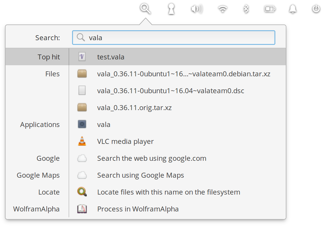
Problem
The app menu today is overwhelming. It needs a lot of work, and once a design is validated in user testing a custom solution apart from what is possible with XFCE will likely need to be created. Many issues have been filed addressing usability issues around the App menu, and this issue was created to track the design exercise and delivery of assets for creating what is decided upon.
2021 EDIT: A Design Brief to guide this project towards completion, was created as both a public GDoc and an Etherpad.
Solution
2021 EDIT: A modest grant was awarded to the Qubes OS project, to fund:
As such, the #6665 issue has been created to track the first "bare-bones" development of a Qubes custom app menu (nicknamed "Valentina"), that resulted from the funded preliminary design and research. The issue for Valentina is being pointed to as a 'parent' issue to multiple descendant child issues. Descendant child issues, exist to track features that users responded to favorably in preliminary user research—and that we hope to receive community support to implement.
For this issue's initial filing, the below was attached as a proof-of-concept mockup.
Related Issues
5386, #5676, #5520