Real-Dev-Squad / website-status

Shows a roadmap of the ongoing projects being done
https://status.realdevsquad.com/
MIT License
21 stars 145 forks source link

[RFC] Design- for showing the Progress Update details #855

Closed fakhruddinkw closed 8 months ago

fakhruddinkw commented 8 months ago

We are planning to take daily updates from the developer about the progress they have made so far on their task. Currently this is behind dev flag.

It looks something like this: status

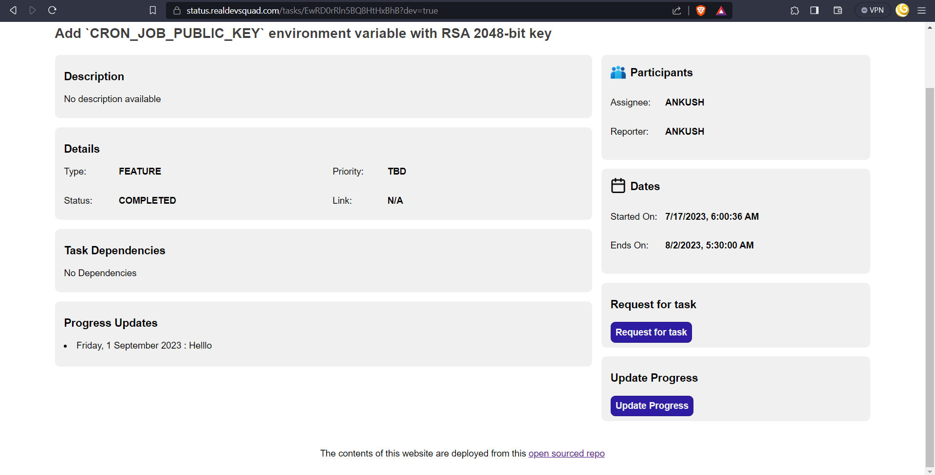
Currently when we click on any of the updates, nothing is shown.

There are two ways we can achieve this:

  1. We can either have a modal, like we have for extension request on my site: my-site-modal

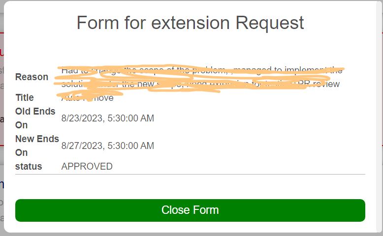
  2. Or we can have a collapsible list, like we have for members site: members-site-collapsible

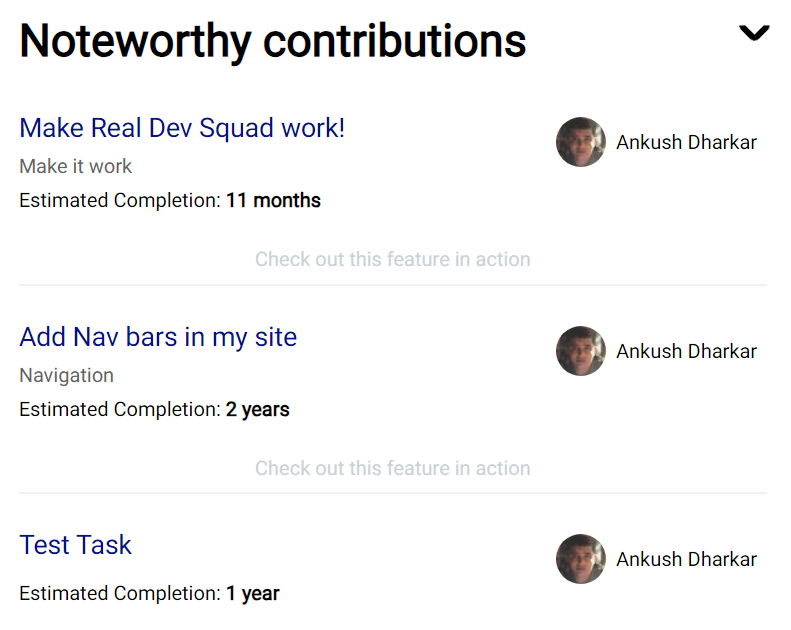
Here is the rough wireframe of proposed solution:

wireframe

I would like Developers to comment on which would be a better option in this case, Thank you!

Pratiyushkumar commented 8 months ago

According to me, the first option would be better because as per the design of the task detail page accordion style would not fit. As an end user, I would like to see lists of updates, not the accordion-style lists where I will have to do 1 or 2 extra clicks. Generally, accordions are used for FAQ pages. and if we include the accordion then we will have to show task updates lists in the same which may be possible that a user scroll event occurs.

Ajeyakrishna-k commented 8 months ago

Even I would prefer a modal view. Can we also have keyboard controls where we can open different modals using up/down arrow keys? something similar to how we can preview files using space+arrow keys in macOS.

fakhruddinkw commented 8 months ago

Even I would prefer a modal view. Can we also have keyboard controls where we can open different modals using up/down arrow keys? something similar to how we can preview files using space+arrow keys in macOS.

Can you please elaborate? Are you talking about having keyboard controls?

bharati-21 commented 8 months ago

Prefer a modal as well. But we will also have to consider having a seamless experience on phones. We need to consider how we are rendering text (importantly quantity. We don't want to show jam packed text). Also are we going to always let the user select and filter based on the date and the kind of update (blocker, completed, and planned)? If yes, then preferably rendering the update and showing the filter should be done within the same modal screen. This would be an easier experience.

fakhruddinkw commented 8 months ago

Also are we going to always let the user select and filter based on the date and the kind of update (blocker, completed, and planned)? If yes, then preferably rendering the update and showing the filter should be done within the same modal screen. This would be an easier experience.

Currently there is no filter as such.. we show all the updates the user has given in desc order of date. Also, we show completed, blocked and planned as a kind of a single form. We do not filter based on them.