Team's Response
Reason for why the severity been downgraded to Very Low:
- Under the TP obligation, JABPro is a CLI-based app. Therefore, most operations are done fast by typing and the clicking functionality is by that definition, meant to be limited.
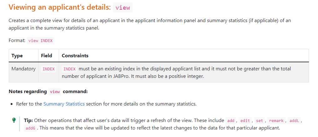
- There was no promise in the UG or any mention that clicking on the UI, especially the list of cards will change the view. Instead, the commands that change view panels are
viewand all the comamnds mentioned in this tip box shown below.
I agree that the app can be made better in terms of UI in this aspect where we allow clicking. However, the functionality of viewing is possible with the commands and no such promises was made. I understand that the person list card might light up when pressed also which may be misleading.
Thus, I accept this as a Very Low feature flaw (As there is a cosmetic issue) , but it is by the above argument not a feature flaw warranting Low

Items for the Tester to Verify
:question: Issue severity
Team chose [severity.VeryLow]
Originally [severity.Low]
- [x] I disagree
Reason for disagreement: I do not agree with the downgrading of the severity because Very Low is purely for cosmetic and very minor issues (like typos) that do not affect the user's usage for the rest of the app. I do believe it is a low-level feature flaw (ie incomplete behavior exhibited) mainly because the users expect some behavior that is not fulfilled and inconveniences them.
The behavior in this case is that the button (Charlotte Oliveiro) on the panel lights up, and the user will most likely expect to view Charlotte's details when the button lights up. However, granted that there is another View function to do so, I did not give it a Medium severity as this feature flaw falls closer to the Low rather than the Medium spectrum. As justified earlier, users should be made aware of this behavior (which goes against their expectations) through Known Issues (in UG) and included in Planned Enhancements (in DG).
In addition, there is a panel on the right that displays the user's information. If the panel displays the person's information of John Doe, and the button lights up for Charlotte Oliveiro, there is a mismatch between what information the user wishes to see, and what is actually being displayed. In this case, users will expect to see Charlotte's information. Since it is established that the button lighting up can be misleading, it can impede functionality, especially for a first-time user who is not accustomed to the application yet. It causes the first-time user to assume they can navigate using the buttons through the UI which is not the case here.
If the concern is not displaying the relevant information in the panel, then users should be made aware of this discrepancy through the User Guide to prevent misconceptions regarding the app's functionality. The bug is thus of low severity I feel as it does pose inconvenience to the user. I feel very low bugs (e.g. typos) do not have an impact on user experience. However, that's not the case here.
Hence, I do not agree with downgrading to Very Low (which are usually cosmetic issues incurred in oversight and are very minor (almost can be ignored)) In this case, examples of bugs of very low severity for UI would be like uneven window sizes. However, the mismatch between the button and the panel is not cosmetic and it does inconvenience the user slightly, and thus should be of low severity.
UI does not allow the navigation across the different persons, as seen from the screenshot here, even though I wish to see the details of Charlotte Oliveiro, it does not change the screen on the panel on the right, which is frozen on the details of John Doe.
This is a feature flaw because user would expect the UI to display the details of the person clicked, however, here, the UI is frozen on the most recent command which is adding a patient called John Doe
I would give this a Medium severity as this is an incomplete behaviour by the UI which is not included in the Planned Enhancements section in the DG or the Known Issues section in the UG and users should be made aware of the limitations, however because it does not hinder functionality of the rest of the app, giving it a low severity