 nus-se-bot
commented
8 months ago
nus-se-bot
commented
8 months ago Team's Response
While hyperlinks have been strategically incorporated into the User Guide to facilitate navigation, we understand that the abundance of links within closely connected sections may present challenges. It's important to note that the intention behind this design is to offer users flexibility and choice in their exploration of the content.
Each hyperlink within a small section is positioned to provide users with the option to delve deeper into related topics or skip to specific sections based on their individual requirements. We recognise that a more linear reading experience may be preferable for some users, and we encourage them to navigate at their own pace.
Moreover, external webpage links are included to offer supplementary resources and additional context, enriching the user experience. We acknowledge that this introduces an extra layer of complexity, and we want to emphasize that clicking on these hyperlinks is entirely at the user's discretion. They are there to provide additional information when needed, ensuring that users have the freedom to choose the level of detail they wish to explore.
It is because of the above reasons that our team here feels that this is not a bug and hence it would be rejected.
Items for the Tester to Verify
:question: Issue response
Team chose [response.Rejected]
- [x] I disagree
Reason for disagreement: > It's important to note that the intention behind this design is to offer users flexibility and choice in their exploration of the content.
Each hyperlink within a small section is positioned to provide users with the option to delve deeper into related topics or skip to specific sections based on their individual requirements.
We want to emphasize that clicking on these hyperlinks is entirely at the user's discretion. They are there to provide additional information when needed, ensuring that users have the freedom to choose.
Taking their considerations into account, the issue still stands that sections are tightly coupled together. There is limited "flexibility and choice" and we cannot "skip to specific sections" as some sections require many more sections to be read, which recursively require more sections to be read first.
To give my example from the perspective of a SoC freshman who has little knowledge on technical information:
As a user who wishes to complete the tutorial.
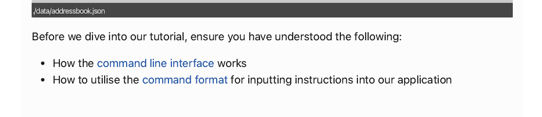
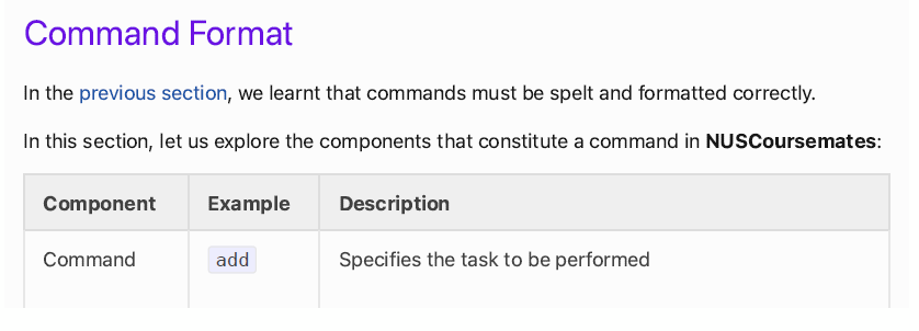
I click on Command Format to find out more details. But Command Format requires me to read the previous section.
The previous section also contained multiple hyperlinks that jump all the way up to the UI section, or all the way down to the glossary section, meaning I had to scroll back every time I encountered something I was unfamiliar with.
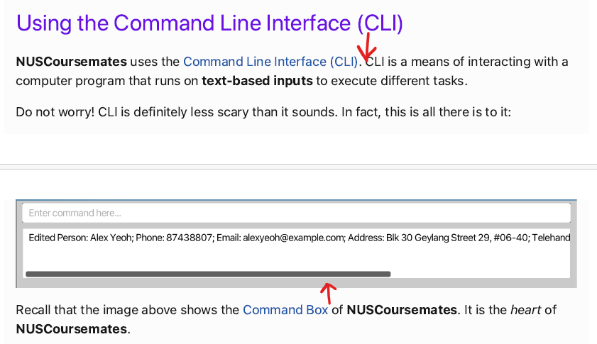
Now that I've read the previous section, I continue and find out that within Command Format there are multiple hyperlinks that jump to the glossary at the very bottom of the UG.
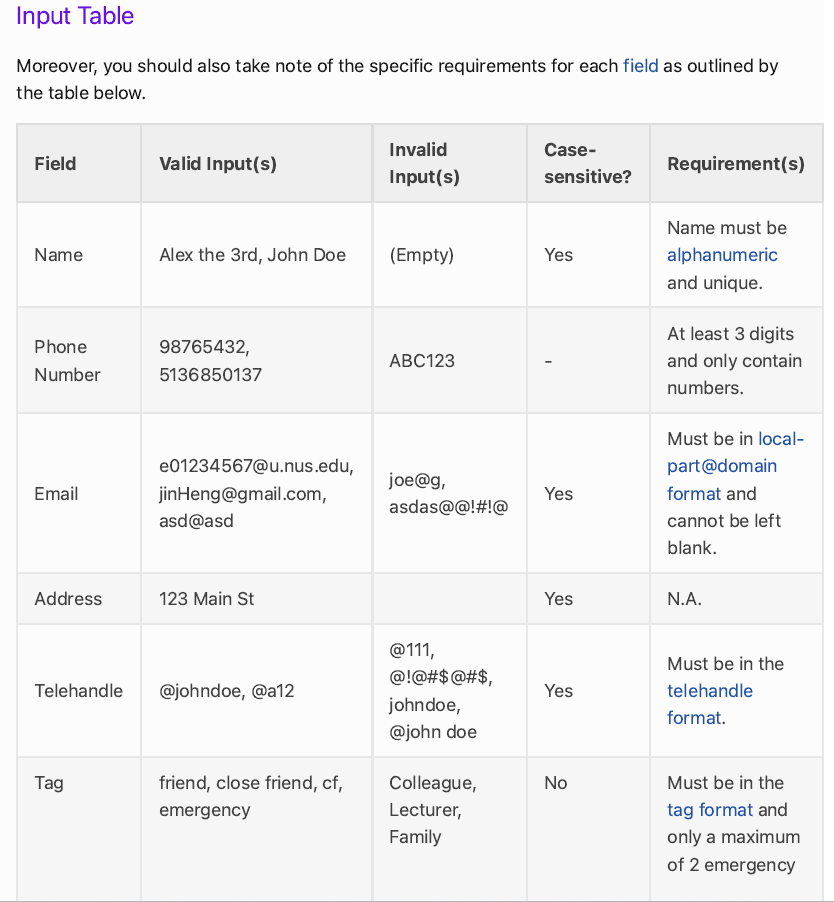
This meant that to understand various terms, I had to click on them, scroll back up, click on the next term, scroll back up, so on and so forth.
Thereafter, I'm done with the the previous sections and can finally resume what I wanted to find out in the first place in the tutorial section.
It is difficult to be able to have "the freedom to choose the level of detail they wish to explore" as their target user involves SoC students who may not be familiar with technical information.
While hyperlinks helped to direct users to different sections of the UG, some parts of tightly coupled together. Furthermore, a small section could contain multiple hyperlinks to jump all the way or down the entire UG, and direct you to an external webpage. This made for a slightly uncomfortable reading experience when trying to understand and test the features.
For instance, this is one of the multiple examples.