 andrew712-1
commented
3 years ago
andrew712-1
commented
3 years ago I can help with ideas and also designing an icon, if you wish...
Open andrew712-1 opened 3 years ago
andrew712-1
commented
3 years ago I can help with ideas and also designing an icon, if you wish...
 SpiritCroc
commented
3 years ago
SpiritCroc
commented
3 years ago A name change to a more international one would need to be somehow related to the current name, I don't think a full re-brand is worth the effort. If you have a really good idea, I might consider it, but probably won't happen anytime soon.
I see that the name might look hard to pronounce, but I don't think it actually is hard to pronounce if you know how to. For the same pronunciation in English, you might write something like "Shilldy-Chat", I guess.
"Too long" - well, it's three syllables, so same as "Element", but way easier to search for in the Internet. I don't see the need to make it any shorter, while risking being less searchable.
We're open to a better version of the icon, if it maintains the original traits.
andrew712-1
commented
3 years ago What does the app stand for? What are its main traits? What is it trying to be? How is it different from other similar chats? Is it pro-free-speech or pro-anonymity, or ..? What is your mission? What does Schildi mean? What does the turtle from the logo mean?
I need to know this in order to come up with some suggestions. Also, are you ok with dropping the "chat" word from the app name? None of the mainstream (or popular) chatting apps do that (Element, Riot, Signal, Telegram, etc..).
SpiritCroc
commented
3 years ago "Schildi" comes from "Schildkröte", which is turtle in German. We don't have any "mission" or philosophical "what the app stands for", we just develop a chat client that we want to use for ourselves, and share it with the community. Accordingly, you might have noticed it's not a priority for us to have a "professional" name, or how you call it.
"chat" is not required, but it is good if the app name says something about what the app does.
If you want an explanation of what the logo stands for, here is some that I came up with (as a joke) after everything was designed already:
andrew712-1
commented
3 years ago Turchat (Turtle + chat) Chatur (Chat + turtle) T-chat (Turtle chat)
The logo could look something like this:

this is just a rough draft
SpiritCroc
commented
3 years ago Thanks for your input. I'm not persuaded though, I still prefer the old icon and name.
 HerrFrutti
commented
2 years ago
HerrFrutti
commented
2 years ago Just installed the app and I like it very much! First thing I thaught, this logo is a little off.
From what I read, you don't want to looseyour identity.
What do you think from this sketch, I'd be happy to work something out with you :)

SpiritCroc
commented
2 years ago @HerrFrutti Great logo idea, we like it!
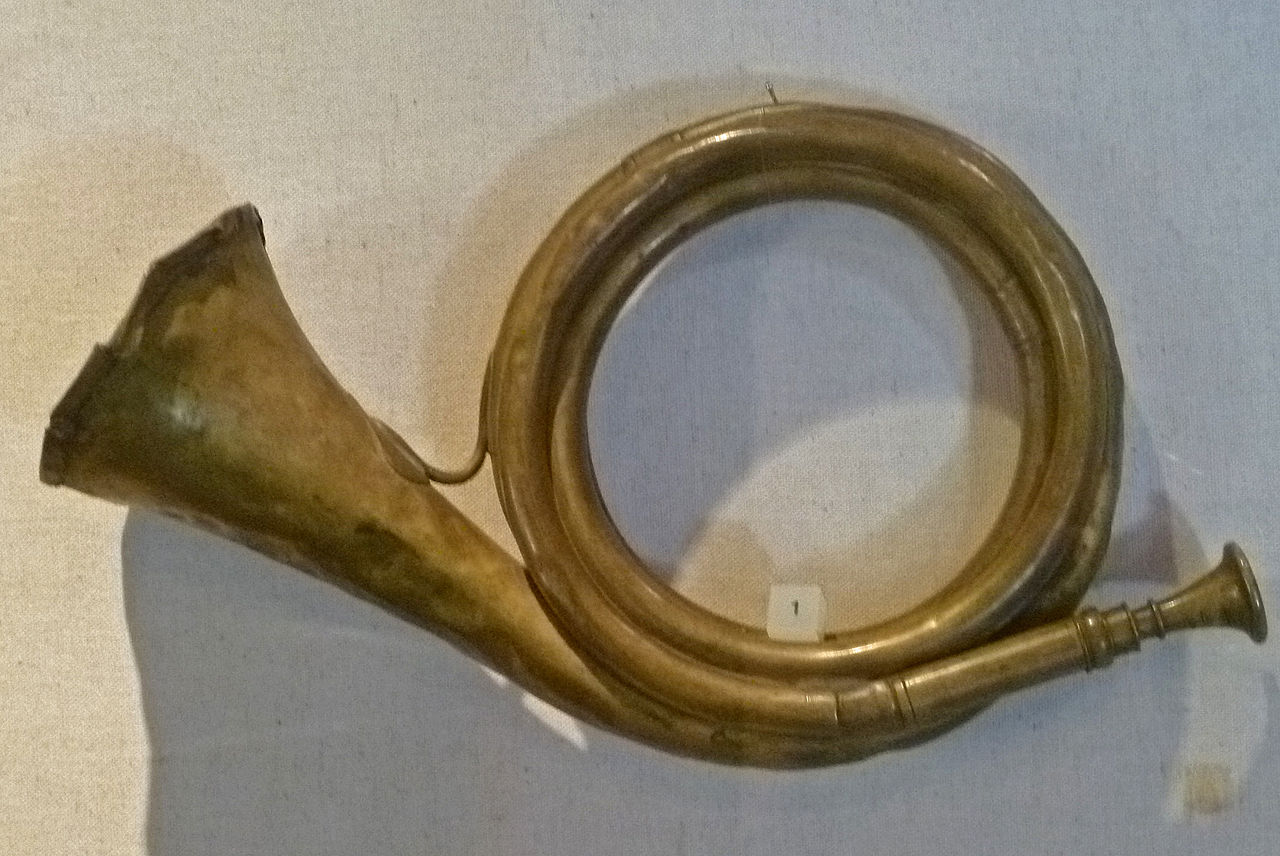
The only thing that bothers me right now is that the shape of the post horn reminds me slightly too much of the "Deutsche Post" logo - maybe one with a little less bending would do, similar to this one? https://upload.wikimedia.org/wikipedia/commons/thumb/f/f4/Berlin._Spandau._Citadel_057.JPG/1280px-Berlin._Spandau._Citadel_057.JPG
Do you have experience with designing icons and/or vector graphics?
HerrFrutti
commented
2 years ago Yeah I taught of Deutsche Post when reading Posthorn :D Me myself not, but my girlfriend (Mediengestalterin). If I can tell her what we want she can do the magic. That sketch is from me, obviously.
I'll talk to her and update you on a more developed version of my sketch.
 squid-f
commented
2 years ago
squid-f
commented
2 years ago Hi. The current logo doesn't really bother me. That being said, if a new one is looked at, I would recommend to use something more "universal" than the horn, on the turtle back. My 2 cents. :)
andrew712-1
commented
2 years ago Great! Thanks guys for your understanding!
I hope we're being understood, we love your app but we can't recommend it to our friends because it gives a first impression of being: weird, childish and with a hard to pronounce name. But when you get past this hurdle you discover a very great app!
It'd be amazing if you changed the name to something more easy to pronounce for as many people from different countries as possible!
Honestly, thank you deeply for your understanding!
SpiritCroc
commented
2 years ago Hi. The current logo doesn't really bother me. That being said, if a new one is looked at, I would recommend to use something more "universal" than the horn, on the turtle back. My 2 cents. :)
I'm open for suggestions
andrew712-1
commented
2 years ago Hi. The current logo doesn't really bother me. That being said, if a new one is looked at, I would recommend to use something more "universal" than the horn, on the turtle back. My 2 cents. :)
I'm open for suggestions
Maybe a lockpad which symbolizes security and privacy.
SpiritCroc
commented
2 years ago Maybe a lockpad which symbolizes security and privacy.
Then we would have no indicator of the messenger aspect.
HerrFrutti
commented
2 years ago Yeah, I'm not having that much time right now, but I was working on an updated logo. I was thinking of a big shield, that has a divided logo on it. One site is the turtle and on the other the horn. But I'm not finding the time right now to create it... sorry
squid-f
commented
2 years ago Hi. The current logo doesn't really bother me. That being said, if a new one is looked at, I would recommend to use something more "universal" than the horn, on the turtle back. My 2 cents. :)
I'm open for suggestions
Hi See below. The link between the round magnets could draw a horn, for instance. Number of magnets could be adjusted. schidli-icon.png If you like the principle, I could try to make a proposal (caution: I am not at all a talented web designer :) ) or someone better than me can take over.
EDIT: to make sure my idea is clear, it is to put onto the turtle shell sketch proposed by HerrFrutti
SpiritCroc
commented
2 years ago Hi. The current logo doesn't really bother me. That being said, if a new one is looked at, I would recommend to use something more "universal" than the horn, on the turtle back. My 2 cents. :)
I'm open for suggestions
Hi See below. The link between the round magnets could draw a horn, for instance. Number of magnets could be adjusted. schidli-icon.png If you like the principle, I could try to make a proposal (caution: I am not at all a talented web designer :) ) or someone better than me can take over.
EDIT: to make sure my idea is clear, it is to put onto the turtle shell sketch proposed by HerrFrutti
That looks like WAY too much detail for an icon.
andrew712-1
commented
2 years ago On the back of the turtle we could have something that symbolises "Chat" like:
1:

2:

3:
 HerrFrutti
commented
2 years ago
HerrFrutti
commented
2 years ago just another quick sketch:

SpiritCroc
commented
2 years ago On the back of the turtle we could have something that symbolises "Chat" like:
1:
2:
3:
Doesn't really persuade me, and also seems like too much detail. These could be icons on their own, but if you put it into another icon, it just gets too small to tell what it is. Keep in mind that an app icon is just a small icon on the screen in many scenarios. Furthermore, 1. takes too much thinking what this actually is, and (2. and) 3. would be kind of copying other apps, and also kind of boring, compared to the horn, if you ask me.
just another quick sketch:
Hm, doesn't persuade me. Your first sketch looked perfect to me, not sure if you're doing new sketches because I said I'm "open for suggestions" for other things to put on the turtles back than a posthorn, or just to have more alternatives to choose from.
HerrFrutti
commented
2 years ago good to know, if I find the time, I'll look deeper into my first sketch.
I just tried different things because my first idea feels complicated to get right. As you said, an icon is small and to much detail is bad. Combining three objects may be too much. But I think we should give it a try and any one can be inspired by the first sketch.
squid-f
commented
2 years ago Hi
I am not good at all at drawing. Here below, I tried to illustrate the idea I had to play with symbols and lines to replace the post-horn.

SpiritCroc
commented
2 years ago Hi I am not good at all at drawing. Here below, I tried to illustrate the idea I had to play with symbols and lines to replace the post-horn.
Still looks like a post horn, I thought you wanted to put something else there :thinking:
squid-f
commented
2 years ago Hi I am not good at all at drawing. Here below, I tried to illustrate the idea I had to play with symbols and lines to replace the post-horn.
Still looks like a post horn, I thought you wanted to put something else there thinking
Yes, I did. Then, I noticed it was important for you to echo the deutsche post logo and why not. So, I came with a more modern look. Actually, in many cultures, a horn has been used to make announcements. So, it might mean more than I thought, even for people leaving outside Germany.
HerrFrutti
commented
2 years ago Hey, if've just played around with a frew Sketches:
 My time right now is very limited, but I just wanted to share this idea here.
I was inspired by this:
https://www.heraldik-wiki.de/wiki/Schildkr%C3%B6te_(Wappentier)
https://de.wikipedia.org/wiki/Westerhorn#/media/Datei:Westerhorn_Wappen.png
Of course right now it's very close to the inspiration, but if you like the over all idea, we can change it up a bit, give it color, etc
My time right now is very limited, but I just wanted to share this idea here.
I was inspired by this:
https://www.heraldik-wiki.de/wiki/Schildkr%C3%B6te_(Wappentier)
https://de.wikipedia.org/wiki/Westerhorn#/media/Datei:Westerhorn_Wappen.png
Of course right now it's very close to the inspiration, but if you like the over all idea, we can change it up a bit, give it color, etc
I was thinking to include the horn inside the turtles back, but I'm not sure about that.
let me know your stands :)
Here the svg file: Schildichat_draft.zip
SpiritCroc
commented
2 years ago Too much detail. Maybe as some sanity check: if it has more detail then the current icon, it is too much. The turtle in the current icon originally had more shell segments then it has now, but we had to reduce it so it looks fine as icon.
HerrFrutti
commented
2 years ago But the overall placement of the objects cool, or are there any suggestions ?
SpiritCroc
commented
2 years ago I still prefer this one:
HerrFrutti
commented
2 years ago So new try. I'm very unsure about the coloring...
And the format okay or is there a specific hight and width?

HerrFrutti
commented
2 years ago Did some coloring:
 Schildichat_draft.zip
 su-ex
commented
2 years ago
su-ex
commented
2 years ago Thanks for working on this! Not ... too bad, because it's closer to your initial draft, but we still prefer the shape of your original draft. Something looks off now.
For coloring: The new icon should only use some of or the same colors as our old icon:
#8bc34a#33691e#fdd835The icon should not contain any black or white, especially at the border, because this is almost always hard to distinguish from either the light or the dark background.
See this as an example: https://github.com/SchildiChat/schildichat-graphics/blob/master/graphics-web/store_icon.svg
I personally don't like the shield, especially the tip at the top.
HerrFrutti
commented
2 years ago okay, so the shield "format" has to be changed. How do you like the horn and the turtle head/feet etc?
SpiritCroc
commented
2 years ago I did prefer the pointy head and feet in your initial sketch. Horn seems okay to me, maybe too much detail, would need to check on the device.
HerrFrutti
commented
2 years ago ahh, so the feet and head not round, instead sharper edges, I see. I thaught about a megaphone instead of a horn, but I think i could simplify the horn.
su-ex
commented
2 years ago A proper post horn should have the looping: https://en.m.wikipedia.org/wiki/Post_horn More examples: https://de.m.wikipedia.org/wiki/Posthorn#Im_Wandel_der_Zeit
HerrFrutti
commented
2 years ago I'd like something like this: https://de.m.wikipedia.org/wiki/Posthorn#/media/Datei%3APosten-norge-2008.svg
su-ex
commented
2 years ago Yes, such a simplified form is perfectly fine (the one from "Schwedische Post" goes in the same direction). We should just make sure it's not too close to an existing logo.
andrew712-1
commented
2 years ago Yes, such a simplified form is perfectly fine (the one from "Schwedische Post" goes in the same direction). We should just make sure it's not too close to an existing logo.
And maybe add a few dots in the middle of the horn to make it even clearer that it's a chatting app.
HerrFrutti
commented
2 years ago This shield + turtle better?

su-ex
commented
2 years ago This looks weird.
Hey, if've just played around with a frew Sketches:
Rather only the turtle from this without all the details on the shell and instead the post horn on the shell. So a merger between this and your initial draft.
HerrFrutti
commented
2 years ago okay, I'll post more drafts, in a few days/weeks. But for this weekend I'm done...
Personally I like this turle the most, so I like your idea.
su-ex
commented
2 years ago Just keep in mind we both (@SpiritCroc and me) like your initial draft the most. My only concern about it is, that it needs to be quite high to actually look good, which might be too high for an icon.
HerrFrutti
commented
2 years ago Yes thats why I asked what you think about the draft:
This shield + turtle better?
Because its aspect ratio is more for icons.
su-ex
commented
2 years ago And again: This one looks weird. It's definitely just too short in height. But the head is also still far too rounded compared to the initial draft. The shape of the legs is better as well on the initial draft.
If we stick to the initial draft, we must live with some padding left and right, which is not necessarily a problem. Rather have it look good than force it into a form which doesn't fit.
 dzg
commented
2 years ago
dzg
commented
2 years ago What about borrowing the abstract look of the Element logo ...

With extremities if you like ...

or more abstract ...

One more...

SpiritCroc
commented
2 years ago @su-ex and I are so disturbed by your color choice, that we can't realistically judge your proposal yet.
Some first thoughts: we both like the 2nd option of your proposals the most. While it looks modern and has the benefit of not having too much detail and having the correct icon ratio, it might be "too modern" for us, we think it looks a little boring and doesn't really stand out on the home screen. Maybe throwing in some more colors from our current logo might help. Also, @su-ex is missing the post horn ;)
HerrFrutti
commented
2 years ago I like this so much better than my drafts. Happy to see someone more professional gives in some thoughts. thank you!
 AnisTaluqdar
commented
2 years ago
AnisTaluqdar
commented
2 years ago or more abstract ...
Wow, it looks cute
dzg
commented
2 years ago @su-ex and I are so disturbed by your color choice, that we can't realistically judge your proposal yet.
Some first thoughts: we both like the 2nd option of your proposals the most. While it looks modern and has the benefit of not having too much detail and having the correct icon ratio, it might be "too modern" for us, we think it looks a little boring and doesn't really stand out on the home screen. Maybe throwing in some more colors from our current logo might help. Also, @su-ex is missing the post horn ;)
Color "choice" wasn't really a choice, I'm just using the Element colors

I thought that since this is a fork of Element, it makes sense to "pay visual homage" to it.
If you look at most modern messaging apps
 they all look modern and simple to me.
Could add shading or your current color

Not feeling the horn, sorry.
SpiritCroc's edit:
People seem to be unhappy with the icon (not all, but a considerable amount). Issues seem to be:
So, while we, the SchildiChat team, are happy with the icon, we're open for contributions if you have any. Note that if you want your suggestion to be taken seriously, you need to be grant us all rights for your design (re-destribution, modifications etc. without having to ask you), and we need a vector graphics / svg, so we can properly work with it. Make sure to also read below discussion for previous suggestions, so you know what aspects are important to us.
Original message by andrew712-1
### EDIT: Let this issue be about the logo only and [this new issue ](https://github.com/SchildiChat/schildichat-meta/issues/3)to be about the app name https://github.com/SchildiChat/schildichat-meta/issues/3 Please change the icon, the current one is too childish. Please change the name of the app, it's too long, and hard to pronounce especially for russians. We need a shorter and easier to pronounce (internationally) name. I love your app, but I can't recommend it to anyone because of these two issues...