Closed stefanomattia closed 6 years ago
Try adding interpolation='none'
to the add_image()
call, I believe without this matplotlib resamples (possibly not very well as seen) the image to fit the axis.
From the matplotlib documentation (for imshow
) this only works for Agg, ps and pdf backends, although I also saw improvements using svg backend when running in Jupyter.
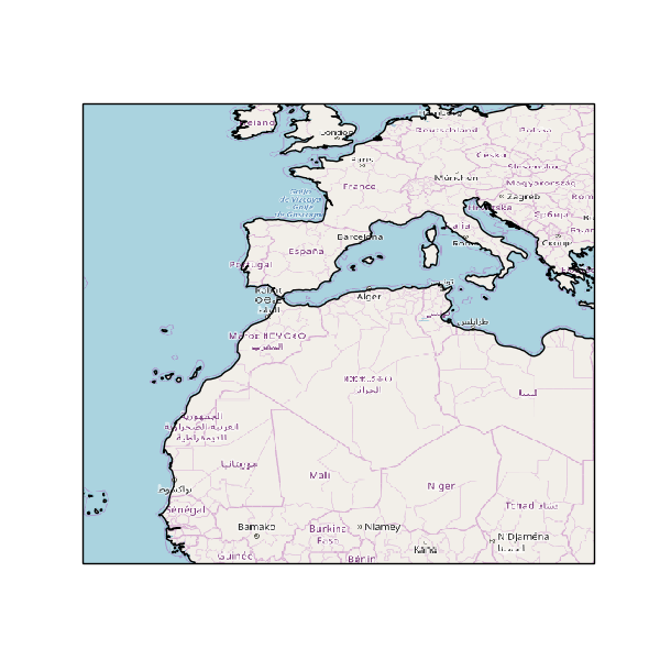
Unfortunately interpolation='none'
doesn't seem to change anything, I can't tell any discernible difference in the output image. But it's weird though, am I the only Mac user having this problem?
I see the same as you on Mac and Linux. I don't have the solution, but this is not an isolated case.
Maybe I've got a slightly different use case in that I was primarily producing PDF files from matplotlib (on a Mac, using Homebrew Python installation) viewing the results with preview or notebook with inline svg.
Your example producing bitmap output (PNG) yes I get noticeable pixelation, there was some improvement using interpolation='bicubic'
, but still not looking as sharp as original tiles.
I think it is down to add_image()
ultimately calling matplotlib imshow()
and if the axes pixels are not the same size as the tiles pixels there is going to be a re-sampling of the tile image. In PDF output case I suspect this re-sampling is left to the viewer to perform.
For reference, I've provided a link to the StackOverflow question.
The interpolation
keyword is definitely the way to go here. I agree that the bicubic
option leads to somewhat fuzzy / less-sharp images. Trying one of the other schemes, such as spline36
has quite a pleasing effect. Take a look at https://matplotlib.org/gallery/images_contours_and_fields/interpolation_methods.html for the options that are available to you.
For future readers who find this and who don't see the benefit from the interpolation keyword, it is probably because you are re-projecting the tiles into the target projection which is happening before matplotlib gets any influence on the scheme. There isn't a lot we can do with this, as cartopy is using a general 3d interpolation scheme in order to support the full diversity of the projections it can handle. Your best option for poor resolution cross projection map tiles is to change the resolution of the re-projection. A question about how to do this came up on StackOverflow not too long ago: [I can't currently find the link :cry: :crystal_ball: ) (there are also others: 1).
To give a concrete example of this, take the following code:
import matplotlib.pyplot as plt
import cartopy.crs as ccrs
import cartopy.io.img_tiles as cimgt
extent = [-25, 25, 10, 55]
request = cimgt.OSM()
fig, ax = plt.subplots(figsize=(6, 6))
ax = plt.axes(projection=ccrs.PlateCarree())
ax.set_extent(extent, ccrs.PlateCarree())
ax.add_image(request, 4)
ax.coastlines('50m')
plt.show()
If we simply add the interpolation
keyword to the add_image
call, we don't get the best possible result:
Instead, we also need to control how coarse/fine the target regridded image should be with the regrid_shape
keyword argument. An example add_image
might then look like: ax.add_image(request, 4, interpolation='spline36', regrid_shape=2000)
I think this addresses the issue at hand, so will close. Happy to re-open this if the issue isn't resolved for you.
Thanks!
Pardon the nagging: while the interpolation
options results in a much better looking result, for me the real question is why cartopy in 2015 didn't require this, while it does now.
The example in the StackOverflow post was posted June 22, 2015. The cartopy version would've been 0.11, 0.12.04, or 0.12.05, judging from the PyPI history.
There's three changes visible:
Could difference 3 be a case of regression?
I had a try at installing an earlier cartopy version to see if I could reproduce the 2015 example, but unfortunately, the earliest version on conda is 0.15.1 (which is also "not-crisp" by default). PyPI does have the earlier versions, but not surprisingly, installing a package from 2015 fails miserably. I'm not nearly familiar enough with the cartopy source to investigate from that direction...
Having good looking tiles is a really cool and convenient feature, so it might be worth another look?
Could this issue be because Cartopy is accessing Google tiles through a deprecated interface that is no longer supported/allowed: https://developers.google.com/maps/faq#tos_tiles ?
The simple answer I think is that the default interpolation changed in matplotlib. I have some things lined up to improve the tiles interface further for v0.18 (interactive & auto zoom). Implementing a better interpolation scheme by default is going to be important for that functionality too.
You could change the figsize=(50, 50)
Description
I posted this on stackoverflow but got no answers so far, hope someone here could shed some light on it. In a nutshell, my tiles look ugly, for example:
Produces:
Look at those pixelated text labels and overall poor resolution. I played with different zoom levels and different styles with no success.
When displaying the same map on google maps, I get the usual nicely rendered look:
I can change tile provider but results are similar:
It doesn't matter if I run the code on a Jupyter notebook or a python console or on a different machine, results are identical.
Any clue?
Traceback
Full environment definition
### Operating system macOS High Sierra 10.13.3 (17D47) ### Cartopy version 0.16.0 ### conda list ``` # packages in environment at /Users/stefano/anaconda3: # _ipyw_jlab_nb_ext_conf 0.1.0 py36h2fc01ae_0 alabaster 0.7.10 py36h174008c_0 altair 1.2.1 py_0 conda-forge anaconda custom py36ha4fed55_0 anaconda-client 1.6.5 py36h04cfe59_0 anaconda-navigator 1.6.9 py36ha31b149_0 anaconda-project 0.8.0 py36h99320b2_0 appnope 0.1.0 py36hf537a9a_0 appscript 1.0.1 py36h9e71e49_1 argparse 1.4.0