Team's Response
No details provided by team.
The 'Original' Bug
[The team marked this bug as a duplicate of the following bug]
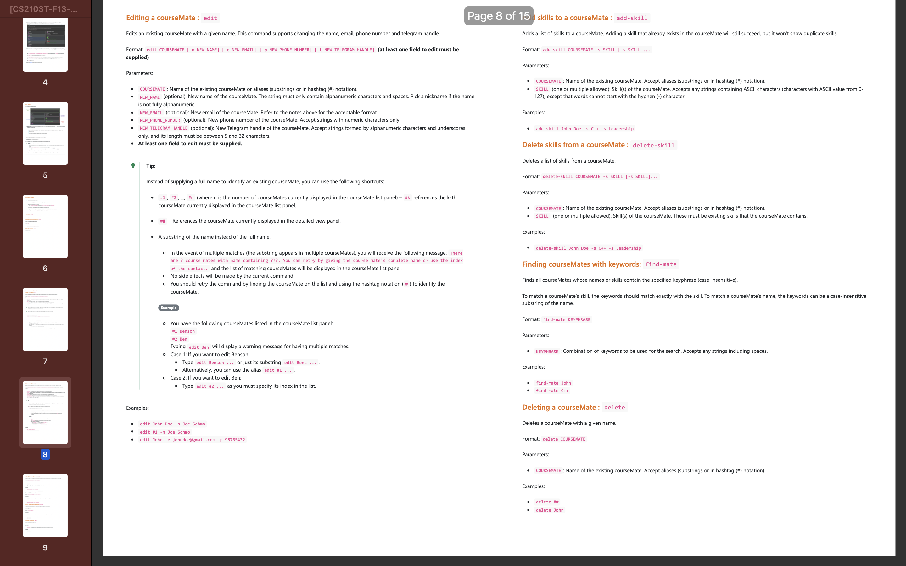
Not enough visuals for commands: edit, add-skill, delete-skill, etc
Note from the teaching team: This bug was reported during the Part II (Evaluating Documents) stage of the PE. You may reject this bug if it is not related to the quality of documentation.

There are no pictures here to show how the command looks like in the UI with the corresoponding output and therefore is too wordy
[original: nus-cs2103-AY2324S2/pe-interim#5323] [original labels: severity.Medium type.DocumentationBug]
Their Response to the 'Original' Bug
[This is the team's response to the above 'original' bug]
Thank you for your suggestion. However, the length of the explanation in the user guide is already very minimal compared to the complexity of the app and the number of features.
Considering the current user guide is highly understandable, adding more illustrations to the user guide would be of a low priority. Thus we will be marking this bug as "Not in scope" with low severity.
Items for the Tester to Verify
:question: Issue duplicate status
Team chose to mark this issue as a duplicate of another issue (as explained in the Team's response above)
- [x] I disagree
Reason for disagreement: I disagree with the team's decision to mark this issue as a duplicate of the previous bug concerning visuals for other commands. While both issues relate to the lack of visuals in the user guide, they pertain to different sets of commands—each with unique functionalities and impacts on the user interface. Treating this issue as a duplicate overlooks the specific need for visual guidance for each distinct command such as "rate-mate," "create-group," "add-member," and "delete-member," which are critical for understanding group dynamics and rating systems within the app. Each command may require different visual representations to clarify its function and output, which are essential for ensuring users fully grasp how to use these features effectively.
## :question: Issue response Team chose [`response.NotInScope`] - [x] I disagree **Reason for disagreement:** There are no pictures here to show how the command looks like in the UI with the corresponding output and therefore is too wordy. This hinders the reader. "Don't interpret 'hinder' as 'impossible to read'. Even formatting issues such as too much/little padding, font size, alignment, inconsistencies, etc. can 'hinder' the reader in the sense they can slow down the reader or require the reader to put more effort than necessary." (Covered under the cs2103T website) The user guide is full of just words and without pictures, it is hard for the reader to form a correlation between how the commands translate to the UI of the application and hinders user experience.
## :question: Issue severity Team chose [`severity.Low`] Originally [`severity.Medium`] - [x] I disagree **Reason for disagreement:** I also disagree with the severity classification as "Low." The absence of visuals for these commands can lead to significant user inconvenience, as it forces users to interpret textual descriptions without clear visual context, increasing the likelihood of errors and confusion. This is particularly problematic for commands that involve complex interactions within the application, such as managing group memberships or rating colleagues. The potential for misinterpretation and the subsequent impact on user experience justifies a "Medium" severity rating, as it affects the ease of use and overall effectiveness of the user guide in enabling competent application usage.
Too wordy, and hard for the reader to follow.