 soc-pe-bot
commented
1 year ago
soc-pe-bot
commented
1 year ago Team's Response
We decided to reject this report due to the following reasons.
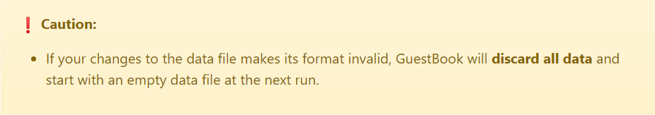
- We believe that the name of our tooltips are clear enough for users to understand their respective meanings, e.g
common mistakesare the common mistakes that a user can make - It would be very unlikely that the user is confused by “common mistake” and “caution” as they have very different definitions.
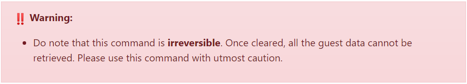
- As for the severity of
cautionvswarning, we believe that based on their symbols and colours, it is intuitive to know the hierarchy between them. The icon used forwarningis 2 exclamation marks that obviously signal a higher level of severity than a single exclamation mark fromcaution.
Items for the Tester to Verify
:question: Issue response
Team chose [response.Rejected]
- [x] I disagree
Reason for disagreement: >>> It would be very unlikely that the user is confused by “common mistake” and “caution” as they have very different definitions.
- Common mistakes can be a cause for caution.
- Caution can be to avoid common mistakes.
The claim that they have very different definitions is false. It, in fact, is very confusing what the distinction is between a Common Mistake and Caution. Clarifying the distinction would be helpful to the user.
As for the severity of caution vs warning, we believe that based on their symbols and colours, it is intuitive to know the hierarchy between them.
- Point is well taken, fair enough.
:question: Issue severity
Team chose [severity.VeryLow]
Originally [severity.Low]
- [x] I disagree
Reason for disagreement: >>> Only cosmetic problems should have this label.
This isn't a purely cosmetic problem, as it could confuse the reader.
There should be a breakdown of the different types of tooltips and what they represent so that the user knows what to read and what each colour/tooltip means ahead of time/before the UG starts.
Without it, it's possible for the user to be confused. What is the difference between
common mistakesandcaution?Does
cautionhave a higher severity, or doeswarningdo? Both of these are synonyms, and there's no clear hierarchy between them, causing confusion without clarification.