 SiRumCz
commented
4 years ago
SiRumCz
commented
4 years ago please remove /neo4j folder from repo
Closed soroushysfi closed 4 years ago
SiRumCz
commented
4 years ago please remove /neo4j folder from repo
 soroushysfi
commented
4 years ago
soroushysfi
commented
4 years ago I deleted the folder
 jonhealy1
commented
4 years ago
jonhealy1
commented
4 years ago Hi. I can't get this to run - I'm not seeing anything except for the chord diagram and some text.
soroushysfi
commented
4 years ago The visualizations are awesome, we could analyze them and find out some patterns.
While I was browsing them, I have few problems:
- Something block me from scrolling up and down which I believe is the zoom interaction. Perhaps you could create outlines for each node-link diagrams and only allow zoom interaction within the outlines.
- For the node-link diagram, the links are not long enough, the nodes are all squished.
- For the adjacency matrix, I really liked this viz, however, I do not understand what the colors represented. Is there any available legend we could add to it?
1- Yes that happens because I enabled zoom for node link diagram. I can either remove the zoom or show a border for the node link. 2- I will make the distance longer but because it's tightly connected the visualization gets cluttered. That's why I'm showing it to say this method is not a good way to show in spite of all visualization tools which use this method to present data. 3- I have mentioned the colors and the opacity under the title. The colors show similar group and the opacity show edge weight. Legend doesn't make sense because I have to wright red for group 2, black for group 3, green for group 4, ... which doesn't make sense for reader. The only thing the user wants to know is colors present different groups. This way they can distinguish groups.
soroushysfi
commented
4 years ago Hi. I can't get this to run - I'm not seeing anything except for the chord diagram and some text.
API take some time to process because of the data manipulation in backend. You would probably have to wait a minute to get the response from APIs.
jonhealy1
commented
4 years ago Run neo4j, run app.py, npm install, npm start... What am I missing?
jonhealy1
commented
4 years ago Hi. I can't get this to run - I'm not seeing anything except for the chord diagram and some text.
API take some time to process because of the data manipulation in backend. You would probably have to wait a minute to get the response from APIs.
Ok. So I'm not missing anything?
soroushysfi
commented
4 years ago Hi. I can't get this to run - I'm not seeing anything except for the chord diagram and some text.
API take some time to process because of the data manipulation in backend. You would probably have to wait a minute to get the response from APIs.
Ok. So I'm not missing anything?
If the chord diagram is showing then no. It takes me about 40sec to show the data.
SiRumCz
commented
4 years ago Run neo4j, run app.py, npm install, npm start... What am I missing?
could you show me the output of the app.py. I suspect that you are using the same one in his branch which doesn't have any APIs. You need to create a new folder and clone the project with master branch in order to run app.py and get APIs working.
jonhealy1
commented
4 years ago Oh ok that makes sense thanks!
jonhealy1
commented
4 years ago Ok I see it now!
jonhealy1
commented
4 years ago The edge bundling diagrams look awesome but it would look better with grouping like the demo. The node link diagram isn't great. The adjacency matrix needs far fewer nodes.
jonhealy1
commented
4 years ago jonhealy1
commented
4 years ago Good job on the code you guys. Kevin's code in Python is really good and Soroush's visualizations are going to be really good too.
jonhealy1
commented
4 years ago @soroushysfi do you think you could get this node link diagram working that I just posted?
soroushysfi
commented
4 years ago @soroushysfi do you think you could get this node link diagram working that I just posted?
Sorry if I'm responding late my Wednesdays are really busy. I will try and see if I can do it thanks for the link.
soroushysfi
commented
4 years ago Clustering added to adjacency matrix and node-link diagram changed a bit. I couldn't add that Dijkstra link because it used a weird format for the data and I have to figure out another way to do it. We cannot just dump our data to that visualizations that Kevin mentioned. @noonespecial009 @SiRumCz
jonhealy1
commented
4 years ago The node link diagram isn't nearly as good as the one I made. I wish you could concentrate on displaying that one. It's a million times better. I think the adjacency matrix is way too crowded. It's impossible to use how it is I think. Do you have any time tomorrow to work on this? You can make some shortest path diagrams with my neovis code too.
jonhealy1
commented
4 years ago I really like the edge bundled diagram. Are some things clustered in it? Some nodes are closer together than others.
soroushysfi
commented
4 years ago The node link diagram isn't nearly as good as the one I made. I wish you could concentrate on displaying that one. It's a million times better. I think the adjacency matrix is way too crowded. It's impossible to use how it is I think. Do you have any time tomorrow to work on this? You can make some shortest path diagrams with my neovis code too.
Yeah definitely yours is better because it uses a library which explicitly focuses on node-link diagram. I will see if I can fit that into our project, if not we can submit a separate html file as we did in the previous assignment. We have different visualizations for different proposes. Matrix one is mostly to see clusters and too see the edge weight distribution in 100 nodes. There are three options that you can choose between distributions(cluster, frequency, name). So with this purpose I don't think matrix is too crowded because you can actually extract meaning by switching between modes.
soroushysfi
commented
4 years ago I really like the edge bundled diagram. Are some things clustered in it? Some nodes are closer together than others.
As you can see only one part of the diagram nodes are close to each other. This is because almost all the nodes have different clusters in the data I get from the API. So if the data was different we would have different parts too that were put closely to each other.
SiRumCz
commented
4 years ago This one is force-merged for the same reason.
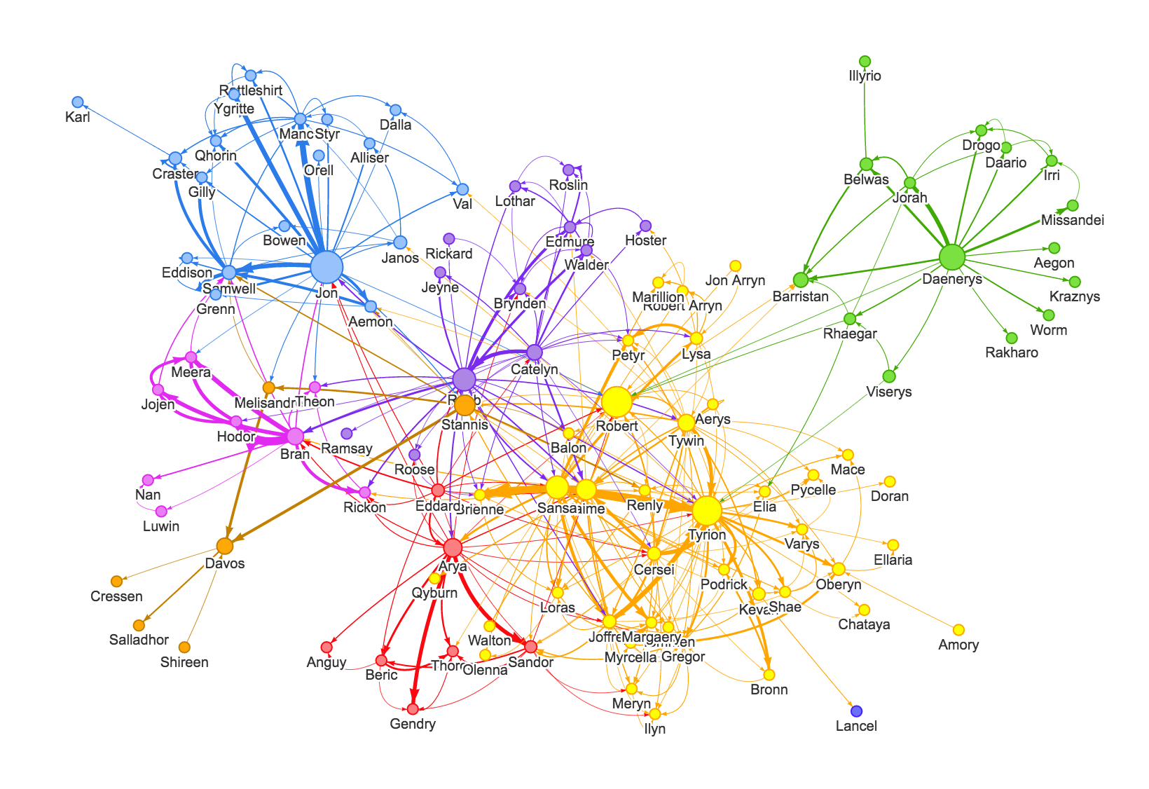
I tried to implement that Dijkstra link to our node link diagram but I wasn't successful. I will try again later see if I can find any other solution. All the visualizations are connected except the first one that uses Jonathans data. I showed different samples of edge bundled and node link to show the problem of scalability of node link diagram. I will talk about it in our technical report.