All good points. The user coloring is a preference. The preference control is behind the menu.
Open eduardoinnorway opened 5 years ago
All good points. The user coloring is a preference. The preference control is behind the menu.
@eduardoinnorway Thank you for the mockup! https://sketch.cloud/s/JaDgb/25ZG9Vl
@eduardoinnorway @timbl fabulous design!
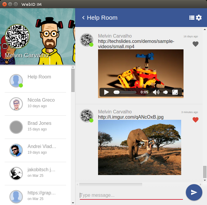
Here was mine with webid.im

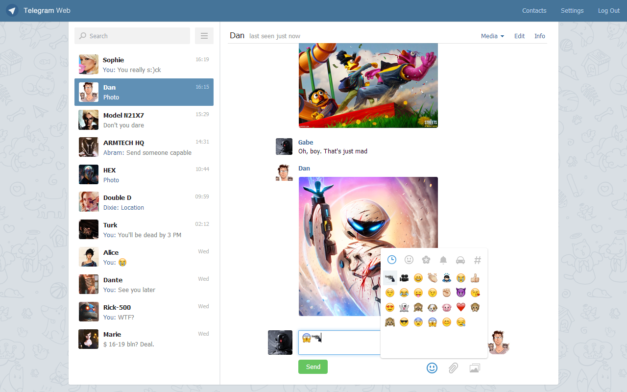
I've also collected quite a lot of links for open source messengers. Many designs in here. The much acclaimed Telegram messenger (webogram) is one of a few that stands out imho
https://github.com/melvincarvalho/webid.im/wiki/FLOSS-Messengers

Perhaps a competition for the best solid chat design? Bounty for a pane? :)
@melvincarvalho I am still in love with mIRC :) I think a competition of design would be waste of valuable time. The design should be based on the coming UI or we will not get UX/Design consistency on the ecosystem. Better team up if more people want to pitch in, I have no issue working with others, in the contrary.
@melvincarvalho There are a group of students who are working on Solid Chat as an assignment and the next Solid World theme is Solid Chat, would you be open to giving a 5 minute presentation on the work so far on Solid Chat?
have people considered adopting a modular CSS system like basscss? i've found this to help tremendously with UI consistency and working collaboratively
@Mitzi-Laszlo We are a team of those students you mention. Here is the UI we built for our first functional prototype.

@emiliocortina LOVE this UI!
EDIT : which css are you using, look a bit like material design?
@melvincarvalho Thanks! It's just CSS with nested flexbox componenets to make it responsive. Feel free to check it out https://github.com/Arquisoft/dechat_en2b/tree/master/experimental_stuff/ui_templates
I feel that user choice in the UI layout is really important. Note quite a lot of things are in the preferences already, but you have a competition don't pick one, try to build a UI which in fact can be customized to produce any of them at the user's will.
BTW the participant list exists, click on the "group" icon bottom left. Like the "Settings" wrend bottom right. Settings include
@SharonStrats
Improve the UX/Design and structure: