Closed cfc-librarian closed 2 years ago
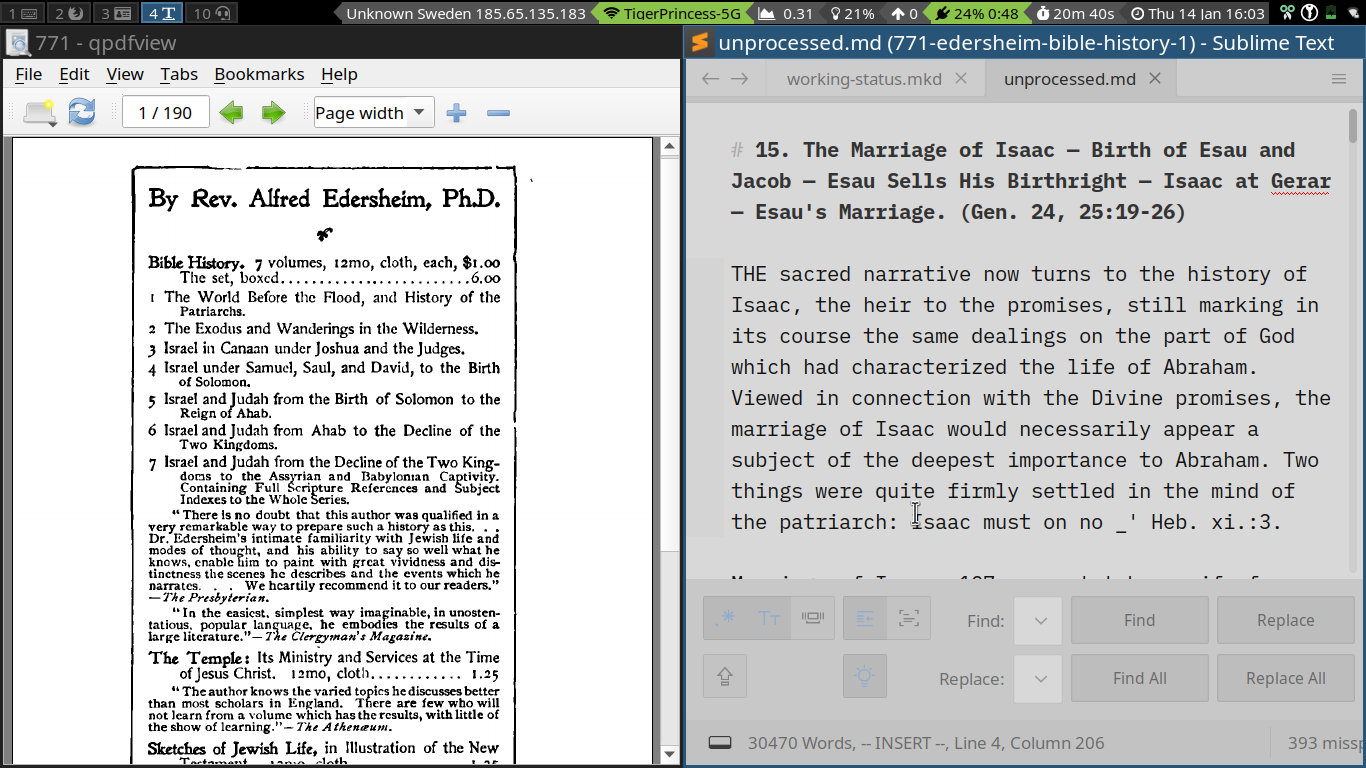
It appears even if icon buttons on the left and the buttons on the right would be as small as possible, it wouldn't give you rasonable space for input fields. With your screen resolution the window should be about 680px wide. I tried the same on Windows with following result.
Situation doesn't change much with Adaptive.sublime-theme, which is shipped with ST out of the box.
Have you tried to set "ui_scale: 0.7"
to reduce size of UI elements?
Thank you.
It seems like this is an issue with the rendering of the Sublime Text 3 application under Arch Linux/i3wm. Using the sublime preference "ui_scale: 1.1" allows the quick panel to be used when a sublime project is opened "half screen". This is a big help!
While the HIDPI "fixes" and "changes" are good for large screens and newer hardware, they really wreak havoc with those of us using simpler equipment.
The sublime menu is still unreasonably large - but a package "hide menu" takes care of that. Now the status is tough to read, but I can modify the custom status font, so that shouldn't be too hard.
One small question - is there any way to reduce the spacing between items on the file list? :+1:
Title bar and main menu are native gtk controls and afaik not under direct control of ST with regards to style and size. Also your pdf viewer's controls look quite large. I am not a linux expert, but my impression is a global scaling factor to be applied.
By explicitly setting ui_scale
those global OS values are overriden for client controls.
Any help with this much appreciated:
Recently shifted laptops to one with a 1366x768 screen. The dpi is set correctly, and all other applications are working fine. With sublimetext 3 and the daneo sodaish theme the quick panel text input box is obstructed by the buttons when set to half screen, which is how I use it 90% of the time. A screenshot is attached.
Thank you also for resurrecting the DA theme. I've been using it for years now, but decided to make a switch with the computer change.