Open SunshowerC opened 5 years ago
原文地址:https://medium.com/jlouage/flutter-row-column-cheat-sheet-78c38d242041 原文作者:Julien Louage 其他 Flutter 相关 Flutter: 图解 Container 部件 Flutter: 图解 BoxDecoration
Row 是用于展示水平方向的子部件的部件。
基本使用:
MaterialApp(
    title: 'Flutter Demo',
    home: Row(
      children: [
        Container(
          color: Colors.orange,
          child: FlutterLogo(
            size: 60.0,
          ),
        ),
        Container(
          color: Colors.blue,
          child: FlutterLogo(
            size: 60.0,
          ),
        ),
        Container(
          color: Colors.purple,
          child: FlutterLogo(
            size: 60.0,
          ),
        ),
      ],
    )
  );
}
Row 部件本身不会水平滚动,如果您有很多子部件并希望它们能够在没有足够空间的情况下滚动,请考虑使用ListView类。
Column是用于展示垂直方向的子部件的部件。
Column(
  children: [
    Container(
      color: Colors.orange,
      child: FlutterLogo(
        size: 60.0,
      ),
    ),
    Container(
      color: Colors.blue,
      child: FlutterLogo(
        size: 60.0,
      ),
    ),
    Container(
      color: Colors.purple,
      child: FlutterLogo(
        size: 60.0,
      ),
    ),
  ],
)
同样,Column部件不会垂直滚动。如果您有一系列小部件并希望它们能够在没有足够空间时滚动,请考虑使用ListView。
Column 和 Row 部件拥有同样的属性,所以在以下的例子中我们将会同时使用这两个部件。
将子部件将子部件尽可能接近主轴起点
Row(
  mainAxisAlignment: MainAxisAlignment.start,
  children: [
    Container(
      color: Colors.blue,
      height: 50.0,
      width: 50.0,
    ),
    Icon(Icons.adjust, size: 50.0, color: Colors.pink),
    Icon(Icons.adjust, size: 50.0, color: Colors.purple,),
    Icon(Icons.adjust, size: 50.0, color: Colors.greenAccent,),
    Container(
      color: Colors.orange,
      height: 50.0,
      width: 50.0,
    ),
    Icon(Icons.adjust, size: 50.0, color: Colors.cyan,),
  ],
);
相当于 CSS 的
.row {
  display: flex;
  justify-content: flex-start;
  /* 竖直排列时 flex-direction: column; */
}
子部件居中
.row {
  display: flex;
  justify-content: center;
  /* 竖直排列时 flex-direction: column; */
}
子部件尽可能靠近主轴尾部
.row {
  display: flex;
  justify-content: flex-end;
}
将可用空间均匀地放置在子部件之间,且头尾两个部件离边缘的空间只有子部件之间空间的一半
.row {
  display: flex;
  justify-content: space-around;
}
将可用空间均匀地放置在子部件之间
.row {
  display: flex;
  justify-content: space-between;
}
将可用空间均匀地放置在子部件之间,包括首尾部件的边缘。
.row {
  display: flex;
  justify-content: space-evenly;
}
和主轴垂直相交方向的轴。
与交叉轴起始边对齐
Row(
  crossAxisAlignment: CrossAxisAlignment.start,
  children: [
    Container(
      color: Colors.blue,
      height: 50.0,
      width: 50.0,
    ),
    Icon(Icons.adjust, size: 50.0, color: Colors.pink),
    Icon(Icons.adjust, size: 50.0, color: Colors.purple,),
    Icon(Icons.adjust, size: 50.0, color: Colors.greenAccent,),
    Container(
      color: Colors.orange,
      height: 50.0,
      width: 50.0,
    ),
    Icon(Icons.adjust, size: 50.0, color: Colors.cyan,),
  ],
);
相当于 CSS 的:
.row {
  display: flex;
  align-items: flex-start;
}
Row 部件:
Column 部件
交叉轴居中对齐
.row {
  display: flex;
  align-items: center;
}
交叉轴末端对齐
.row {
  display: flex;
  align-items: flex-end;
}
子部件填充满交叉轴
.row {
  display: flex;
  align-items: stretch;
}
子部件 基线对齐
值为 CrossAxisAlignment.baseline时 必须同时使用 textBaseline, 否则会报错
CrossAxisAlignment.baseline
textBaseline
Row(
  crossAxisAlignment: CrossAxisAlignment.start,
  children: [
    Text(
      'Flutter',
      style: TextStyle(
        color: Colors.yellow,
        fontSize: 30.0
      ),
    ),
    Text(
      'Flutter',
      style: TextStyle(
          color: Colors.blue,
          fontSize: 20.0
      ),
    ),
  ],
);
Row(
  crossAxisAlignment: CrossAxisAlignment.baseline,
  textBaseline: TextBaseline.alphabetic,
  children: [...]
)
.row {
  display: flex;
  align-items: baseline;
}
文字从右到左排列,主轴(水平)方向 start->end 是 从右到左
Row(
  mainAxisAlignment: MainAxisAlignment.start,
  crossAxisAlignment: CrossAxisAlignment.center,
  textDirection: TextDirection.rtl,
  children: [
    Text(
      'Flutter',
      style: TextStyle(
        color: Colors.yellow,
        fontSize: 30.0
      ),
    ),
    Text(
      'Flutter',
      style: TextStyle(
          color: Colors.blue,
          fontSize: 20.0
      ),
    ),
  ],
);
从左往右排列,主轴(水平)方向 start->end 是 从左到右
交叉轴(水平)方向 start->end 是 从左到右
Column(
  mainAxisAlignment: MainAxisAlignment.start,
  crossAxisAlignment: CrossAxisAlignment.start,
  textDirection: TextDirection.rtl,
  children: [
    Text(
      'Flutter',
      style: TextStyle(
        color: Colors.yellow,
        fontSize: 30.0
      ),
    ),
    Text(
      'Flutter',
      style: TextStyle(
          color: Colors.blue,
          fontSize: 20.0
      ),
    ),
  ],
);
默认情况不必多说
和 textDirection 类似
从上往下摆放组件,竖直方向 start->end 是 从上到下
对于 Column 部件的子部件从下往上摆放组件,竖直方向 start->end 是 从下到上
Column(
      mainAxisAlignment: MainAxisAlignment.start,
      crossAxisAlignment: CrossAxisAlignment.end,
      verticalDirection: VerticalDirection.up,
      children: [
        Text(
          'Flutter',
          style: TextStyle(color: Colors.yellow, fontSize: 30.0),
        ),
        Text(
          'Flutter',
          style: TextStyle(color: Colors.blue, fontSize: 20.0),
        ),
      ],
    );
所有子部件占据主轴的空间大小
Center(
  child: Container(
    color: Colors.yellow,
    child: Row(
      mainAxisSize: MainAxisSize.max,
      mainAxisAlignment: MainAxisAlignment.center,
      children: [
        Container(
          color: Colors.blue,
          height: 50.0,
          width: 50.0,
        ),
        Icon(Icons.adjust, size: 50.0, color: Colors.pink),
        Icon(Icons.adjust, size: 50.0, color: Colors.purple,),
        Icon(Icons.adjust, size: 50.0, color: Colors.greenAccent,),
        Container(
          color: Colors.orange,
          height: 50.0,
          width: 50.0,
        ),
        Icon(Icons.adjust, size: 50.0, color: Colors.cyan,),
      ],
    ),
  ),
);
加上黄色背景可以看到 Row 部件占据了一整行空间
Column 同理,不再赘述。
使子部件占据空间尽可能小。
Center(
  child: Container(
    color: Colors.yellow,
    child: Column(
      mainAxisSize: MainAxisSize.min,

      children: [
        Container(
          color: Colors.blue,
          height: 50.0,
          width: 50.0,
        ),
        Icon(Icons.adjust, size: 50.0, color: Colors.pink),
        Icon(Icons.adjust, size: 50.0, color: Colors.purple,),
        Icon(Icons.adjust, size: 50.0, color: Colors.greenAccent,),
        Container(
          color: Colors.orange,
          height: 50.0,
          width: 50.0,
        ),
        Icon(Icons.adjust, size: 50.0, color: Colors.cyan,),
      ],
    ),
  ),
);
Row 部件同理,不再赘述。
如何在 Row 中平分空间且子控件 Text 向指定方向对齐?
 bestK
commented
5 years ago
bestK
commented
5 years ago  bestK
commented
5 years ago
bestK
commented
5 years ago
Row
Row 是用于展示水平方向的子部件的部件。
基本使用:
Row 部件本身不会水平滚动,如果您有很多子部件并希望它们能够在没有足够空间的情况下滚动,请考虑使用ListView类。
Column
Column是用于展示垂直方向的子部件的部件。
同样,Column部件不会垂直滚动。如果您有一系列小部件并希望它们能够在没有足够空间时滚动,请考虑使用ListView。
属性
Column 和 Row 部件拥有同样的属性,所以在以下的例子中我们将会同时使用这两个部件。
mainAxisAlignment (主轴)
MainAxisAlignment.start(默认值)
将子部件将子部件尽可能接近主轴起点
相当于 CSS 的
MainAxisAlignment.center
子部件居中
相当于 CSS 的
MainAxisAlignment.end
子部件尽可能靠近主轴尾部
相当于 CSS 的
MainAxisAlignment.spaceAround
将可用空间均匀地放置在子部件之间,且头尾两个部件离边缘的空间只有子部件之间空间的一半
相当于 CSS 的
MainAxisAlignment.spaceBetween
将可用空间均匀地放置在子部件之间
相当于 CSS 的
MainAxisAlignment.spaceEvenly
将可用空间均匀地放置在子部件之间,包括首尾部件的边缘。
相当于 CSS 的
crossAxisAlignment (交叉轴)
和主轴垂直相交方向的轴。
CrossAxisAlignment.start
与交叉轴起始边对齐
相当于 CSS 的:
Row 部件: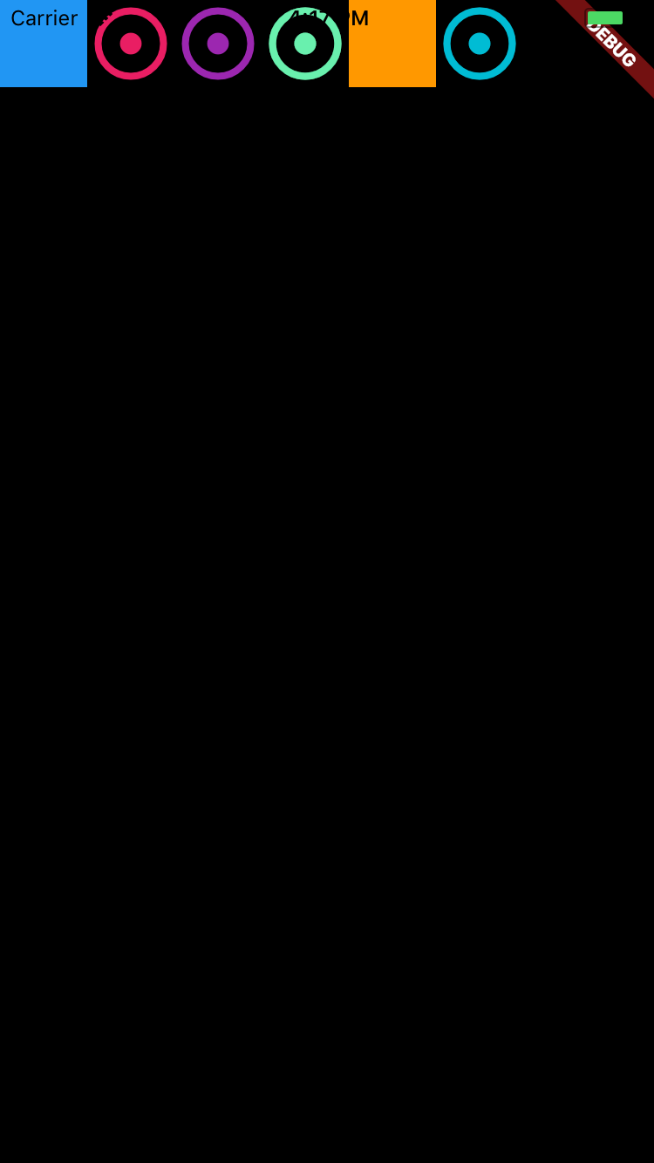
Column 部件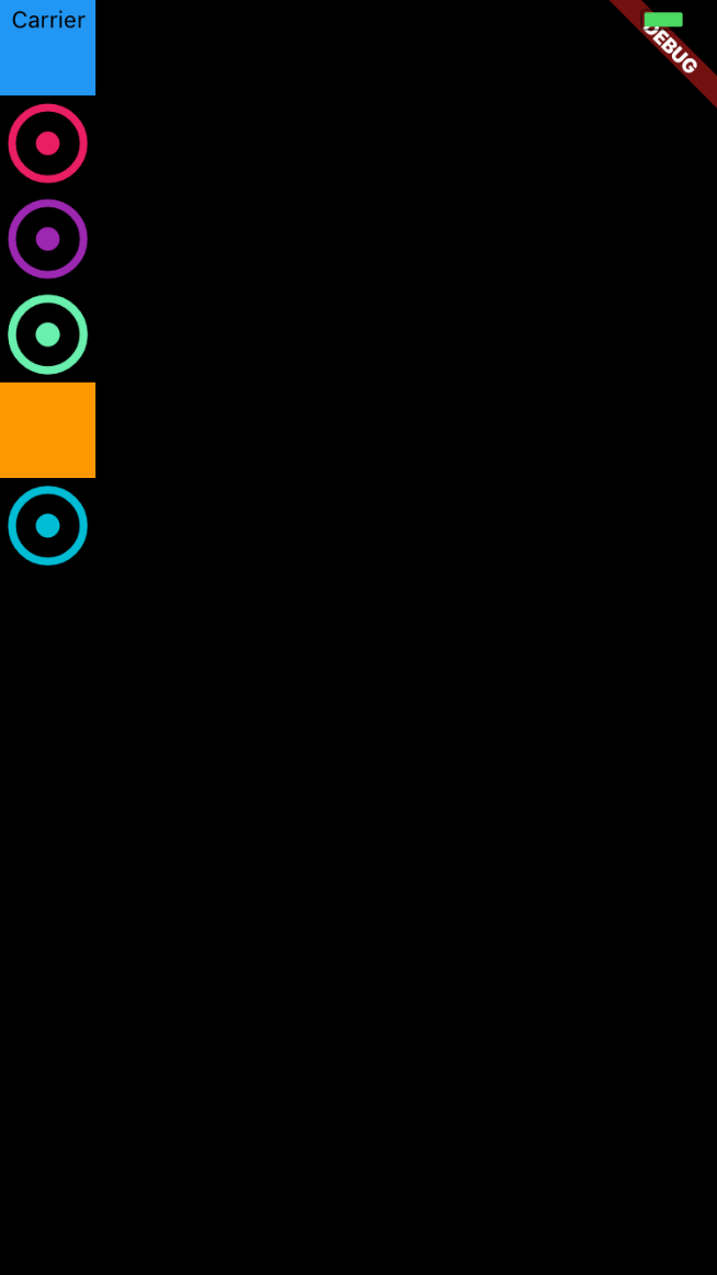
CrossAxisAlignment.center (默认值)
交叉轴居中对齐
相当于 CSS 的:
CrossAxisAlignment.end
交叉轴末端对齐
相当于 CSS 的:
CrossAxisAlignment.stretch
子部件填充满交叉轴
相当于 CSS 的:
CrossAxisAlignment.baseline
子部件 基线对齐
值为
CrossAxisAlignment.baseline时 必须同时使用textBaseline, 否则会报错没有用 baseline
使用 baseline
相当于 CSS 的:
textDirection
Row 部件的 textDirection
TextDirection.rtl
文字从右到左排列,主轴(水平)方向 start->end 是 从右到左
TextDirection.ltr (默认)
从左往右排列,主轴(水平)方向 start->end 是 从左到右
Column 部件的 textDirection
TextDirection.rtl
交叉轴(水平)方向 start->end 是 从左到右
TextDirection.ltr(默认)
默认情况不必多说
verticalDirection
和 textDirection 类似
VerticalDirection.down (默认)
从上往下摆放组件,竖直方向 start->end 是 从上到下
VerticalDirection.up
对于 Column 部件的子部件从下往上摆放组件,竖直方向 start->end 是 从下到上
mainAxisSize
所有子部件占据主轴的空间大小
MainAxisSize.max(默认)
加上黄色背景可以看到 Row 部件占据了一整行空间
Column 同理,不再赘述。
MainAxisSize.min
使子部件占据空间尽可能小。
Row 部件同理,不再赘述。