 nus-se-script
commented
1 year ago
nus-se-script
commented
1 year ago Team's Response
Disagree that the added image is visual clutter.
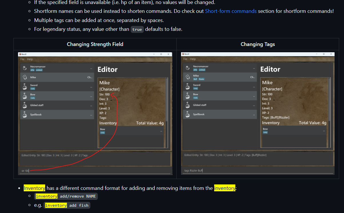
As you can see below, the image is displayed side by side with the other image, which reduces the amount of space / additional scrolling the user has to do, while providing an example of a field with a different input type (str which is numeric vs tags which are alphanumeric).
Items for the Tester to Verify
:question: Issue response
Team chose [response.Rejected]
- [x] I disagree
Reason for disagreement: It is precisely because the images are placed side by side that reduces its readability. By reducing the size of the images, it makes it difficult to read the individual images. Also, the other image is to show an example of the same command, just a different field. This does not add much value. Weighing the reduction in readability to the value added from the other image, I believe that the con of less readability outweighs the value from the second image.
## :question: Issue severity Team chose [`severity.VeryLow`] Originally [`severity.Low`] - [ ] I disagree **Reason for disagreement:** [replace this with your explanation]
In the UG, two pictures are provided for the
editcommand, just that each picture shows the editing of a different field. The second image does not add much value and it clutters the UG.