 Akikaze1119
commented
2 weeks ago
Akikaze1119
commented
2 weeks ago @KaiKoide Thank you for your review! I modified codes.
Closed Akikaze1119 closed 2 weeks ago
Akikaze1119
commented
2 weeks ago @KaiKoide Thank you for your review! I modified codes.
Overview
The task is to create a shared UI component for
steps indicator.Changes
Created
steps indicatorcomponent based on figmaScreenshots or videos
▼Figma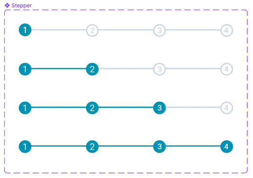
▼Code https://github.com/Tascurator/tascurator-frontend/assets/132441773/7ce8df02-e98a-4420-8c11-84dc2ec22c69
Notes
About bar style
I used hard code for setting the height of the horizontal bar.
h-1 (4px), which is too long for the bar.About the name
Since 'stepper' seems to be more common, both the file name and the component name are set to 'stepper'. Reference
About the confirmation code
The following code can be used for review.
Assignee Checklist:
Reviewer Checklist: