Team's Response
Our team does not think the diagram should be split into two diagrams because the Logic and Model components interact with one another. It would be easier to see this interaction if the diagrams are combined into one.
Additionally, we have already simplified the Sequence Diagram to only include the Logic and Model components, it should not be that hard to read.
Items for the Tester to Verify
:question: Issue response
Team chose [response.Rejected]
- [x] I disagree
Reason for disagreement: Thanks for the response. However, I am sorry to disagree with your stance.
I agree that we need to show the interaction between the 2 component, but we can greatly reduce the complexity and improve the readability by treating the other component as a black box in diagram for Model and Logic component.
Another alternative would be just omit the details that are not required for the current interaction and treat that part as a black box, this would also greatly reduce the complexity of the diagram.
With this, the diagrams are easier to comprehend and maintain the all the relevant information at the same time.
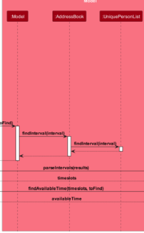
If we look the current diagram, we can see that the Model component is exposing too much low level details which can be omitted or abstracted to another diagram.
Example :
AddressBook and UniquePersonList can be totally omitted or put in another diagram for Model component, as it is not required to for the users to know about these information to understand the interaction.

If we look at the image above, we can see the sequence diagram is stuffed information. In fact, I think it covers too much information at once, spanning
LogicandModelcomponent at once.I think the diagram can be simplified by breaking them down into 2: one for
Logicand one forModelcomponent.