 GreenTurtwig
commented
6 years ago
GreenTurtwig
commented
6 years ago It's going to be difficult to display one as an icon.
A gauge could potentially be used, but it may not get the point across depending on the use case.
Open SeidiJr opened 6 years ago
GreenTurtwig
commented
6 years ago It's going to be difficult to display one as an icon.
A gauge could potentially be used, but it may not get the point across depending on the use case.
 SeidiJr
commented
6 years ago
SeidiJr
commented
6 years ago For medic sites, it won't be a good solution.
GreenTurtwig
commented
6 years ago Yeah, which I why I said it may not get the point across. If you could get an example that would be great. :+1:
 MrGrigri
commented
6 years ago
MrGrigri
commented
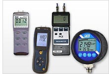
6 years ago I feel this might be too niche for this icon pack. We cannot add every measurement device.
For reference, this is a manometer
 james-jenner
commented
6 years ago
james-jenner
commented
6 years ago The manometer comes in all styles and shapes, for example.
A hand held manometer is very similar to other devices that measure something. So you could just have a generic "hand held device for measuring x" icon. This would cover things like measuring decibels, frequency, temperature, light, voltage, current, resistance, etc. For example: https://www.jaycar.us/multifunction-environment-meter-with-dmm/p/QM1594.
This would be good because a gauge icon does not convey performing a measurement via a hand held device. To use it in such a context would be confusing imho.
Maybe something along the lines of the following (48px):

Maybe with rounded edges would be more appropriate, but I find any angled lines are always difficult to get pixel perfect at 48 and under.

james-jenner
commented
6 years ago So something like the following?

Looks a tad like an iPod to my mind, but maybe that's just cause I'm old ;-)
Oh and someone told me that it looks like a radio (speaker at base and gauge at the top for selecting the station, this is from someone a tad younger than me, but also old, so used to radios).
Hmm. Wasn't sure what you meant, so created a few:
 Filled with rounded screen
 Filled with lines to represent screen
 Filled with cutout screen
james-jenner
commented
6 years ago I like your approach, but not sure about the analogue indicator. Maybe remove the indicator and it will look good. The widths look a tad odd to my eyes, but maybe it's the square corners inside he rounded corners creating that effect. Need to get someone to look at it without context, as it still looks a tad like a transistor radio (I don't think there is any way to resolve that).
Did a new variant, very similar to yours. Main diff is the inside curve on the "lcd screen" part and I've simplified the dial.


 mririgoyen
commented
5 years ago
mririgoyen
commented
5 years ago Removing the Contribution label because no source SVG files were provided.
A manometer icon