Team's Response
Thank you for the report. Due to the limitations of a PDF file and its margins, the picture cannot be much larger otherwise it would run to the next page. We recommend zooming in, or looking at the online website for a clearer definition. In addition, this is of much lower priority than the work already done in v1.4, and is thus notInScope.
Items for the Tester to Verify
:question: Issue response
Team chose [response.NotInScope]
- [x] I disagree
Reason for disagreement: I do not agree that documentations, especially maintaining the overall readability and navigatibility of user/developer guide is of lower priority than developing the product as a whole. It is important to ensure that documentations are clear such that they could be easily referred by the user/onboarding developer
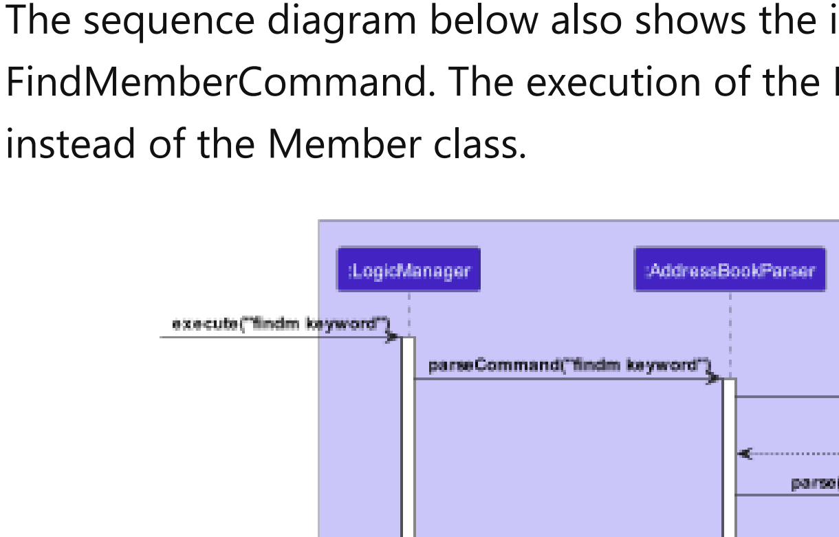
Point in fact the image was blurrier than it was supposed to be given the resolution, and zooming in would not make a huge difference to the overall readability, it's moreso an oversight from the dev team when inserting the diagram than a limitation of the PDF format

This is how the diagram looks like when zoomed in. While you could discern the individual words with cognitive abilities, I believe that this is not very reader-friendly
As such, I disagree that this is not in scope of the current version
The sequence diagrams in the DG are too small and blurry to read. See the following screenshot
Consider using better quality images or resize sequence diagrams so they appear more readable in the DG