Unvanquished / updater

QML based updater to install, update and launch the Unvanquished game.
https://unvanquished.net/download
16 stars 7 forks source link

a bunch of fixes and improvements, fix #39 #40 #42 #43

Closed illwieckz closed 4 years ago

illwieckz commented 4 years ago

medium thumbnail not always exist, the full one is expected to always exist, fix #39

we can display the blog post even if the thumbnail fails to load, fix #40

it's better to tell people what to do, fix #42

illwieckz commented 4 years ago

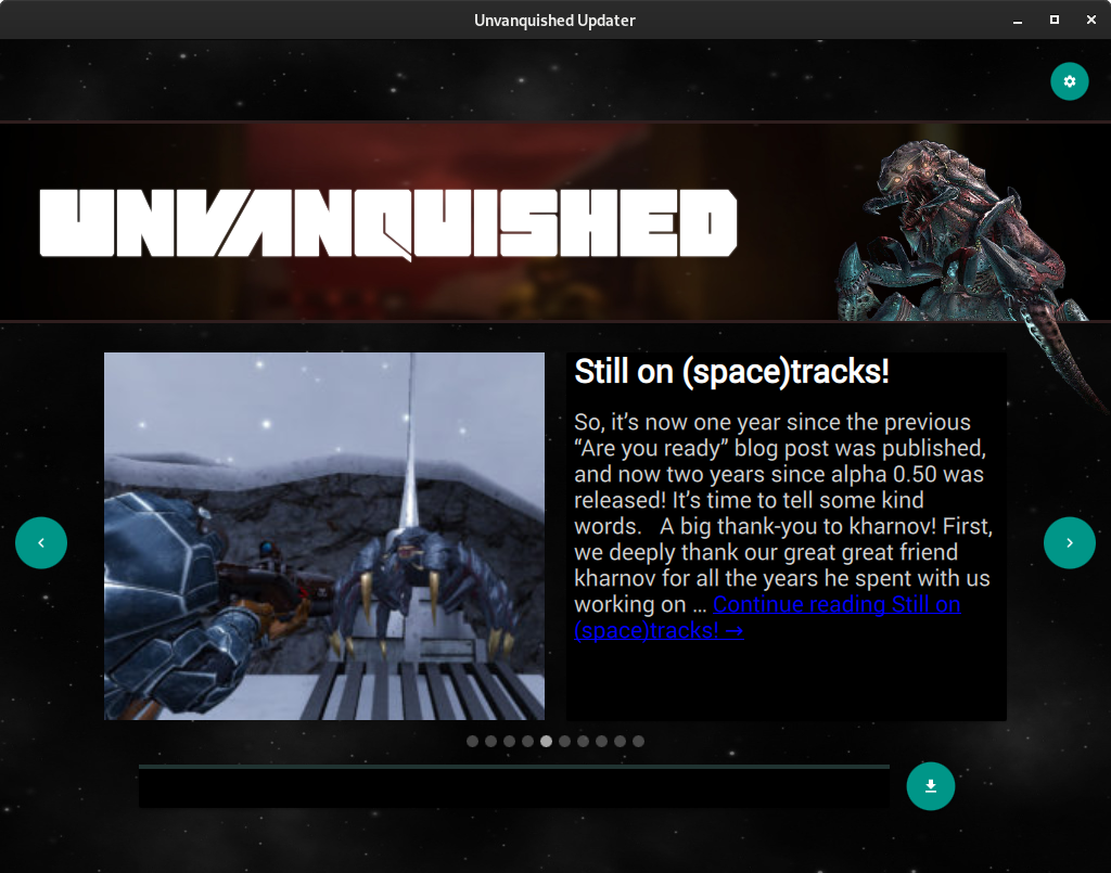
What I see is that the eight of the text zone is the eight of the image, which looks a bit inconsistent across news. If I'm right the medium thumbnail is cropped to a square (there is an option for that Wordpress side). But that's a minor issue that is far more acceptable than news that don't load at all.

updater

updater

updater

The other issue is of course that there is more downloaded data.

I really don't know how to do “try medium then full” in that code.

illwieckz commented 4 years ago

OK, I found the way to attempt to load the medium one then to fallback on full one.

illwieckz commented 4 years ago

I did a large rework of news stuff

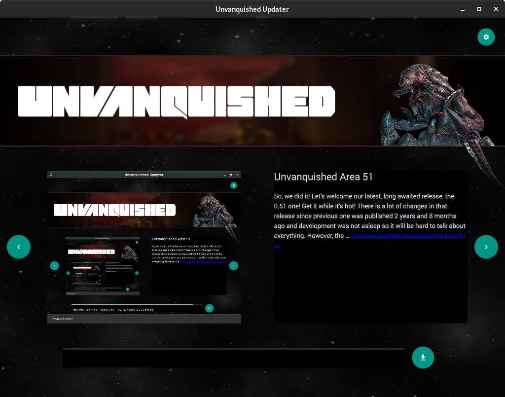
Thumbnail quality before:

unvanquished updater

Thumbnail quality now:

unvanquished updater

Loading thumbnail (it keeps this state if it fails to download, I tested wrong url which is taken as a wrong image format, and network disconnection):

unvanquished updater

Missing thumbnail (must not happen, but we are ready):

unvanquished updater

illwieckz commented 4 years ago

I fount a way to also display fallback on thumbnail error

the rotating loading symbol is displayed until the fallback is loaded or fails to load, then the thumbnail is displayed or the fallback is printed instead

it is known to behave this way on wrong url, bad image format, and network outage

illwieckz commented 4 years ago

The updater also displays a fallback post if json fails to load.

I verified it works on disconnected network, unresolved domain name, or 404 error, there code also take care of bad json but that part does not work, probably due to a Qt bug (they even returns HTTP 200 code on 301 redirect… so I would not be surprised if there would be other bugs).

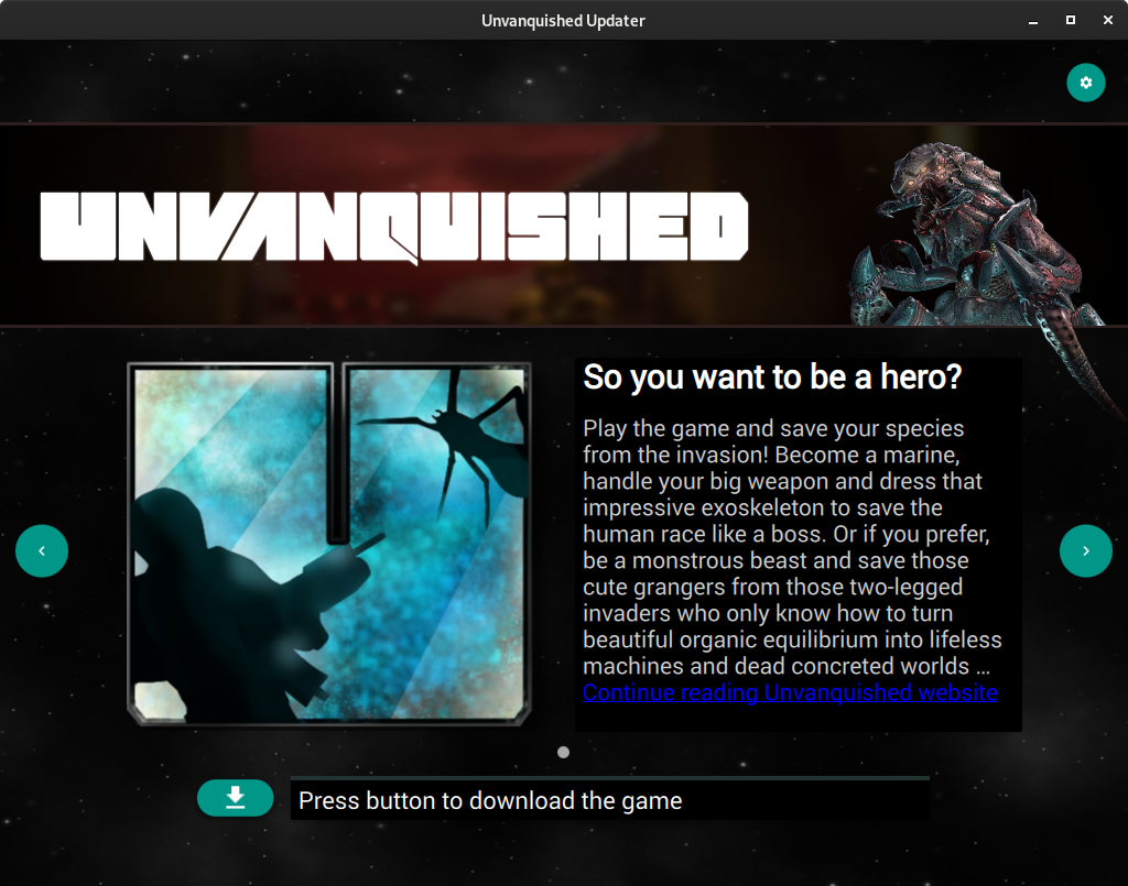
By the way the fallback post looks like this, I just reused the words I've recently written on home page:

unvanquished updater

The link open to the Unvanquished home page.

illwieckz commented 4 years ago

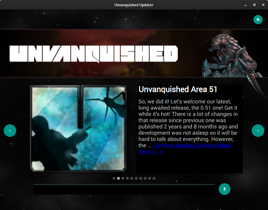
This is the way it looks with a 256×256 unvanquished icon as fallback instead of a 128×128 one:

unvanquished updater

illwieckz commented 4 years ago

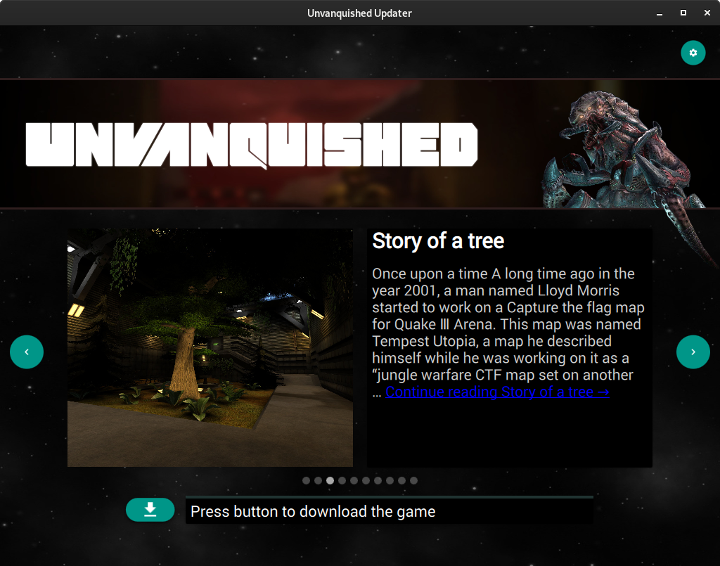
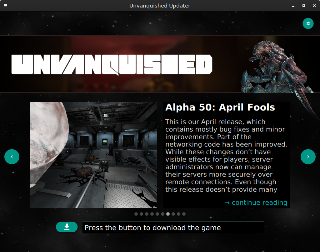
When we see this:

unvanquished updater

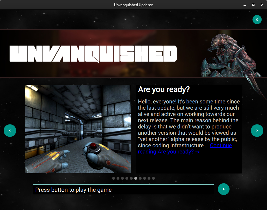
We notice user is more urged to browse the website than to download the game, and the instructions to browse the website is more obvious than to download the game or to play it.

This is a variant of the issue reported in #36 and tracked in #42.

I added obvious instructions on the progress bar, while I was at it I also increased a bit the progression info text size to make it more readable.

unvanquished updater

unvanquished updater

unvanquished updater

Notice the stealthy bottom notification is kept. This is not bad as it draws attention something happened:

unvanquished updater

unvanquished updater

We may also put the button on the left so the user naturally read it before reading text, making it more obvious, something he can't miss. The button would also be closer to the sentence talking about a “button”, then the user has less effort to make a cognitive association between those.

illwieckz commented 4 years ago

So, I did this:

unvanquished updater

unvanquished updater

unvanquished updater

Note that I got the rounded-rectangle button shape by accident (height that is larger that the a bottom/top anchor), and liked it. I would like to know if it's expected or not…

illwieckz commented 4 years ago

@GamesOpenSource what do you think about the last three screenshots? :smiley:

illwieckz commented 4 years ago

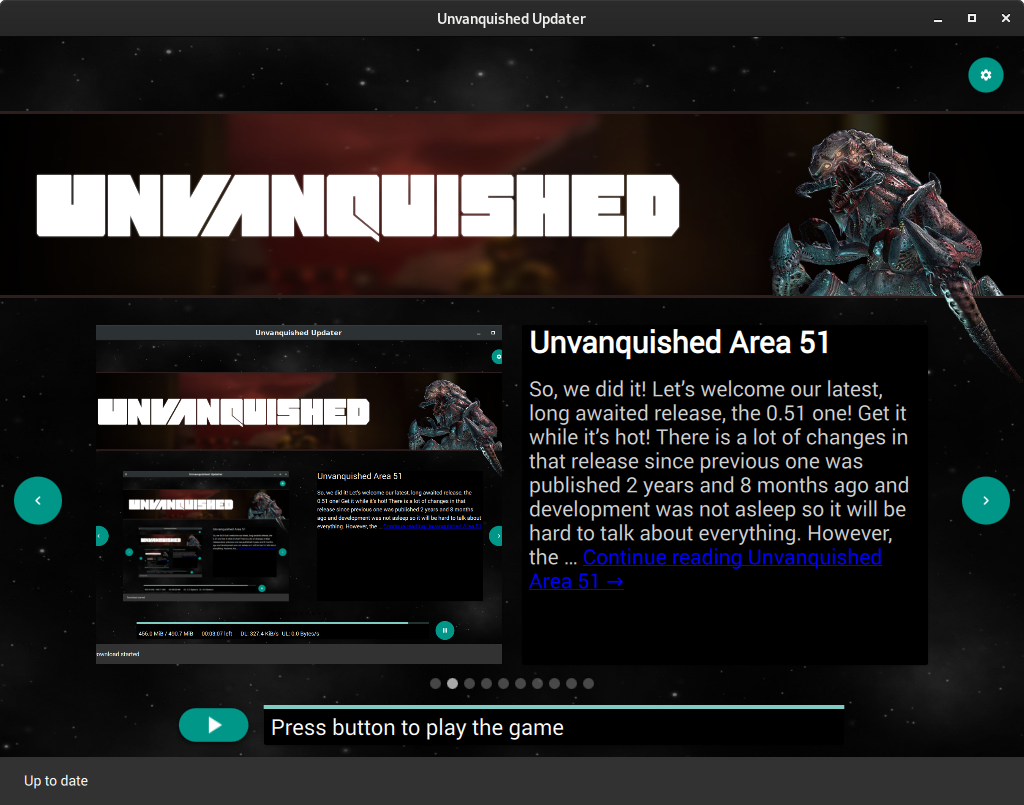
A little touch-up, I used a real symbol instead of a poor-looking > one in disappearing bottom notification:

unvanquished updater

Edit:, After some thoughts I just cut the notification after “Up to date”, there is no need to repeat how to play the game, and this is more coherent with other messages that just notice status but does not give instructions:

unvanquished updater

illwieckz commented 4 years ago

I found a better way to load the fallback posts json, it works anytime.

The code now logs the json url that is fetched:

qml: fetching posts json: http://www.unvanquished.net/index.php
qml: failed to parse posts json with error: SyntaxError
qml: message: JSON.parse: Parse error
qml: fetching fallback posts json
qml: fetching posts json: qrc:/resources/disconnected_posts.json
illwieckz commented 4 years ago

This looks better with a 470×470 fallback icon :smiley:

unvanquished updater

See https://github.com/Unvanquished/Unvanquished/pull/1118 about the story behind that icon :wink:

Viech commented 4 years ago

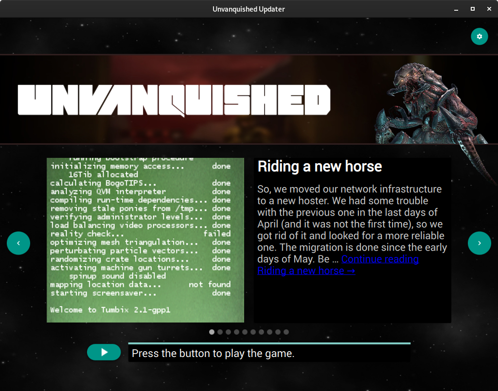
Press the button to download the game.

Just "Continue reading." should be enough.

illwieckz commented 4 years ago

Press the button to download the game.

unvanquished updater

I find the . very weird, this is an instruction, this is text is not expected to be read as an informational content about the game. I think it's better to keep the sentence open since player is opening his mind to do something after that (playing the game), and the dot introduces a closing feeling which is the opposite we must look for. That's the same reason it's not a good things to end SMS or a tweet with a dot but it's better to keep things open, because it's open to what may happen after that.

It's also the same reason there is no ending dot in “stop” roadsign.

It looks to be a bad idea to add a dot to anything that is not a blog post nor text that is meant to be read as a story.

So at this point I added the the but not the dot:

unvanquished updater

illwieckz commented 4 years ago

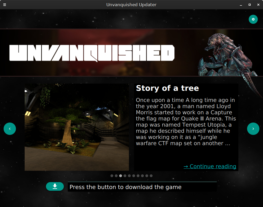
Just "Continue reading." should be enough.

This part is done by Wordpress itself, this is why we also have no control on the color of the link (which is ugly). We use the excerpt Wordpress produces.

The other option would be to add updater ability to do the excerpt itself, by stripping all html markup from the complete article (which is already present in post json), truncate it, add an ellipsis then rebuild a link. This would be the best solution and it would give us absolute control on the excerpt length (we may truncate on character count instead of word count to avoid long words to overflow the text zone) and absolute control on link style (it would be better to reuse the cyan-ish color).

I'm already thinking about this but that's not for today and probably not for this PR.

Viech commented 4 years ago

It's a proper sentence, you can hardly compare it to a stop sign. Sentences always end in a dot and it is always bad style if they don't. Even on Twitter, the 140 character limit does not make it good style to omit the dot, professional/official twitter feeds will use correct grammar. Coding style guides will force you to end your imperative comments with a dot even if they allow you like 70 characters tops (think of PEP 8 + PEP 257). Many minimalist advertisements will end their (imperative, all uppercase or all lowercase) sentences with a dot (think of "JUST DO IT.", "eat fresh.") regardless of how that makes them appear less exciting or how it could counteract the feeling of openness/freedom that they shall transport. We are no exception here.

GamesOpenSource commented 4 years ago

Kinda weird . discussion but I dig it.

I guess game launchers tend not to have full stops in short statements image image(short: no ., long: yes .) image

I guess this one is somewhat comparable: image

The play button should simply have "Play" in the button, like steam does, so you don't need to second-guess or read text to figure out how to play ^^: like steam: image or epic: image (well this is no play button because I have no epic games installed but still) Or unity? image

The statement could be simply "Unvanquished is up to date" or "Unvanquished ins ready to play"

Whatever, great job on fixing the issues!

PS: the blue link on black BG is unreadable by the way.

illwieckz commented 4 years ago

Yes, the “play” text in the button is not a bad idea, except the “download” button becomes a “play” one and those will not have the same time…

While I would tend to put dots everywhere because of purity, your examples illustrates wells the absence of dot in direct information (status, instructions) and the usage of dot in blablabla (explanation…). This looks to be the very common guideline out there.

GamesOpenSource commented 4 years ago

@GamesOpenSource what do you think about the last three screenshots? 😃

Oh sorry, I had missed that.

Great progress, glad it's being fixed!

When I run the updater now it immediately starts the game, not sure I can test anything until the updater gets a new release.

DolceTriade commented 4 years ago

if you click the settings box in the splash screen, it will force open the updater and not open the game.

illwieckz commented 4 years ago

you would have to build the updater yourself to test those change, btw

illwieckz commented 4 years ago

@Viech I found a not-so-hard way to redo the link.

I stripped the original link from excerpt, then added a rectangle at the bottom (so it's always at the same place) with a brand new link we have full control on (text, style…).

While I was at it I clipped the excerpt in case it's so long it can reach the link. This may happen with very long words and/or user having custom large font size on his computer.

unvanquished updater

unvanquished updater

If we find a way to properly strip the html, we may just use the post itself and not rely on excerpt.

illwieckz commented 4 years ago

I updated the link text (which is an instruction) to put a capital, to be consistent with other instructions:

unvanquished updater

illwieckz commented 4 years ago

I also redid the icon, using the icon by Gireen I found there:

unvanquished updater icon

Then I fixed some issues (small pixels were looking like there was a light rotation) and readded a border and a shadow by reusing the ones from the Unvanquished icon, I made the adjustments (repainting the reload symbol on border):

unvanquished updater icon

The Windows .ico file was redone with steps from 16 to 512.