 nus-pe-bot
commented
3 years ago
nus-pe-bot
commented
3 years ago Team's Response
This is purely a visual bug, it purely reflects the tester's preference of how a user guide should look but in our opinion, leaving each section to its own page makes our user guide look neater.
In addition, we include the Return to Table of Contents button in order to save the user time from having to scroll between pages.
For the User Guide, we allocated a single page to most features since printing to PDF could lead to unexpected page breaks sometimes and we believe that using a full page on each section is good formatting especially since we provide a return to table of contents button so the user can easily navigate to other sections after reading a specific section.
Items for the Tester to Verify
:question: Issue response
Team chose [response.Rejected]
- [x] I disagree
Reason for disagreement: As a reader reading through the UG, it feels like I need to do much scrolling to get move on to the next parts each time, which would make it difficult for the reader.
:question: Issue severity
Team chose [severity.VeryLow]
Originally [severity.Medium]
- [x] I disagree
Reason for disagreement: Perhaps low is more appropriate, as there will be users who will get inconvenienced by the scrolling and constant whitespace, making it less readable
Although the UG is split up into sections, many places have loads of whitespace which could have been better utilised.
for example, the help command is very short, and leaves behind much whitespace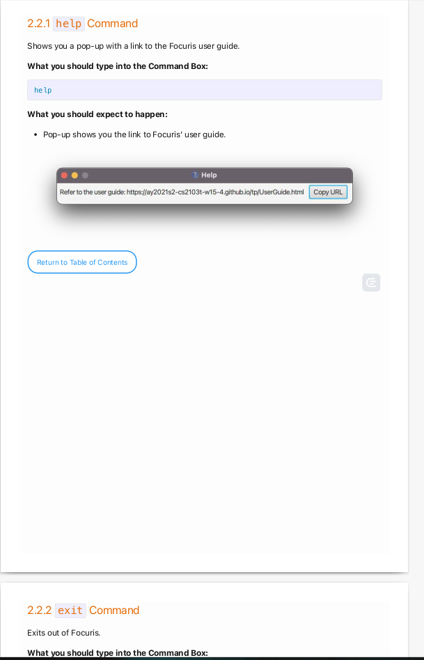
which could have been easily filled up by the exit command, which is right after the help command in the UG, that takes up very little space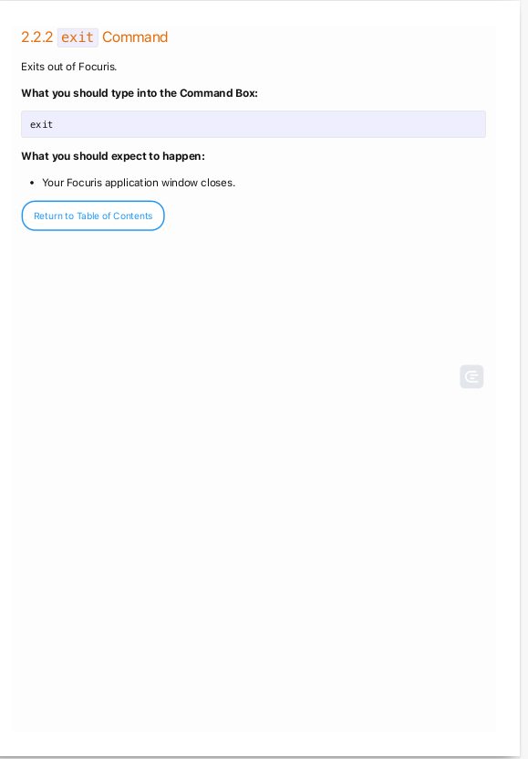
This has recurred in other places in the UG as well