Open JuliannaR opened 6 years ago
Hm, I'm not sure these apply.
We don't actually remove focus, we just remove focus styling when it seems likely that the user will not need to know that focus has been moved (i.e. when the user is using a mouse). The element is still focused.
2.4.7 states "Any keyboard operable user interface has a mode of operation where the keyboard focus indicator is visible", which this clearly provides: as soon as you use the keyboard, the focus outline becomes visible.
Hey @JuliannaR thanks for bringing these points up. I don't know if we've explained the intent behind this pseudo class well enough (I was actually working on that a bit this week). Sorry this turned into a bit of a blog post!
Our goal is to make sure that anyone who needs a focus indicator has one. We think in order to do this, we have to address the problem in two phases:
outline: none;
to recklessly remove focus indicators.outline: none
First, we wanted to figure out why developers do this. The answer there is pretty clear: when a sighted user is using a mouse or touch screen to interact with certain control types, the browser does not display a focus indicator. But when developers create custom versions of those same control types (or create entirely new widget types), the browser opts to display a focus indicator. The best example of this is an unstyled <button>
element.
If a developer tries to style the <button>
element so it fits in better with their site design, suddenly it starts displaying a focus indicator on mouse/touch click.
The developer googles "how do I get rid of this blue ring?" and there are a litany of StackOverflow posts explaining the outline: none
trick. Even though folks in the accessibility space have tried mightily, for years, to tell developers not do this, the practice remains extremely prevalent.
Our thinking with :focus-visible
is to say "ok, we acknowledge that this happens and is going to continue to happen. How can we at least make sure developers do this in a responsible way?" In other words, can we make it so your button at least matches the behavior of the native <button>
and remains keyboard accessible. Even achieving this goal would be an improvement on where we are today.
Aside: Sometimes the developer isn't even in full control of the situation. Recently someone in the a11y Slack channel told me that after they turned their project in, the client asked, "What's with the blue outlines on mouse click?" The developer explained why they're important for accessibility. The client said "We just don't like them. We're going to have our developers remove them." The developer protested, but at the end of the day the client did what they wanted. It's possible that if :focus-visible was shipping in the browser by this point, they could have said, "As a last resort, let's use this instead."
Keyboard access is great, but as you pointed out, there are plenty of folks who use a mouse or other pointing device who may still want a consistent focus indicator.
On mac OS, there are settings you can turn on to tell the system certain things about yourself. For instance, someone with a vestibular disorder can set the 'Reduce Motion' flag to disable animations that might cause motion sickness.
This, in turn, can be picked up by the browser via the prefers-reduced-motion media query. Developers can then use that media query to disable bothersome animations on their sites.
We would like to do something similar with :focus-visible
. By default it would only match against keyboard focus, but if the user flipped a flag on their system, we would override this rule and match it on any focused control, regardless of the user's input modality. We deliberately worded the spec text of the :focus-visible selector to allow for this.
The :focus-visible pseudo-class applies while an element matches the :focus pseudo-class and the UA determines via heuristics that the focus should be made evident on the element.
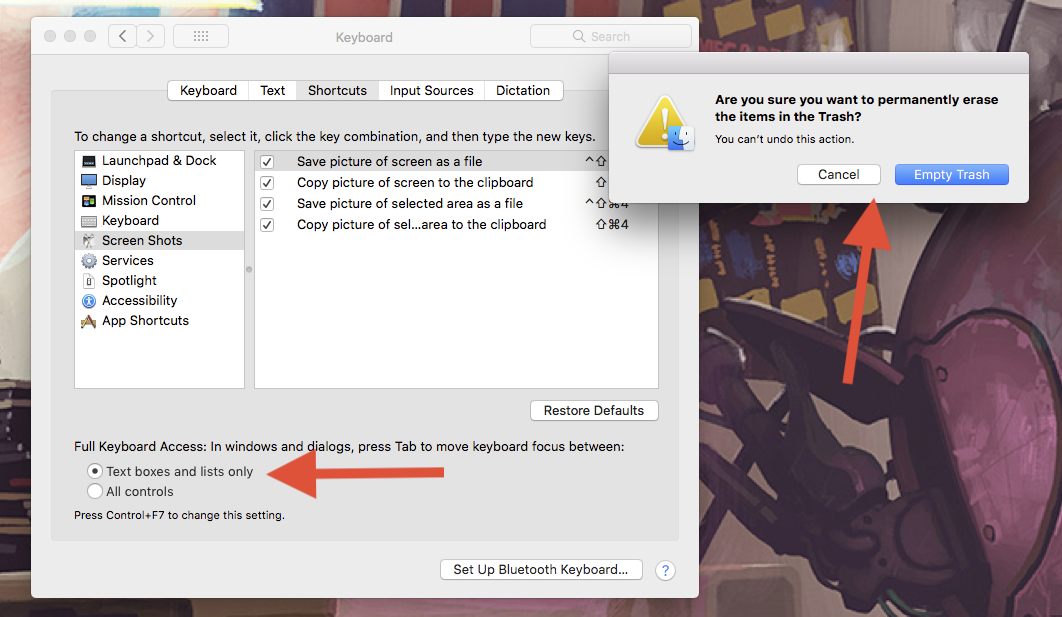
You can kind of see something similar (but not exactly the same) on Mac OS today, which only displays focus indicators on specific controls unless you toggle the Full Keyboard Access flag.
So given the following CSS, which would make a custom button exactly match the behavior of the built-in <button>
:
.custom-button:focus:not(:focus-visible) { /* removes focus outlines on mouse clicks */
outline: none;
}
If a user flipped a hypothetical flag to tell the system that they always want a focus indicator, then the above style would no longer match—because we would start applying :focus-visible
to any focused element—and the focus indicator would appear on mouse clicks.
To take things a step further, we would like to move the behavior that the browser currently uses to decide if/when to display a focus indicator on a control into the UA stylesheet by using :focus-visible
. In other words, if we had CSS that looked like this in the UA stylesheet:
button::focus-visible { /* only show focus indicator on keyboard focus */
outline: auto 5px -webkit-focus-ring-color
}
We could recreate the existing behavior of <button>
, with the added benefit that our hypothetical flag would be able to override this behavior, and display a focus indicator on mouse click for <button>
.
If you have made it this far—thank you 😀
To summarize a bit, we absolutely agree that folks should have a consistent focus indicator. We also feel like things are a bit of a jumble at the moment and, try as we might, it's tough to get designers/clients/whoever to agree to always show one. We don't think the situation can get much worse than it already is, so tactically, we'd like to approach the problem from a different angle: Help folks do things responsibly, while also making the system smarter.
I hope this explanation helps some and I'm happy to keep discussing it!
@robdodson & @alice I think its one of these cases that to reduce reckless behaviour the choice gets made for us. Under the Cognitive Gap Analysis there is a lot that could not even be brought into WCAG 2.1. Things like an inconsistent focusing method might actually have a significant negative impact on members of that disability group. Assuming that because a user used a mouse action means that they do not need focus styling is kind of a difficult position to take. Those with learning and cognitive disabilities and disorders require highlighting in a way that is understandable. If they are looking for both use of keyboard and mouse they will likely run into issues. I work with a core user group that represents many of the types of disabilities so I am very aware of how users are using these types of identifiers.
I actually really get where your coming from, and honestly after having the focus debate hundreds of times with devs who want to fix the "design" I'd still hate to see the gap for support for cognitive disabilities increase. I totally agree with the thoughts on helping people do things more responsibility to aid the greater good.
The statement "Removing the focus outline is like removing the wheelchair ramp from a school because it doesn’t fit in with the aesthetic." does actually apply. We need virtual wheelchair ramps to help with the accessible and usability of our content. Inclusive by default....and not exclusionary to stop bad practices. I kind of feel like this is like blaming the woman and talking to her about how she dresses, rather then addressing how the man acted towards to woman because one is perceived as an easier problem to solve then the other.
The premise is right....could this be done as a user option in the browser to be turned off to maintain a standard inherent focus?
Also, how would this work with sip and puff technology, switches, and voice rec navigation?
Still working on a follow up to your previous comment but wanted to quickly respond to this one:
Also, how would this work with sip and puff technology, switches, and voice rec navigation?
I need to look into how Chromium categorizes all of these input methods to give a definitive answer. But off the top of my head I'd say that I'd like all of these to fall under the same umbrella as keyboard focus, so they would all trigger a focus indicator/match :focus-visible
.
@robdodson Thank you for your willingness to engage and discuss this topic. For me it's an important one.
@JuliannaR Thanks for the follow up, I definitely understand where you're coming from.
A couple of thoughts:
:focus-visible
will encourage bolder, more noticeable focus styles by being more choosy about when they apply.:focus-visible
styles to apply at all times. On ChromeOS, for example, there is already a setting to always show a consistent focus highlight regardless of author styles.I would be really interested to hear if your user group experience is consistently towards finding the focus ring useful in "pointer mode". If a user is not currently or about to use the keyboard, what does the focus ring tell them? Is it more of a "bookmark" or "cursor position" of the last thing the user interacted with?
To echo Alice's points, and respond to a few of your comments:
I think its one of these cases that to reduce reckless behaviour the choice gets made for us.
… could this be done as a user option in the browser to be turned off to maintain a standard inherent focus?
As Alice mentioned, our goal is to have a similar option as ChromeOS to force an always-on focus indicator. This option would likely need to be opt-in by the user.
But we don't want to solely rely on this option. We also want to improve the status quo of focus states on the web. That means addressing the unintended side effects caused by the :focus { outline: none; }
trick. Our hope is that by providing a slightly better focus selector, developers will be able to build experiences which are at least on par with native UI. If their controls can exactly match the behavior of the built-in HTML elements, there's fewer chances for users to complain about unexpected focus indicators, and fewer chances for the developer to accidentally nuke focus styles across the page.
As Alice mentioned, it would be really useful if you could tell us any use cases where you think :focus-visible
would be problematic. The reason we're developing this in the open on GitHub is specifically to receive feedback and incorporate it into the design.
quick note, I updated the title of this issue so it is easier for folks to find
I have concerns about this technique for users like myself with low vision. I often switch between input modalities such as by clicking and dragging off a button to set focus somewhere then use the keyboard to navigate from there. I may click on a radio button and then use arrows to select other radio buttons. I will switch between touch, mouse, keyboard, and many other settings such as large text, screen reader, or zoom depending on the situation. This pattern of switching between modalities is pretty common with some user groups thus the new WCAG 2.1 SC AAA criteria for allowing concurrent input modalities.
In the demo I can see that the focus ring does come back if you use the keyboard after the mouse -- so it's the initial situation where it is lost. Also from a low vision/cognitive perspective the lack of focus ring on click provides less re-assurance for me of where I am and what will happen when I press another key.
I understand that browser's can implement a feature to always turn on focus -- but in my experience browser's inconsistently implement these features and there is no guarantee that all browsers will. Android browsers like Chrome for Android which can and often are used with the keyboard often lack these features because it's wrongly assumed that mobile or tablet users will only be using touch.
My experience with features like Google Chrome removing support for user style sheets or not supporting Windows high contrast mode leaving users with low vision to use stylish or the contrast plug-in are not sufficient. The increase contrast plug-in is a filter that can't address all contrast issues across a complex page and often sets dark text on a dark background. Use of stylish or other extensions for styles means the styles are placed at the document level and thus can be very complex to overwrite author styles with specific prioritization such as when IDs are used. These are impractical for the standard user. So in short I would want a covenant that the browser implements this focus technique that they also implement the user setting at the same time in all their browser's not just the desktop browser.
In the demo I can see that the focus ring does come back if you use the keyboard after the mouse -- so it's the initial situation where it is lost.
I wanted to mention that in the latest version of the demo, if you click on an interactive control, and then press any key on the keyboard, it will switch to keyboard modality mode and restore the focus indicator. For example, mouse-click on a button, then press the shift
key, and the focus ring should return. Previously it would only restore the ring if you moved focus to a new control using the keyboard. The updated behavior matches the native behavior in Chrome and is a regression we fixed in the polyfill.
So in short I would want a covenant that the browser implements this focus technique that they also implement the user setting at the same time in all their browser's not just the desktop browser.
That's interesting. I'm not sure if that's something we can enforce from the web standard side of things, but I could ask the TAG. Perhaps it's something we could add to the language of the spec itself as a recommendation.
Right now if you use the keyboard and then touch the screen to scroll or pinch zoom on my touch screen laptop or use control+scroll on the mouse the indication of keyboard focus stays visible. This is good and I would want to ensure that this scenario is captured as the intended behavior.
On a separate note -- I did try the shift or control trick after clicking and moving off a button and the indicator did come back.
@robdodson I do have another concern now as well. With screen readers like NVDA when you arrow through content in browse mode NVDA will focus controls like buttons (JAWS does not) -- I believe VoiceOver does. In your demo when I arrow to a button in browse mode with NVDA in Chrome it is not visually focused. As a person with low vision I do want it focused. The code things I am a mouse user because NVDA is programmatically focusing the button and the key is not sent to the browser -- but indeed I am using the keyboard. With tab/shift+tab it's different as those are sent to the browser and the page displays the visual indication of keyboard focus.
The NVDA issue sounds like a great use case for a browser preference (or possibly even an automatic setting to match :focus-visible
if assistive technology is running, although that does run into issues with screen reader detection using :matches
).
The code things I am a mouse user because NVDA is programmatically focusing the button and the key is not sent to the browser
Do you happen to know if NVDA is calling focus()
on the elements in JavaScript, or is just moving its internal cursor to that control and reading its accessibility tree node?
NVDA is calling .focus()
Such a great discussion here, thanks everyone for recording your insights. There was a similar conversation a few days ago on Twitter about a related tool, What Input, which is prior art for :focus-visible
. Questions arose about how focus intents should be handled for voice interfaces like Dragon Naturally Speaking, echoing the concerns in this thread for users with cognitive and physical disabilities. Eric Wright recorded a great screencast on what happens currently with those two tools, and it's unclear what exactly should occur in the case where AT is performing clicks on behalf of the user but they need visible focus indicators to know where they are on the screen. Alice hinted at this challenge in her comment about :matches
: https://github.com/WICG/focus-visible/issues/128#issuecomment-379507144
The OS setting idea is a winning goal in my opinion, but I agree that it would be good to get the best defaults possible for a wide range of users with disabilities. I don't know very much about how Dragon operates under the hood, does it interact with accessibility APIs in similar ways to NVDA? Are there any hints that can be used as signals to the user's intended interaction, such as mouse events without X/Y positions or other odd characteristics? It seems doubtful, but maybe someone with more intimate knowledge can help inform us on possible workarounds.
@marcysutton Thanks for the follow up!
I agree, a user preference seems ideal. I made a note of this in my PR to the Selectors Level 4 Overview: https://github.com/w3c/csswg-drafts/pull/2897/files
It looks like Dragon possibly doesn't go via the usual accessibility APIs, as far as I can tell without trying things out.
Having different focus indicators for mouse and keyboard users is going to be very confusing. More specifically for users with low vision or cognitive impairments or learning disabilities. It is very problematic. Focus indicators need to be presented in a consistent way.
I think there are several usability and accessibility issues with most of the demoed options here.
Common WCAG 2.0 AA failures include: Common Failures for SC 2.4.7 F55: 2.1.1, 2.4.7, and 3.2.1 due to using script to remove focus when focus is received. F78: Failure of Success Criterion 2.4.7 due to styling element outlines and borders in a way that removes or renders non-visible the visual focus indicator