Open eeeps opened 3 years ago
What, exactly, is device-width
in <meta name="viewport" content="width=device-width">
? Could we have a hint that sent that?
As best as I can tell it's spec'd here, with a circular definition of 100vw
.
As best as I can tell it's spec'd here, with a circular definition of 100vw.
Looks like the vw/vh units are defined relative to the UA-default viewport size. That seems like it might be a good fit here, actually.
@acomminos 100vw
on Chrome Android on a page without a parsed/applied <meta name=viewport>
= 980px, which doesn't help us.
What would help us (I think?) is a resolution to this issue: https://github.com/w3c/csswg-drafts/issues/1323
In the meantime, we could use some combination of working backwards from device-width
and @patrickhlauke's explanation in that issue:
the viewport / mapping of CSS pixels to hardware pixels determined by the device/OS/UA to be the "best" mapping / usually the mapping closest to the reference pixel https://www.w3.org/TR/css3-values/#reference-pixel based on the device's general use and viewing distance
...but I get ahead of myself.... @acomminos can you share a bit more about Facebook's use case for Sec-CH-Viewport-Width
?
@eeeps, it's to improve our server-side rendering pipeline, which depends on the exact dimensions of the device viewport. Providing this lets us precompute layouts and styles for better performance on lower end devices.
With more accurate viewport information via client hints, we can drop the cookie we use for storing the last recorded width/height/density, which can be out of date quite often.
Thank you for bringing this up @eeeps. I agree that the current implementation has limited value. Especially for non-mobile user-agents.
In ImageEngine (disclaimer: I work there) we use viewport-width
as a fallback for mobile user-agents when no other reliable information is available. For desktops viewport-width
is useless for our case which is real time image optimization. It would help though, like facebook suggests, if viewport-width
was simply reporting the innerWidth
. To simulate time travel, the hint could be defined as critical.
On first thoughts, I'm not sure I'm in favour of through new hints at the problem. I'm just thinking about the potential mess and confusion among devs with privacy, opting in and delegating permissions across origins. The whole space of the various client hints is already too "dynamic" for most devs to keep up (imo).
@yoavweiss and I discussed this today. We have a shared gut sense that some sort of client hint should expose what the viewport dimensions would be, if a <meta name="viewport" content="width=device-width">
is present on the page, for folks who want to do any kind of adaptation on navigation requests.
Yoav leans towards re-using the existing Sec-CH-Viewport-Width/Height
hints, such that they would send these values (equal to the number of physical device pixels ÷ DPR), ONLY on navigation requests, in contexts that would use/apply the <meta>
(the <meta>
is often applied on mobile devices, but doesn’t do anything on desktop). In other contexts, Sec-CH-Viewport-Width/Height
would continue to do what they do, now. This is somewhat magical and complex to spec, but, the thinking goes, will do what almost all developers expect, almost all of the time, because anyone that’s using the hint is probably also designing for mobile, and therefore using width=device-width
. Also, it eliminates useless/misleading values.
I initially leaned towards more granular and less magical solutions, like inventing new hints which always send the width/height of the viewport in physical pixels (which developers could then divide by Sec-CH-DPR
, themselves, in situations where they knew width=device-width
would soon be in effect), but the more I think about it the more I hope we can do something that requires less stuff to learn about, and sends fewer misleading hints in fewer contexts. Eliminating bad values on navigation requests is just as important as sending useful ones. If we can in fact make Sec-CH-Viewport-Width/Height
just do what developers expect it to in ~all situations, great.
Key open questions…
Viewport-Width/Height
hints do different things on navigation requests work for the teams who are currently using these hints?<meta name=viewport>
that can change the viewport after receiving a payload? We don’t have to care about @viewport, do we? What about <meta name=disable-adaptations>
? Are there others?Sec-CH-Viewport-Width/Height
on navigation requests will also use <meta name=viewport width=device-width>
?One question which came up, which we think we resolved, is: are there things in HTML payload that can change the DPR? My current understanding is: no (phew); browsers that use a default viewport “zoom out” from it using pinch zoom, not page zoom; pinch zoom does not affect DPR.
^^ @spanicker
@eeeps @yoavweiss I agree with what you suggest.
Did you query httparchive to check device-width
is (almost) always the viewport width used in <meta name="viewport" width="device-width">
?
I recently saw a <meta name="viewport" width="800px">
, but it was the first time in years, on a very dated site.
I think for devices where <meta name="viewport">
has an effect, assuming device-width
seems both simple and useful.
For desktop, <meta name="viewport">
doesn't have any effect, but page zoom is a thing and affects the viewport width in CSS pixels. Reporting the viewport width in CSS pixels, taking page zoom into account, ought to match up with reality when the page is loaded (unless the user changes page zoom level).
re-using the existing Sec-CH-Viewport-Width/Height hints, such that they would send these values (equal to the number of physical device pixels ÷ DPR), ONLY on navigation requests, in contexts that would use/apply the
This makes sense.
Just a note that came to mind; <meta name="viewport" width="800px">
is one thing, but the proposed solution would also cover things like <meta name="viewport" content="width=device-width, initial-scale=2.0">
, right?
@jonarnes initial-scale
changes the pinch zoom level, and the visual viewport size, but not the layout viewport size. If I understand correctly, this header is intended to report the layout viewport size.
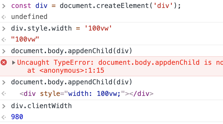
And, without time-travel, they can't be, as the (request) values here are dependent on the response.
This issue was first reported against Chromium, by Facebook.
Right now, Chrome on Android always reports its default viewport width of 980px in the
Sec-CH-Viewport-Width
header – which makes a certain kind of sense, given constraints – but in cases where that viewport width is quickly modified by a<meta name=viewport>
declaration, this hint is at best not useful and at worst misleading/harmful.The only things I can think to do about this are:
Sec-CH-Viewport-Width
on navigation requestsThese two things plus the
Sec-CH-DPR
, defaultSec-CH-Viewport-Width
, and any viewport declaration (which the server sending the HTML has the ability, in theory, to know) could be used to calculate the viewport dimensions on the server side after receiving the request but before sending any response. That'd be a pretty complex server-side flow, though.cc: @acomminos @tarunban @domfarolino