 JamesPHoughton
commented
1 year ago
JamesPHoughton
commented
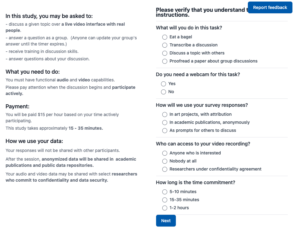
1 year ago Looks like there's still some content overlap:
Closed JamesPHoughton closed 1 year ago
JamesPHoughton
commented
1 year ago Looks like there's still some content overlap:
JamesPHoughton
commented
1 year ago Not sure if this is something we should fix by moving the button, or by moving the text...
 Alan-Qiao
commented
1 year ago
Alan-Qiao
commented
1 year ago Hmm good question. Moving the tex would probably mean adding a top padding to every page, but that feels like the same as just having the button as its own div above everything else. How about bottom left corner?
JamesPHoughton
commented
1 year ago Lets try it. Or could we make the button smaller? Just say "Feedback"? Or make it vertical, and attached to the edge?

Alan-Qiao
commented
1 year ago I like this vertical idea. Feels less intrusive even if it does cover some content occasionally. We might need to implement some way to allow content to scroll clear of that vertical button.
Let me try it
JamesPHoughton
commented
1 year ago Can we fix the button to a particular point in the window, and have the content scroll behind it, like the empriica elephant does?
Alan-Qiao
commented
1 year ago
Make button smaller so that it won't overlap with page content, too