 nus-se-script
commented
1 year ago
nus-se-script
commented
1 year ago Team's Response
Warning is colored red with multiple exclamation marks while note is colored green. We felt that this was sufficient to differentiate the two and hence decided to reject this documentation bug.
Items for the Tester to Verify
:question: Issue response
Team chose [response.Rejected]
- [x] I disagree
Reason for disagreement:
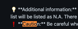
I would disagree with your statement as the huge chunk of words are still in the same color which is red and it would catch more attention than just a word in a different color. But when I was reading, I missed it, and only took me a while to figure out whether it was a note or a warning. They are way too similar and since they both have very different uses, they should be different enough to be easily differentiated. You wouldn't want a user to mistake your warnings for notes or vice versa.
Maybe you can use specific logos to point out which is a tip/note or warning.
The warning box and note box looks similar and user may mistake whether its a tip or warning or advice. might be better to use different logos or font or word color