Closed ajrobbins closed 7 years ago
pinging @lsetiawan; remember that he's the real expert here on technical aspects of the JSON files and the climatology overlays. Don, please reply as needed.
confirmation if this is indeed the color ramp to be using for the climate rasters (both precip and temp)
Based on the "ppt" file prefix, http://data.nanoos.org/files/cz/mapoverlays/ppt_colorbar.png must be the color ramp for precipitation only. The colorbar image for each overlay is referenced in the overlay's JSON file .
Is it important or meaningful to use the same color breaks as the previous tiles? Or could we use a color scheme more consistent with the new app?
That's not entirely for me to answer. @aufdenkampe? But what I will say is that we spent a lot of time refining the colormaps and value ranges to work well for the variability found spatially and temporally, and based on common approaches for this type of data. And they've had some public exposure already, with generally positive feedback. For the MODIS EVI, I would strongly suggest that we stick with what we have. More broadly speaking, I would recommend using what we developed (color ramps and color breaks) and reassess in the future if needed and based on wider user input. That also would free you up at this time to focus on implementation challenges rather than rendering and styling decisions.
I'm also not quite sure what you mean by tuning color schemes of data to be more consistent with the app. With more overlay layers, in my experience the driving goals are instead distinctiveness across layers, coherence with common rendering practices in a core community, and a balanced representation of variability across the spatial and temporal domains.
appropriate raster values to assign to color breaks
I'm not sure I understand the question. Those values are defined in the JSON files. I think @lsetiawan explained the file a while ago, but if not, let us know and he can do that.
Adding this document for reference: https://github.com/BiG-CZ/BiG-CZ-Portal/blob/master/ClimatologyGriddedData.md I had mentioned this document before, and I believe (but my memory is sketchy) that @lsetiawan provided additional technical details via emails a few months back.
Hi Emilio, thanks for getting back on this. Specifically, we had questions about how is the colormap extracted from the JSON configuration. Each month's configuration in the JSON has the following values:
{
"legends": {
"default": "v1",
"v1": {
"units": "Precipitation (mm/month)",
"colormap_tick_labels": {
"0.9": "",
"0.8": "160",
"1.0": "500",
"0.1": "",
"0.0": "0",
"0.3": "",
"0.2": "40",
"0.5": "",
"0.4": "80",
"0.7": "",
"0.6": "120"
}
},
"v2": {
"units": "Precipitation (inches/month)",
"colormap_tick_labels": {
"0.9": "",
"0.8": "6.3",
"1.0": "19.7",
"0.1": "",
"0.0": "0.0",
"0.3": "",
"0.2": "1.6",
"0.5": "",
"0.4": "3.1",
"0.7": "",
"0.6": "4.7"
}
}
},
"colorbar_url": "http://data.nanoos.org/files/cz/mapoverlays/ppt_colorbar.png",
"model_date": "2016-03-25T00:00:00Z",
"colormap_long_pixels": 256,
"colormap_short_pixels": 16,
"values": {
"max": 700.09564208984,
"min": 4.9004921913147
},
"bbox": [
-125.021,
-66.479,
24.062,
49.938
],
"key": "January",
"var": "Precipitation",
"image_url": "http://data.nanoos.org/files/cz/mapoverlays/ppt_01.png",
"creation_timestamp": 1461810909,
"colormap": "ppt_colorbar"
}
It seems the values in legends
are used for displaying the legend, not coloring them, but I could be wrong. I'm also not sure what role colormap_long_pixels
and colormap_short_pixels
play. Is there any magic happening in the colormap: ppt_colorbar
mapping?
Or do we take the 1000 pixel values in the ppt_colorbar.png
file and resize it to fit the min
-max
range of the dataset? That would lead to a relative color scale that won't be comparable across datasets with different min
and max
values.
Thanks for the clarification, @rajadain.
@lsetiawan, I assume you can answer all his questions?
Hi All,
I will use @rajadain example here.
Below is the screenshot of the colorbar legend.
v1
and v2
are simply used to be able to have different units for the tickmarks.
colorbar_url
is where the colorbar that I have created based on the output climatology is located.
model_date
is when I last ran the climatology
colormap_long_pixels
and colormap_short_pixels
is just the dimension for the size of the colorbar
values
is just simply there for the climatologies, usually used if there are actual live data in the vizer application
bbox
is the climatology extent
key
, var
, image_url
is pretty straightforward
colormap
is an arbitrary name of the colormap that I have created for unique identifier.
So if you are looking to recreate the colorbar that accurately matched the dataset you would use one of the v1
or v2
for the tickmark. 0.0
would be the start and 1.0
would be the end value. You'd have to follow that or else it would be inaccurate, unless you are able to evaluate the values on the fly.
Hi @lsetiawan, thanks for the info. We are going to generate visual tiles from the data tiles we have, and need to assign colors for each value / range of values.
The ppt_colormap.png
file has 1000 pixels. Should this color range be applied to the min-max range for Precipitation?
@lsetiawan is working on a different project (different PI) today. He's back tomorrow.
Don, if it's relatively easy to respond today to @rajadain's question:
The ppt_colormap.png file has 1000 pixels. Should this color range be applied to the min-max range for Precipitation?
that'd be really helpful. With our time difference (Azavea is on the East Coast), he may be able to use your information first thing tomorrow morning. Thanks!
We can clear up any remaining confusion tomorrow at out scheduled call. Don, it'll probably be helpful if you review before the call the code you use to go from the data rasters to the colormapped png's; it sounds like the information you have there will actually be more helpful to @rajadain than the JSON file.
Should this color range be applied to the min-max range for Precipitation?
No. The range of the color should be where the 0.0 and 1.0 tickmarks are. So in this case, 0 to 500.
In the example above, the tickmarks go up to 500. But the max value is actually 700.09564208984. Should we use the final color for all values after the 500? And same for temperature for values beyond -20 ℃ and 40 ℃?
Should we use the final color for all values after the 500? And same for temperature for values beyond -20 ℃ and 40 ℃?
Yes indeed. Thanks
Idk if this helps but here's how I made the colormap:
Thank you. That is what we were looking for. I had written some code to reverse-engineer the colors from the legend image, but this is far more helpful.
I had written some code to reverse-engineer the colors from the legend image, but this is far more helpful.
@rajadain wow. That is quite impressive! Glad I can help. Let me know if you need anything else. 😄
Hi @lsetiawan & @emiliom, unfortunately we've hit another point of confusion in interpreting the appropriate colors for the precipitation visualizations. I've used the code you've provided to generate a color ramp from 0-500, the value -> rgba
output can be found here: color-ramp-ppt.txt
When I render January, I get a visualization that does seem to match the legend you provided, when cross referenced against the actual data tif. However, my rendering for Jan does not match the Nanoos rendering for Jan. I've added some screenshots below to help clarify my question, but I'm essentially wondering if we're working from the same data tifs, as the Nanoos rendering does not appear to match the legend you provided, assuming it was derived from the tif I'm using. If the sources are correct, am I comparing against the correct Nanoos visualization? I'm fairly confident that the colors your code produced are accurately reflected in my rendering, but the discrepancy between the two systems is concerning. Can you provide any insight?
The Jan data tif I'm using to render can be found here: ppt_01.tif.zip
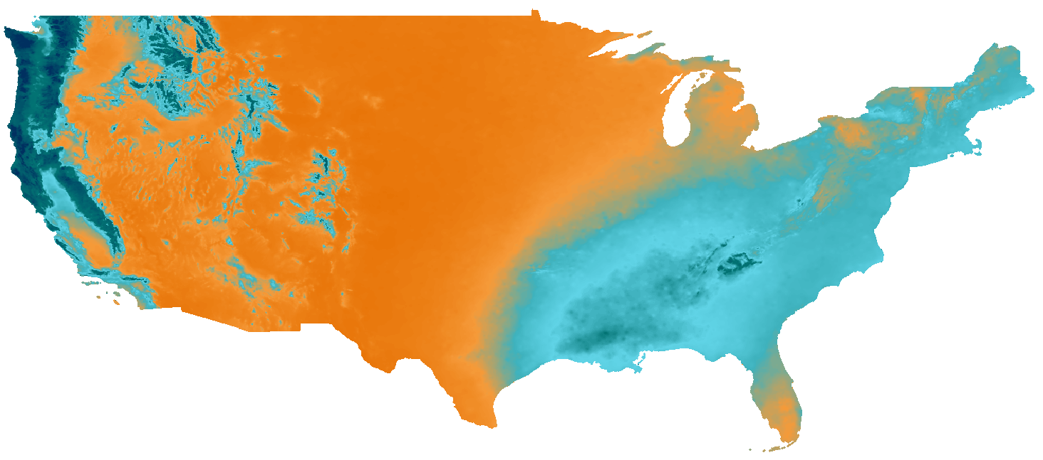
Here you can see data values clipped between 37 and 68 as symbolized for Michigan in Jan. According to the legend, I would expect rendered values to be in the aqua-blue range. That is the approximate color in my screenshot, but not the Nanoos version. In that version, Michigan appears largely orange, which represents data below 20. Based on the data tif I have, Michigan does not have any values that low for January (as you can see in the screenshot below, they are between ~37/68). The same holds true for South Florida.
Thanks for the clear report, @mmcfarland. @lsetiawan, please look into this and follow up on this issue.
@mmcfarland We do have the same exact dataset. I have found the problem. The tickmark values in the legend isn't correct. My rendering is the correct rendering. Here's what I did. Hope that helps! Thanks.
def export_png(out_png,var,meanArray,CMAP, profile):
values = {
'tmean':{
'min':-20,
'max':40
},
'ppt':{
'min':0,
'max':500
},
'EVI':{
'min':0,
'max':10000
}
}
if var == 'tmean':
meanArray = np.ma.masked_where(meanArray <= -9999, meanArray)
meanArray = meanArray - values[var]['min']
x = np.ma.masked_where(meanArray < 0, meanArray)
x = np.ma.masked_where(np.isnan(x), x)
# Normalizing data to make it from 0-1
x_normed = x / float((values[var]['max'] - values[var]['min']))
# Create Image from array and apply EVI, converting np array to values of 0-255
im = Image.fromarray(CMAP(x_normed, bytes=True))
print("Creating PNG Overlay")
# Save image out
im.save(out_png)
Thanks @lsetiawan, I'll try to work through this. In your code above, is CMAP
the result of your previous make_cmap
function, based on inputs provided in the dictionary pasted in a comment above?
@mmcfarland CMAP is the pylab
registered colormap
from pylab import cm
colors, position = colors[var]['colors'], colors[var]['position']
cmap = make_cmap(colors, position=position, bit=True)
cm.register_cmap(name=var, cmap=cmap)
CMAP = cm.get_cmap(var)
I've updated the legend for both precip
and tmean
. Thanks for catching this error. Apologies for the hassle and the confusions. 😞
Thanks, @lsetiawan
Thanks @lsetiawan, we've got the rendering down so we can generate tiles that match your previous visualizations.
Woo hoo! Thanks again @mmcfarland. I've left a little bit of comment in PR, just a little tweak to the code. I hope that doesn't mess things up too much. 😸
We are ingesting the BiG CZ climate rasters into GeoTrellis to create visual tiles. We need clarification from @emiliom as to the appropriate color ramp and color breaks for the rasters. There is some configuration in the sample JSON in the documentation that references this 1000×1px image: http://data.nanoos.org/files/cz/mapoverlays/ppt_colorbar.png
This could be the desired color ramp - we extracted 243 unique colors from the image to use. However, we need:
@emiliom Can you give us some guidance on the two questions above?