 zzap
commented
6 years ago
zzap
commented
6 years ago Pinging @mapk.
Open joyously opened 6 years ago
zzap
commented
6 years ago Pinging @mapk.
 mapk
commented
6 years ago
mapk
commented
6 years ago Like #236 I think we can solve some of this by removing the black header altogether and just have a minimal support header for the support section. This would also eliminate the double search bars that look ridiculous. This is a larger discussion though.
But ultimately as for mobile, research shows that people scroll. https://www.nngroup.com/articles/scrolling-and-attention/
Analytics for wordpress.org show that the top page for people to visit from the /support page is the "Get started" link taking them to /welcome.
The 4th most visited page from the /support page is the codex.
The 2nd, and 3rd most visited page after the /support page are non-support related. The 5th most visited is a forum page.
This could be because the 'search' box on the support home page only offers to search the forums. If our new search covers more than just forums, we might get more traction on it.
Something to consider, is that this design currently follows the design patterns of the rest of the site. Yes, the "search" will be prominent on mobile, but I don't think that's a bad thing.
 joyously
commented
6 years ago
joyously
commented
6 years ago The 5th most visited is a forum page.
It could be because the main menu link for Forums goes to the support page. I've asked about this before. Makes no sense to me.
I just think the blue part with the search box should be a bit smaller on mobile. The black part could be smaller too, but I wouldn't want to get rid of it. I like being able to search all of wp. Please don't choose a "solution" that reduces the user's options on the part of the site that is supposed to be helping him. When I am answering forum questions, I use a lot of the links in the black part menus to get to the pages that have the info for the user.
 wittwitsan
commented
5 years ago
wittwitsan
commented
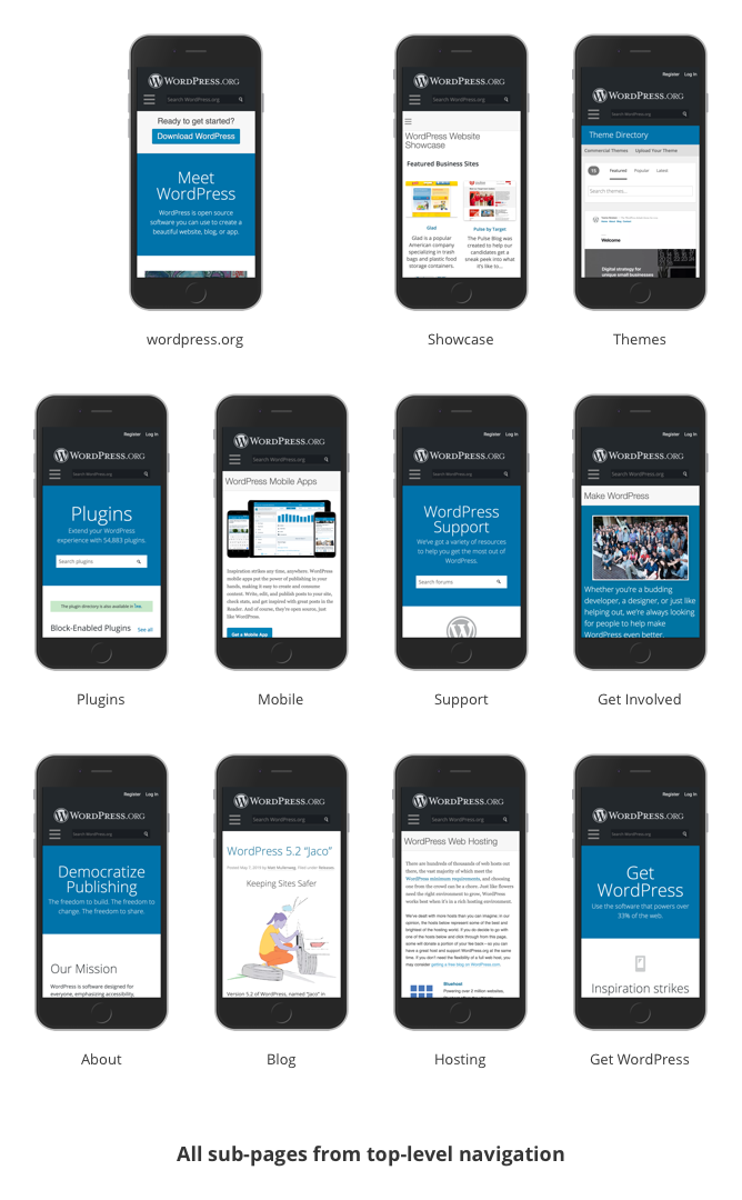
5 years ago Screenshots

Current design patterns from the site.
wittwitsan
commented
5 years ago I agree that the search box in the blue prominent area should cover more than just forums. This will be the same "above the fold" approach as the Plugins page.
 shaunandrews
commented
5 years ago
shaunandrews
commented
5 years ago 
Seems like the blue banner area needs a better responsive design, likely across the whole site. Reducing the font-size and padding goes along way, and left-aligning the text on mobile reads more naturally to my eye.
I do question the double search box, but that's likely a different issue.
 estelaris
commented
5 years ago
estelaris
commented
5 years ago We had a discussion with the #design team and we will be looking into finding a solution that works for all the pages/sections. In the meantime, I found that mobile screens work better with both ribbons and only the main search field if both ribbons are shrunk in size. It even has a filter to hide the welcome screen.


Viewing https://wp-helphub.com/ on a mobile device gives the first impression that there is nothing to do but search.