Closed melchoyce closed 5 years ago
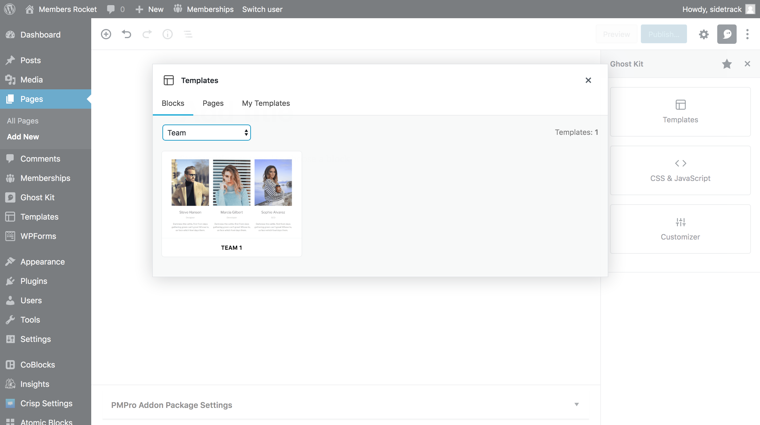
Screenshots of the UI from block plugin Ghost Kit. The plugin has several patterns that lend themselves to editor-side block selection, and potentially, installation.
Using the Inspector Controls area, the user is presented with three panels.
The Template panel allows the user to select a template type from a drop down. Those templates are complete page setups or grouped blocks that can be added to the page.
Is there a list of products you'd like to view for competitive analysis? It might be good to ask in next week's design meeting for people to either pick one from the list to screenshot. Similarly, it might be good to ask if anyone has any to add to mix.
Good question, and the answer is, I'm not sure. I think finding some good examples of in-app purchases, especially apps that let you preview the feature you're purchasing ahead of time, would be good inspiration. Pretty much any freemium product that lets you preview before purchasing could work.
Similarly, the "Gutenberg Blocks Template" plugin initially comes with ZERO block, but once you open their Gutenberg sidebar panel, you can import the "designs" -- which are essentially sections of Core blocks styled with custom classes and a CSS template.
So, in terms of existing UI of Gutenberg there seems to be two obvious places where new block discovery/installation can happen:
Like the Ghost and Block Templates plugins above, adding a custom sidebar to allow for block discovery/installation seems consistent with existing Gutenberg patterns.
PROS:
CONS:
The space problems with a sidebar panel can be overcome with a modal popup.
PROS:
CONS:
Overall, I'm not convinced that block discovery/installation should be happening in the editor at all. So, just voicing those concerns (like I have already a few times on make.wordpress).
But if it's happening no matter what, I wanted to provide constructive feedback as early in the process as possible. Thanks for your leadership and initiative on this @melchoyce and @karmatosed !
Jetpack has recently been looking at how to handle blocks only available in paid plans, and I think there are some ideas we could potentially adapt:
These two ideas in particular fit well into existing Gutenberg patterns:
I can easily imagine something like...
"This is a preview of the (Name) Block. Install to use it on your site. [ INSTALL ]
A couple "Freemium" / preview examples:
https://www.uisources.com/app/pacemaker https://mobile-patterns.com/search/patterns?q=preview:tag
Search → Take action from results example:
Search results, with people you follow and people you don't follow:
https://mobile-patterns.com/iphone/snapchat/misc-gesture-transition-730
More search results that mix stuff you have/stuff you don't have:
https://mobile-patterns.com/iphone/vine/engagement-and-retention-microinteraction-search-438
Preview modal for in-app purchase:
https://mobile-patterns.com/iphone/path/actions-in-app-purchases-customization-428 https://mobile-patterns.com/iphone/path/actions-in-app-purchases-messaging-143 (WARNING: NSFW language) https://www.uisources.com/explainer/pacemaker-add-filter-to-mix
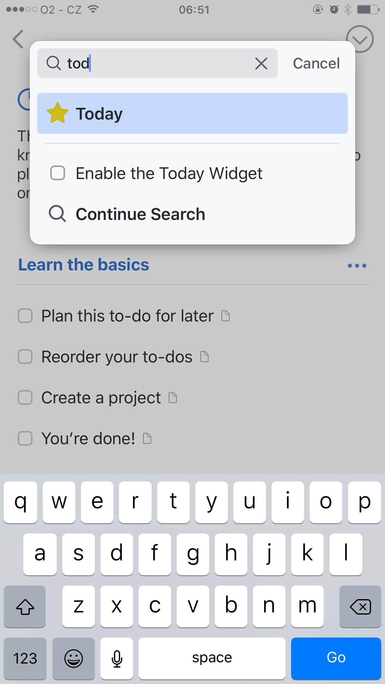
Some 'wide' examples of searching and suggestions:
Bear:
Apple:
Monzo:
WordPress mobile app:
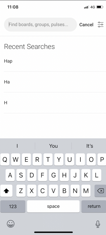
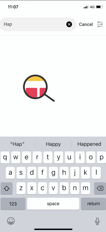
Monday:
Searching animation: this moves around showing sections
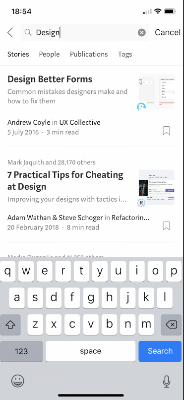
Medium:
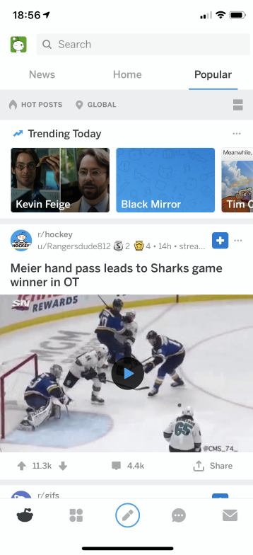
Reddit:
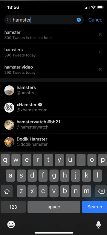
Twitter:
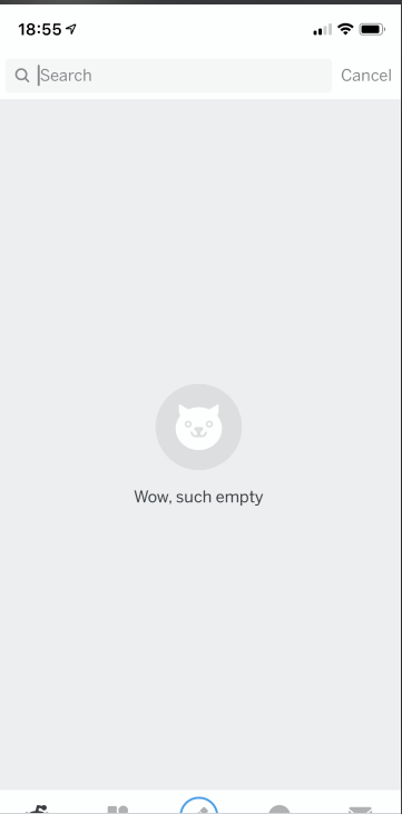
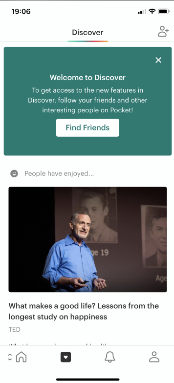
Pocket:
Thoughts:
Wrote up a post summarizing these: https://make.wordpress.org/design/2019/05/17/block-library-competitive-analysis-recap/
Closing to mark as complete, but feel free to add more examples here or to that p2 post.
We'll use this to compile research and screenshots.