Closed melchoyce closed 5 years ago
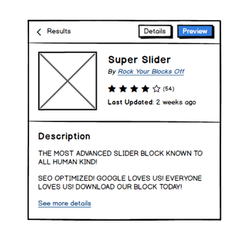
I have three ideas here:
Some questions:
Personally, I'm a fan of option 3. I'm not 100% sure why, but I think its because it'd encourage "simpler" details. I don't think a block should have the same level of details that an entire plugin would.
Sorry in advance for the notification spam, but gotta give a shout out to "Rock your Blocks Off". Nicely done.
I'd prefer to go for 2 or 3, since those have tags in them. It would be nice to be able to explore from there too. Although it's hard to guess what information one searching already has. I also haven't been looking at what info is given in the cards that appear after search, so it kind of depends on that too.
@TimothyBJacobs In your ideal world, what details would we restrict blocks to?
@boemedia:
It would be nice to be able to explore from there too. Although it's hard to guess what information one searching already has.
I think we can definitely explore that in future iterations on the block library.
I also haven't been looking at what info is given in the cards that appear after search, so it kind of depends on that too.
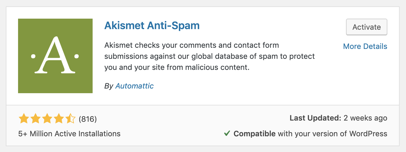
I'm envisioning the block cards would match plugin cards.
I lean towards something more like 3 personally, as I frequently have to sort through way more information than I need on the WP.org plugin screens. I'm usually looking for two simple things:
For people who need more detailed information, it'd be cool to allow them to click into a more detailed screen from the small preview:
@TimothyBJacobs In your ideal world, what details would we restrict blocks to?
I think a description, screenshots, author, rating and last updated. I think tags is probably duplicated by the keywords when registering a block. Maybe limiting the description length as well.
Bunch of alternate ideas:
This one seems clear and well-organized to me:
One minor suggestion: We could change "Last Updated: 2 weeks ago" to just "Updated 2 weeks ago" to save on a little space.
Also, would it make sense to put the buttons at the bottom of the view instead of the top?
I was using existing strings:
We could try to update the string everywhere, though.
Only problem with that version is what happens if a block has a really long name/author:
Also, would it make sense to put the buttons at the bottom of the view instead of the top?
We've had issues previously putting actions on the bottom β people using keyboards would need to navigate through the description (which could scroll, because the library popover is a fixed height) to get to the actions. @bemdesign-er / @LukePettway could we get your thoughts on this?
I feel that the action buttons will need to occur after the description. Yes, it means users have to "tab" through to get there, but... I don't think that's too much of a problem - most users will want to read the description before installing the plugin. We can provide an affordance to keyboard/AT users who don't want/need to read the full description by a "skip-to-actions" link before the description. Yes it adds an additional "tab" stop - but it provides a quick way to move past the description area and into the "actions" for users who really don't need or want to read the full description. Let me know if that makes sense or if you have any other questions.
Thanks @bemdesign-er! Would something like this end up being okay?
I think this is ok.
Definitely 3 feels like the right approach here. Some people will want more details prior to "committing" to a block, but the options for 1 and 2 feel super overwhelming. Nobody needs that much information.
Do we need to show the block banner, or is an icon sufficient?
A picture of the rendered block would probably be super helpful. If that's what a block banner would comprise, then yet. If it's just a shiny unrelated picture, then probably no.
Do we want to open details in a new modal at all, or keep everything in the block library?
The current design-leaning-toward (which I think is staying in the block library?) makes senseβit's all part of the same flow, and being able to navigate through this flow all from one view seems sensible, especially when you're providing back links and links to install directly. π
Do we want to even show details? Yes! Some people will want them. But let's pare it down to the most useful and relevant details. Or wait, if you mean more details after this "more details" screen, then no. This is sufficient information to make a decision.
The layout with the star rating and update details below the author is the easiest to parse. (As a bonus, we can totally nix the "Description" heading unless it's helpful for accessibility reasons, which may not be required if we provide a skip-link? But I'm not exactly sure.)
Thanks @bemdesign-er and @sarahmonster! I'll make these updates in the higher fidelity version I'm working on in Figma next: https://www.figma.com/file/QKhoOKXkBN2mHacqvrtdNuI6/Gutenberg-Block-Library-Installation?node-id=2%3A15
As far as the description header, I would keep it. Heading levels help denote different sections of content and help assistive technology users navigate through the content. Feel free to style the heading to be more like a bolder version of the description text if it makes sense for spacing or layout reasons. An <h3>
doesn't have to "look" like an <h3>
! All that being said, do be careful to not overdo it - if markup styling starts to depart too radically from expected norms, users can get confused.
I agree with @bemdesign-er having them after is fine. If someone is using tab shift focus, assuming there are no focusable elements within the description, it shouldn't require much effort to get past the main content and to the action buttons.
@LukePettway @bemdesign-er:
Double-checking since I'm looking at rearranging the popover again β between these two options, is the second one better for keyboard users?
Thanks everyone for the explorations here π just a question: based on previous conversations, I thought it was decided to always have the primary button on the left. Recently, we also have moved some buttons from the right to the left to meet this (supposed) new, established, pattern.
Not arguing: whatever the decision is that will be fine. I'd just like to have consistency across the admin, where at the moment the primary button position is very inconsistent.
I'd greatly appreciate the design team to establish (and document) a pattern that from now on should be used everywhere: left or right, please let us know π
References to previous tickets / discussions on this topic: https://core.trac.wordpress.org/ticket/40822 https://core.trac.wordpress.org/ticket/40822#comment:9 https://core.trac.wordpress.org/ticket/40822#comment:10 https://wordpress.slack.com/archives/C02S78ZAL/p1554138401066300 https://core.trac.wordpress.org/ticket/46758 https://core.trac.wordpress.org/ticket/45972 https://core.trac.wordpress.org/ticket/43412 https://core.trac.wordpress.org/changeset/40655 https://core.trac.wordpress.org/ticket/9777
@melchoyce As far as keyboard accessibility is concerned, as long as the content itself is linearized, the button placement isn't going to really matter so either design is fine. Where it would be a problem is if a user had to go through the the content area before they could interact with the primary button.
Just a question: based on previous conversations, I thought it was decided to always have the primary button on the left. Recently, we also have moved some buttons from the right to the left to meet this (supposed) new, established, pattern.
π Thanks for noting that, @afercia. I know Mel prepared a number of alternate positions for the buttons there. These are from the Figma doc:
Because these buttons exist in a small, dialog-like overlay, I think it feels appropriate to follow the guidelines for modal buttons, which depict right-aligned buttons. In a smaller area like this, right-aligned buttons help guide the eye over the full content. That works well in this case, but wouldn't in the context of a WP-Admin page where the content spans the full width of the page (for example). In that case, the buttons end up being too far away from the content.
I'd like to see some guidelines too βΒ this seems like something that could be added to the Button component documentation.
Since this button placement issue keeps coming up, I've opened a new ticket to discuss establishing clear guidelines for placement: https://github.com/WordPress/gutenberg/issues/16123
@kjellr thanks for adding more details π
However, I'm not referring to the position of the buttons group. As long as buttons are grouped, they can be placed on the left, center, right, depending on the context.
Instead, I'm referring to the position of the primary button (the primary action one) compared to the other buttons within the group.
A while ago, it was agreed (see references above) that the primary button should always come first within the group, that is: on the left in LTR and on the right on RTL π First.
Whatever the decision will be, I'm more interested in consistency and make a decision once and forever on the primary button position π After that, we should consolidate the pattern across all the admin. Thanks!
How do we give people enough information about blocks to make informed decisions?