 jasmussen
commented
10 years ago
jasmussen
commented
10 years ago You make a lot of good points here. Your suggestions on cleaning up the CSS and separating out some of the stuff that was intended for the example page from the helper CSS is stuff we should do. Removing the baked in width and height from the helper CSS also makes good sense.
I disagree about removing the font-size: 20px; though, it's there for a very good reason. Dashicons has been designed according to a specific 20x20px pixel grid. Just because it's vector graphics doesn't mean it'll actually look good at any size, especially when they're shown small.
Here's an example showing the same icon in 20px and 21px sizes, zoomed way in. On the left you'll see that the hairlines inside the sticky note are exactly 1px high. On the right, the increased size blurs that all up due to the antialiasing. As such, Dashicons with its 20px grid will look perfect in only that size, and 2x multiples thereof (i.e. 40px, 80px etc.)
The issue becomes less prevalent as you pick larger sizes due to the increased fidelity. 60px and anything above will look fine probably. But I doubt many use them in those sizes. As such, removing font-size: 20px; does a disservice to those using the icons. But if you still want a non-pixel-grid size, you can easily override with font-size: inherit; in your own stylesheet.
 steveush
 field2
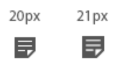
Hey Guys,
Straight into the issue I'm having, you have a fixed font-size, width and height set on your .dashicons class. This makes actually getting the icon to fall inline with text not so straight forward if using a font-size different to the standard baseline size of 20px.
Here is a what I propose the class should look like:
The original 20px set on the width and height has no affect on the :before element that is actually showing the icon as that grows to it's content based on font-size, it simply alters the default inline layout.
As for the font-size that is a decision that should be left up to the developer making use of the icons. Having to override the default of 20px is out of line with the majority of font's out there like FontAwesome or anything created with IcoMoon that simply inherit the parents font-size.
There are also some transitions included in the .dashicons class which should rather be refactored out into the #iconlist div class in the styles.css file.
Overall it seems as though some style properties used to create the index.html page have crept into the core dashicons.css file when they should be in the styles.css file. This makes simply switching from other font's to dashicons in plugins etc. more complicated as we have to go and override these properties to get the icons to display correctly inline.
This issue is even evident on http://melchoyce.github.io/dashicons/. Simply open dev tools and inspect any of the icons and you will notice the rather strange layout. A small 20px div (.dashicons) padded to increase it's size to the required size to get the layout to work as expected. In dev tools untick the padding on the #iconlist div class and all the icons overlap each other, this is not how the default layout should behave.
With the above changes to the .dashicons class the #iconlist div class in styles.css could be changed from the current one using paddings to force the layout to one that simply uses the font-size and margins so the layout behaves as one would expect from an inline element adjusting itself according to the font-size. I also added in the transitions that I removed from the above to this class. Not everyone will want transitions and this is simply something else we would need to override.
Please let me know what you think as currently the hard coded defaults seem more restricting than anything else.
Thanks